
Updated
Curated inspiration sent every Tuesday
Unsubscribe at any time
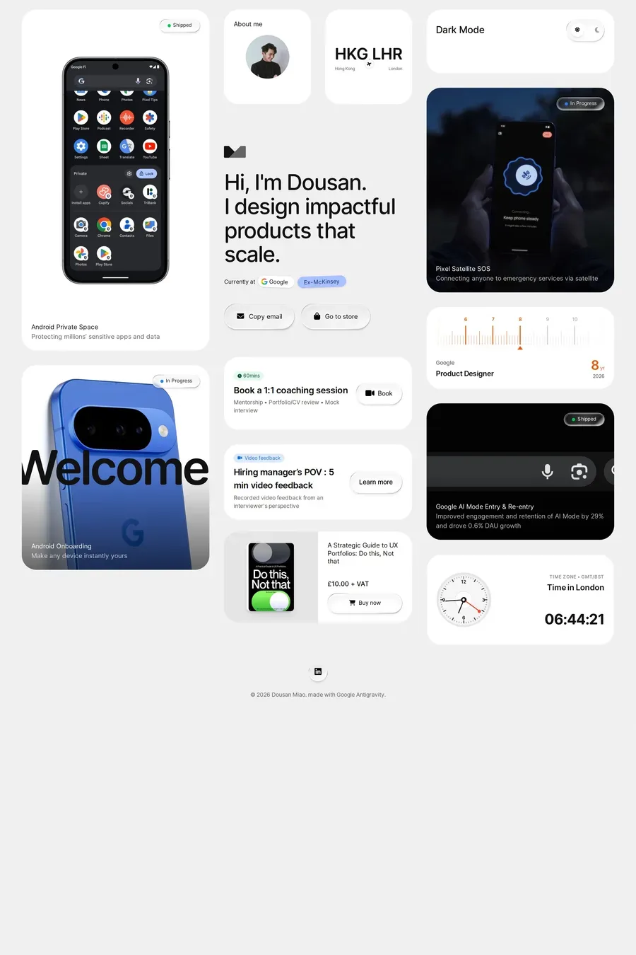
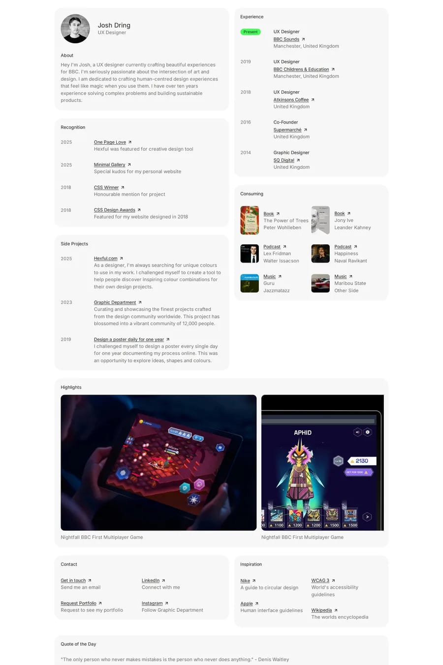
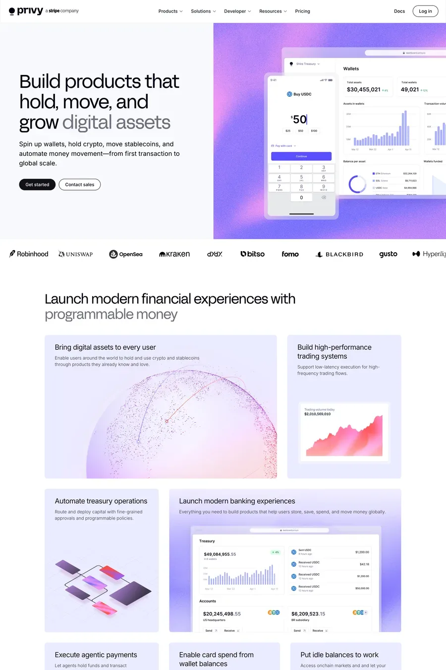
A bento layout uses a modular grid where cards of varying sizes sit together with uniform gaps. Each card typically contains a single focused piece of content — an image, stat, feature, or illustration — with generous padding and rounded corners throughout.
Apple popularised the bento approach in their product marketing pages, and it quickly spread because it solves a real problem: presenting lots of information without overwhelming the viewer. The modular structure also adapts well to responsive breakpoints.