Updated
Curated inspiration sent every Tuesday
Unsubscribe at any time
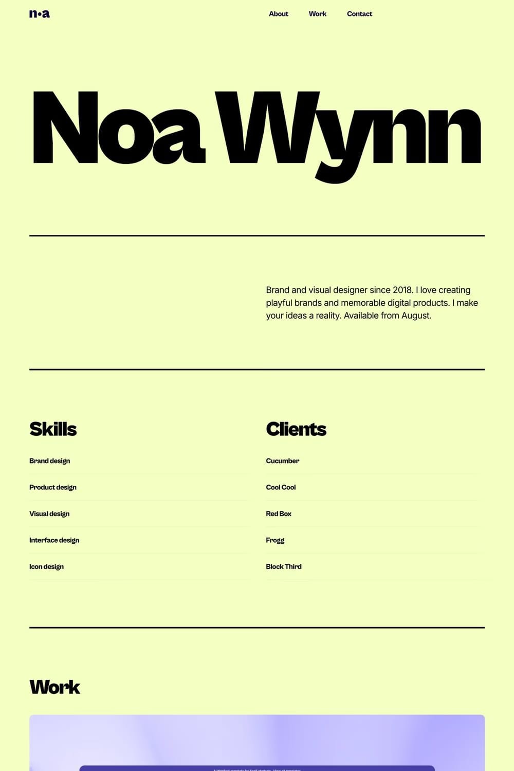
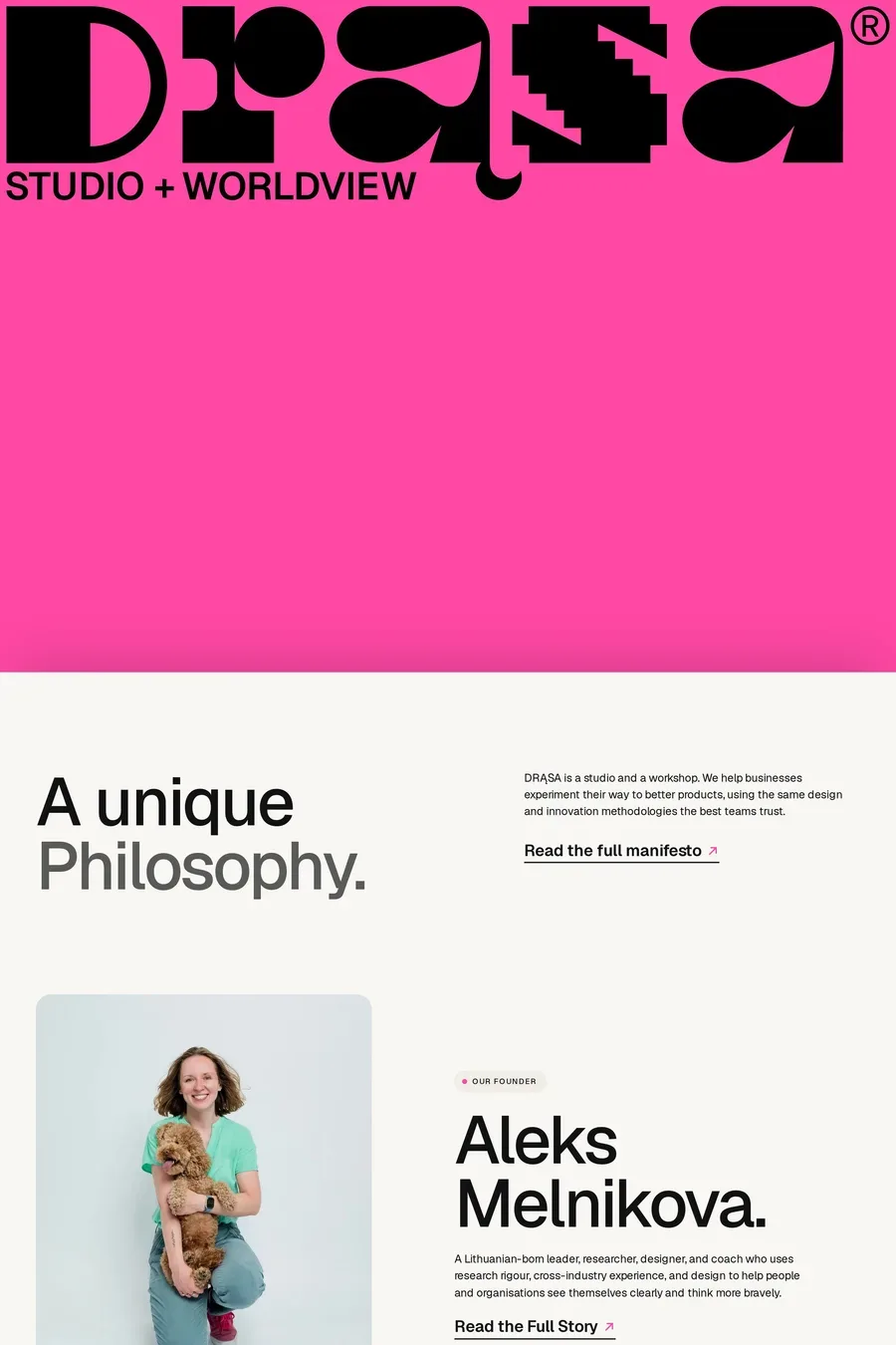
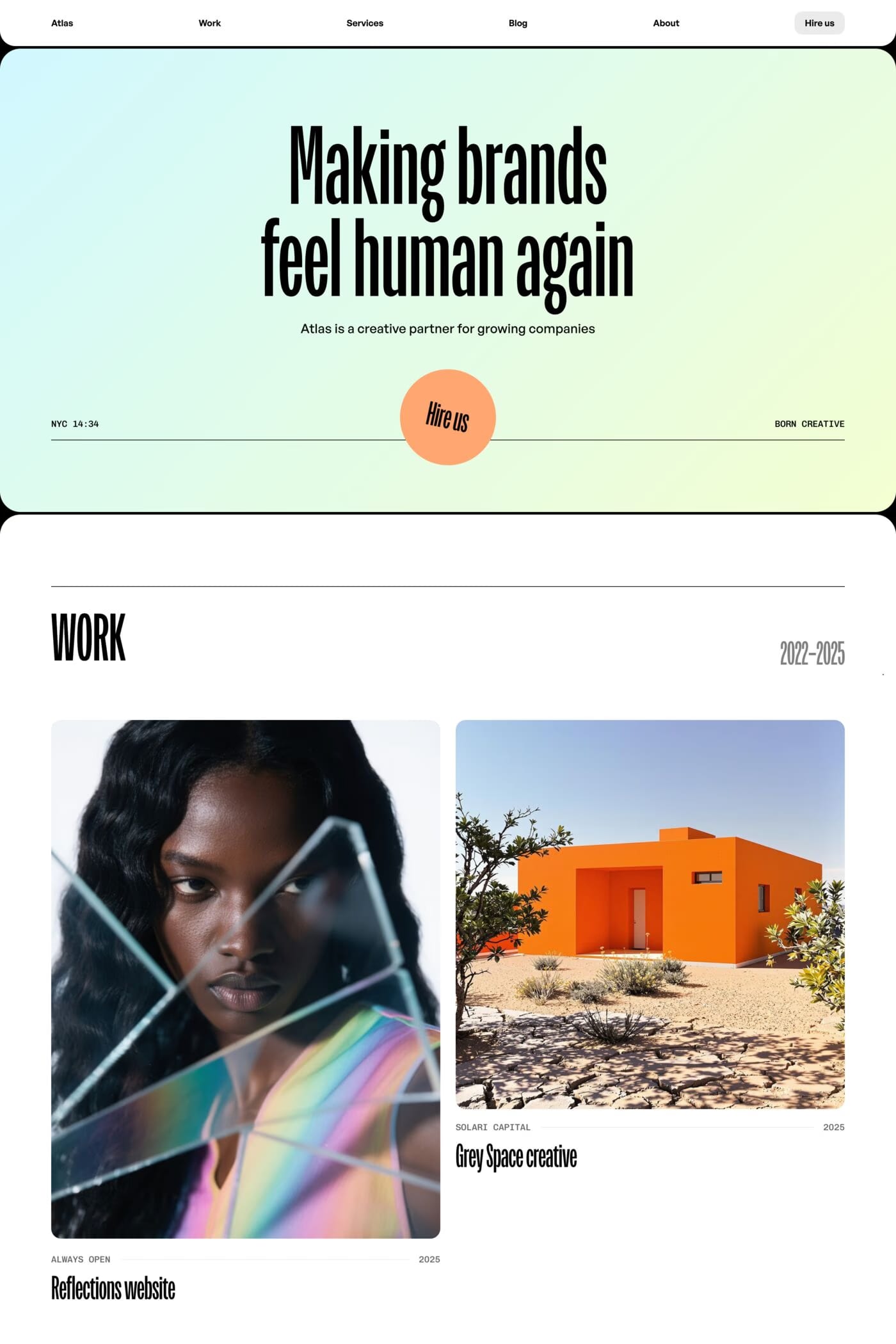
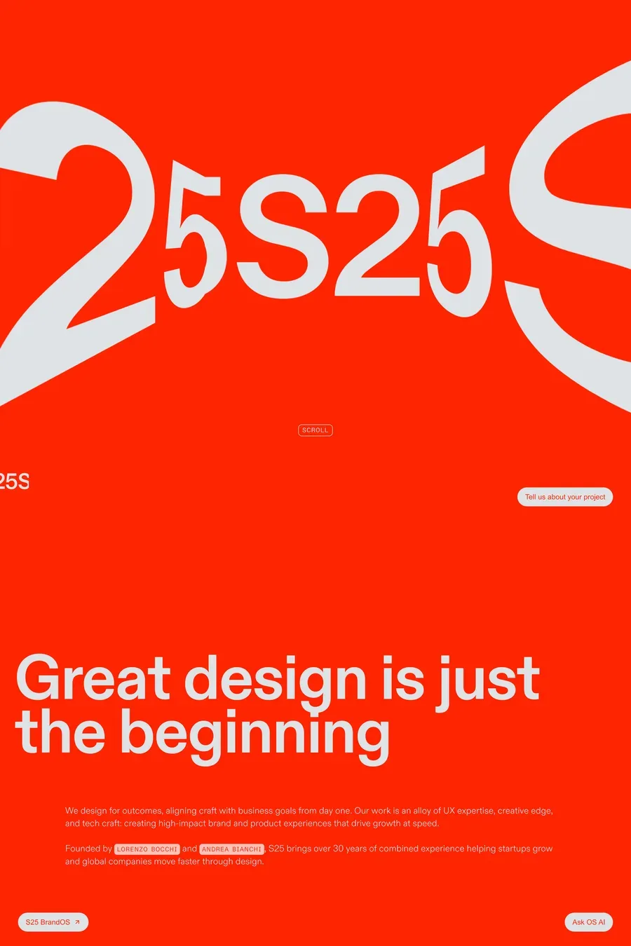
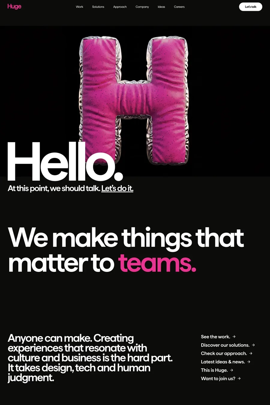
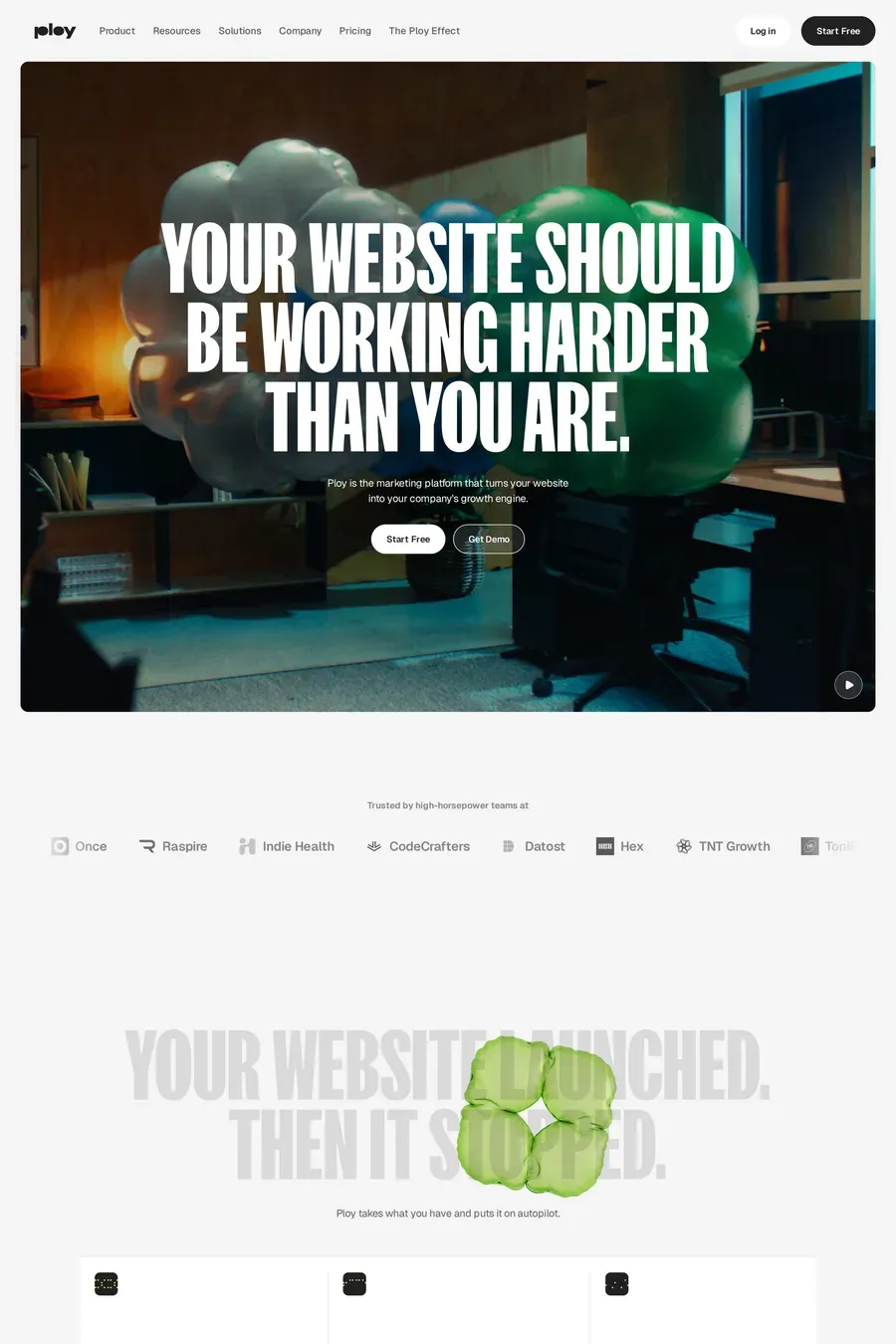
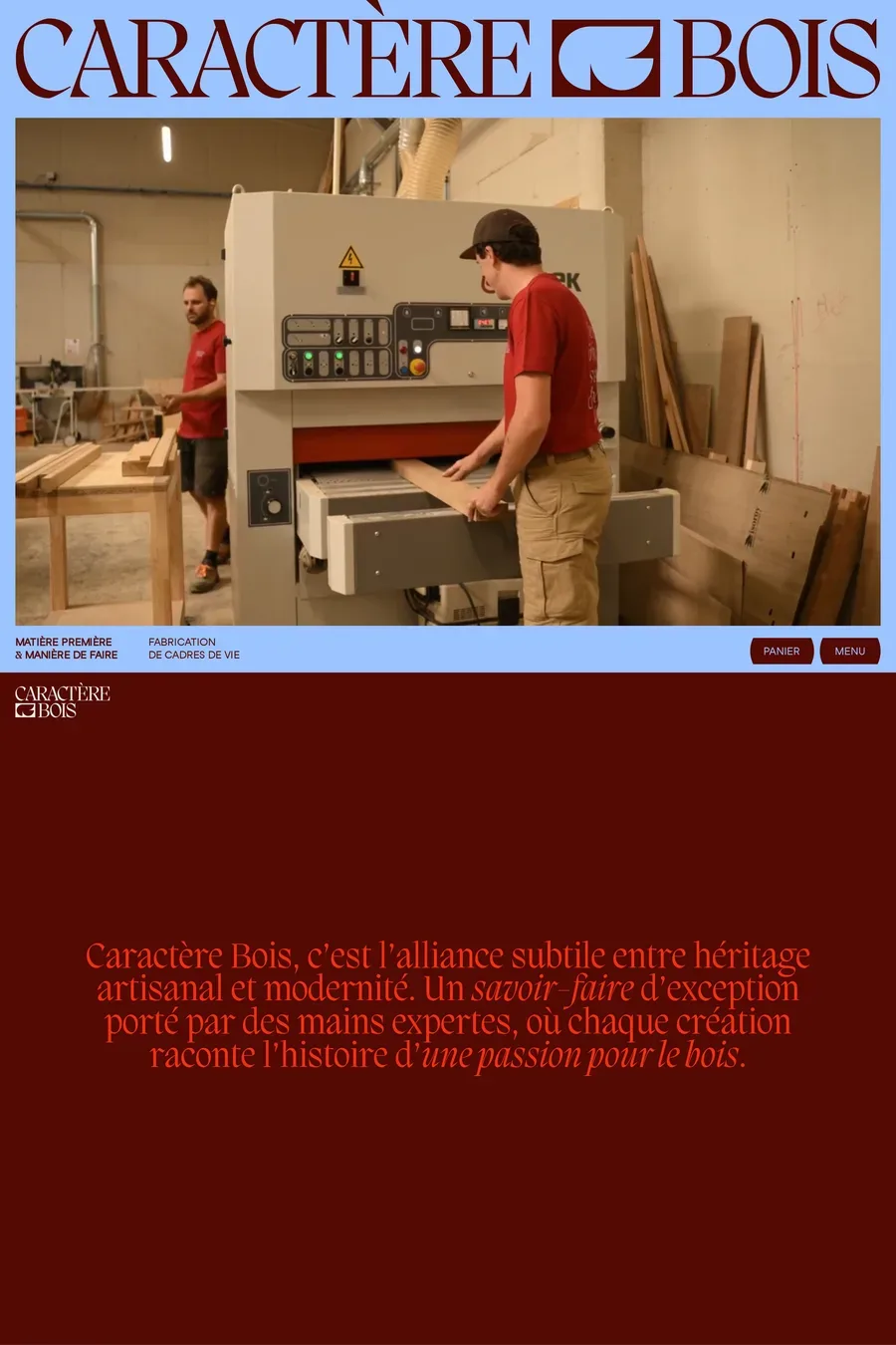
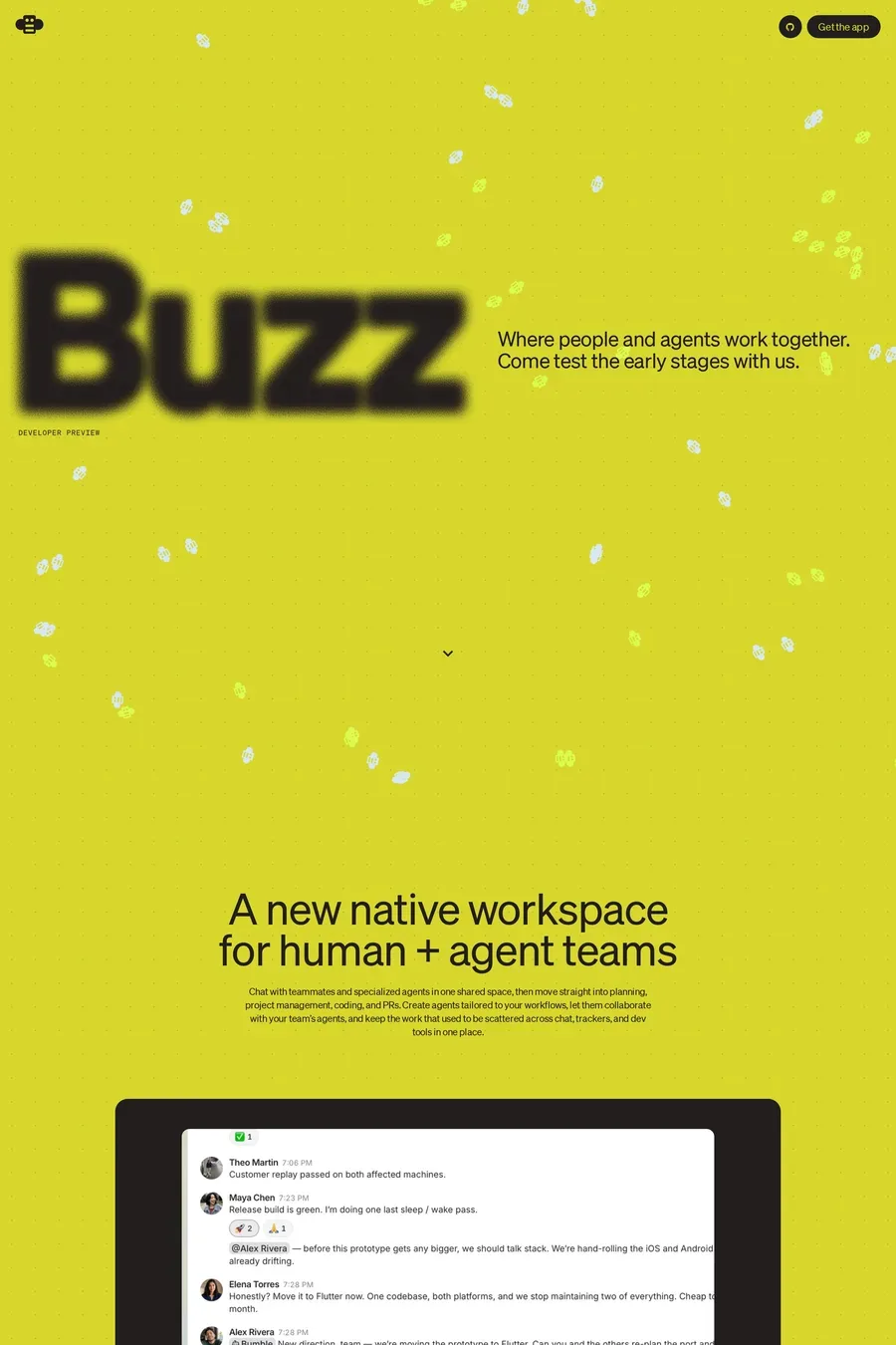
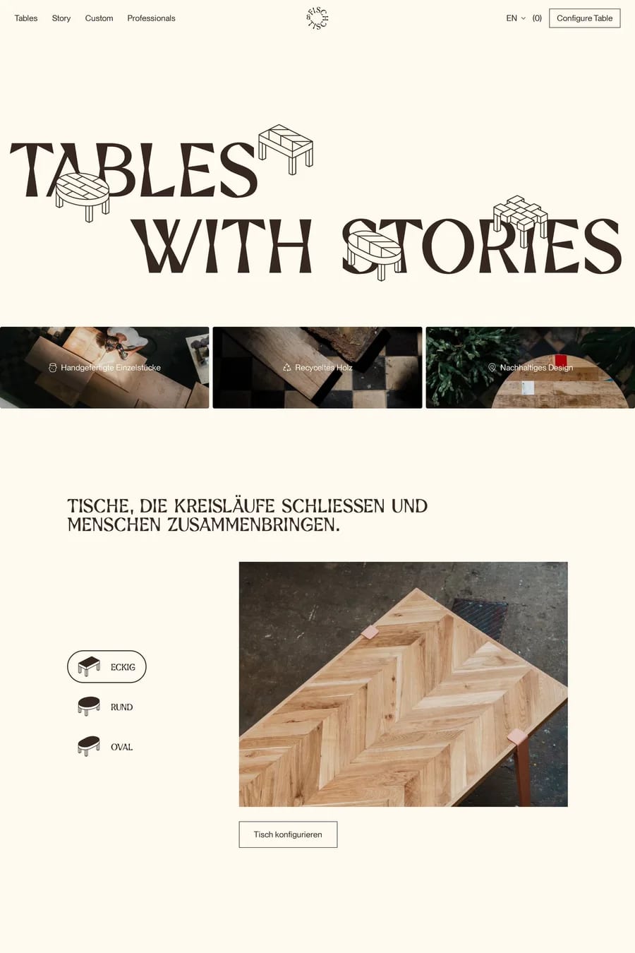
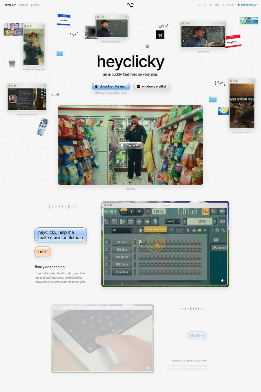
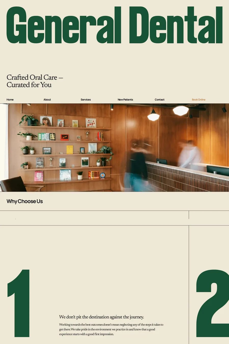
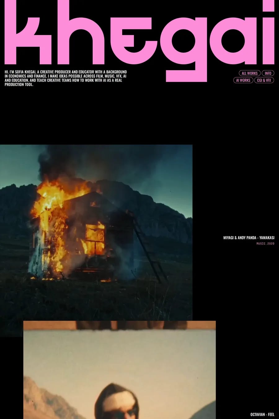
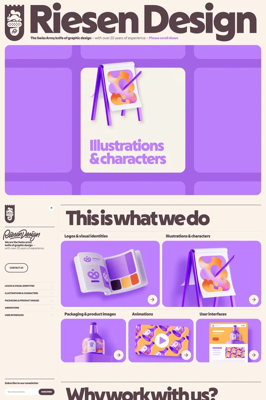
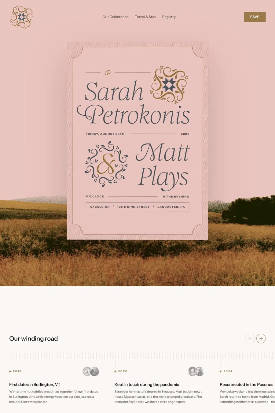
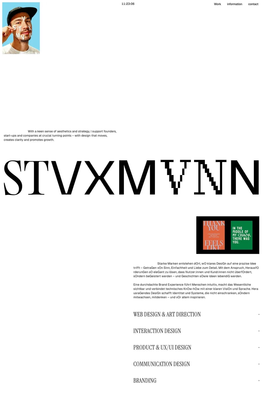
Display fonts are designed for large sizes and short text — they often have exaggerated features, tighter default spacing, finer details, and more expressive character shapes. They sacrifice the even colour and readability needed for body text in favour of visual impact.
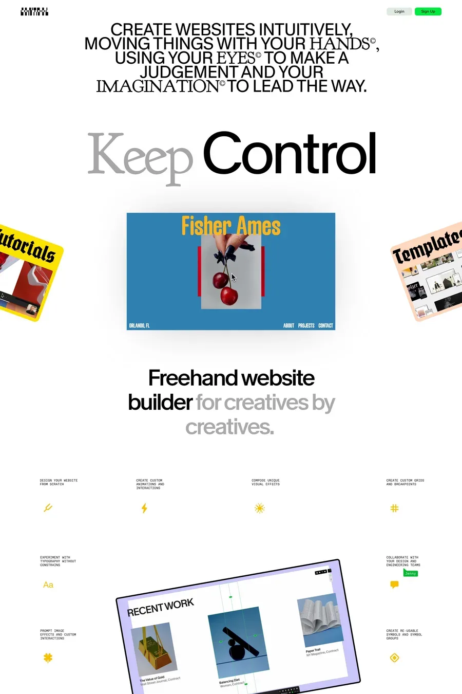
Contrast is key — an expressive display font pairs best with a neutral, highly readable body font. A decorative serif headline works well with a clean sans-serif body, and vice versa. The display font should carry the personality while the body font stays invisible.