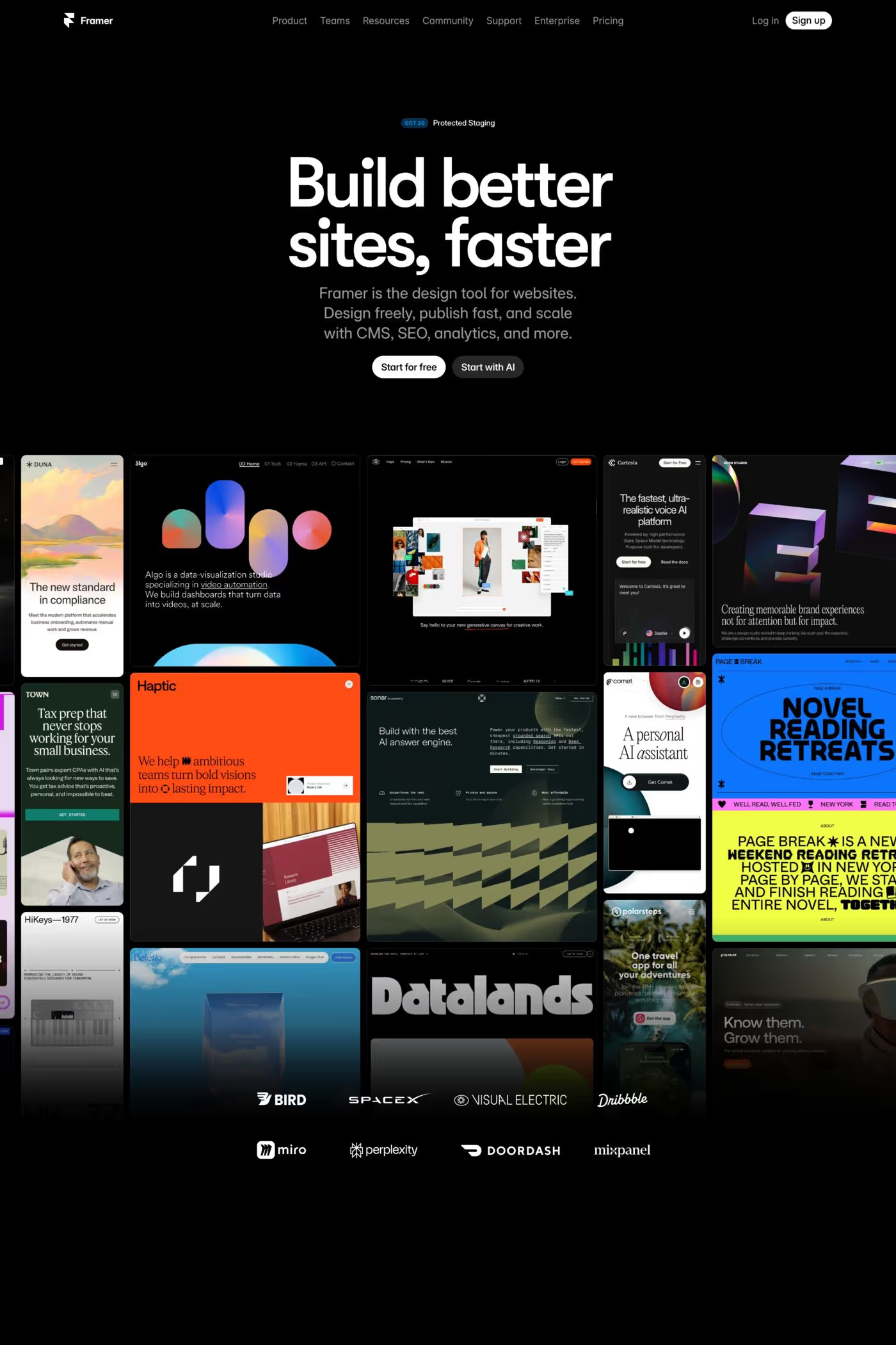
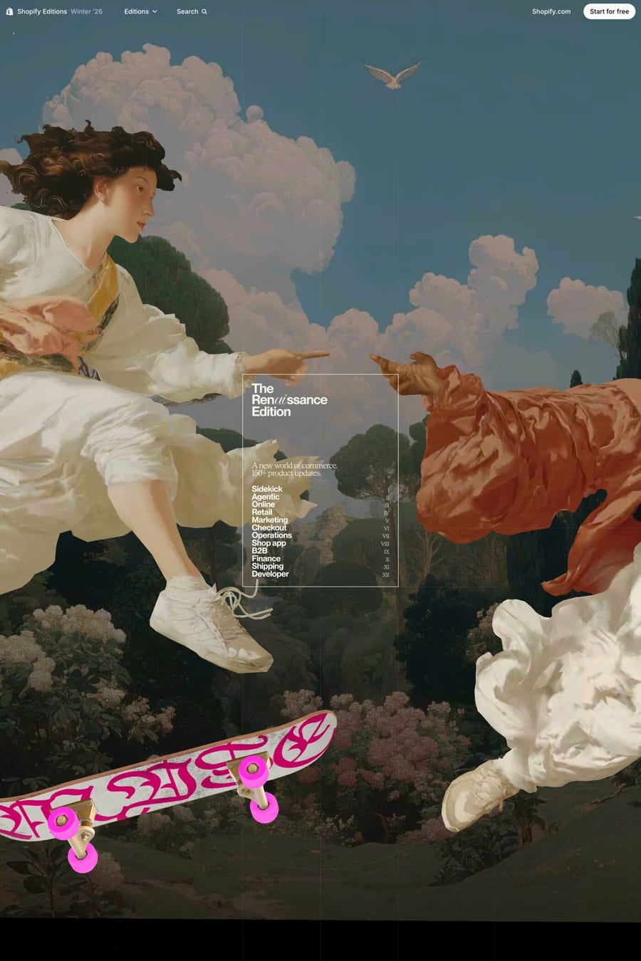
White is the most common background on the web and the hardest to make interesting. Every site in this collection starts with the same blank page. The ones that stand out — Soren, Daybridge, Airspace — do it with type, space and one or two decisions that fill the void. The first thing to notice is that the white is rarely pure. Most of these pages sit at #fafafa or a warm off-white, which softens the glare and lets pure white be used for cards and raised surfaces. The second is that white sites live or die on typography. There’s no colour to carry the page, so the type has to. Big headings, tight letter-spacing, a clear scale, and a body face that’s comfortable at 16 to 18px. The third is structure. Borders and dividers at low contrast, generous padding, and a grid the visitor can feel even if they can’t see it. White also photographs well. Product shots, UI screenshots and portraits sit on white without any treatment, which is why so many software and portfolio sites choose it. The weak examples are the ones that treat white as “no decision”: default type, default spacing, a hero with a stock illustration. Compare with the light style, minimal and clean collections, or see light landing pages and light design sites.