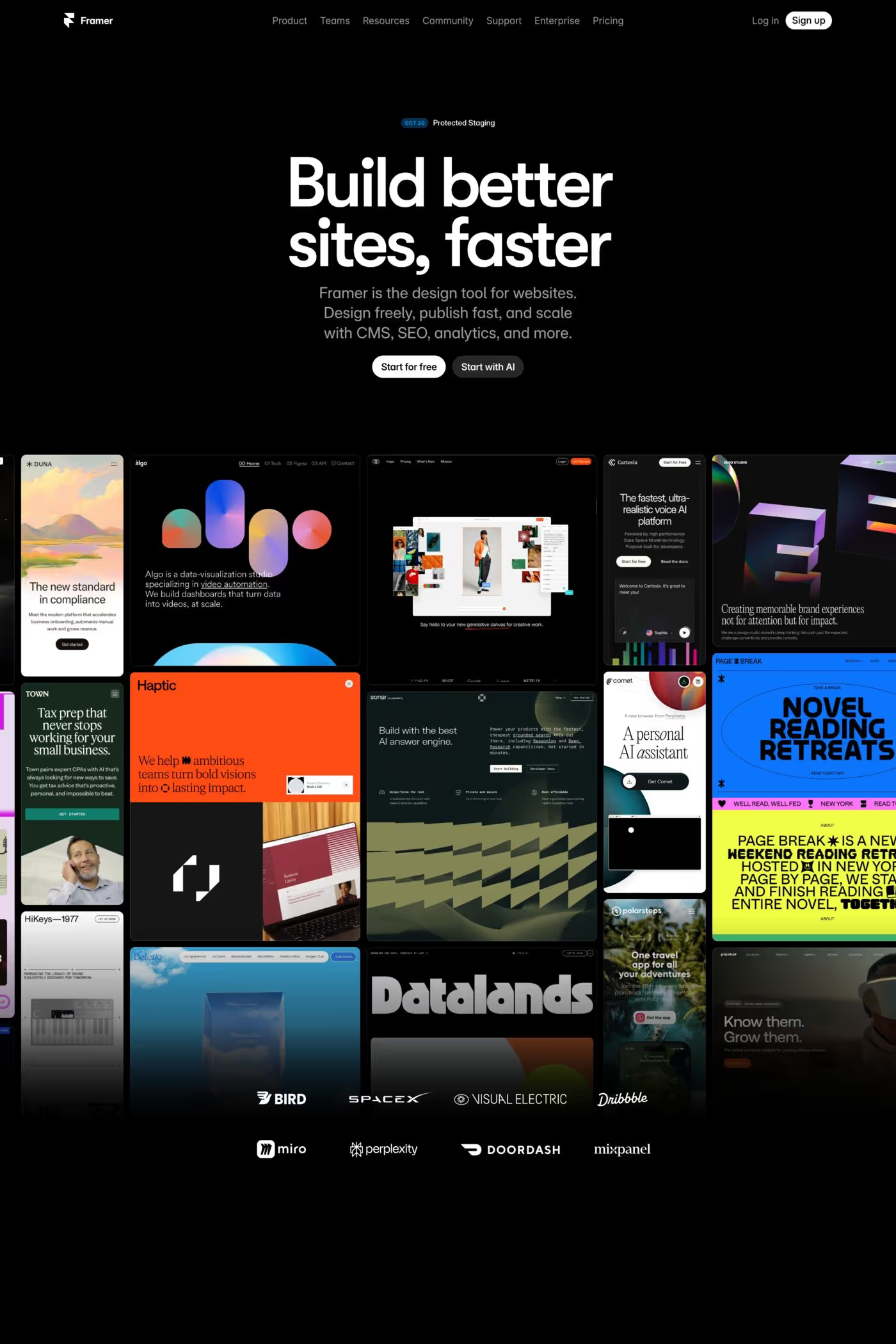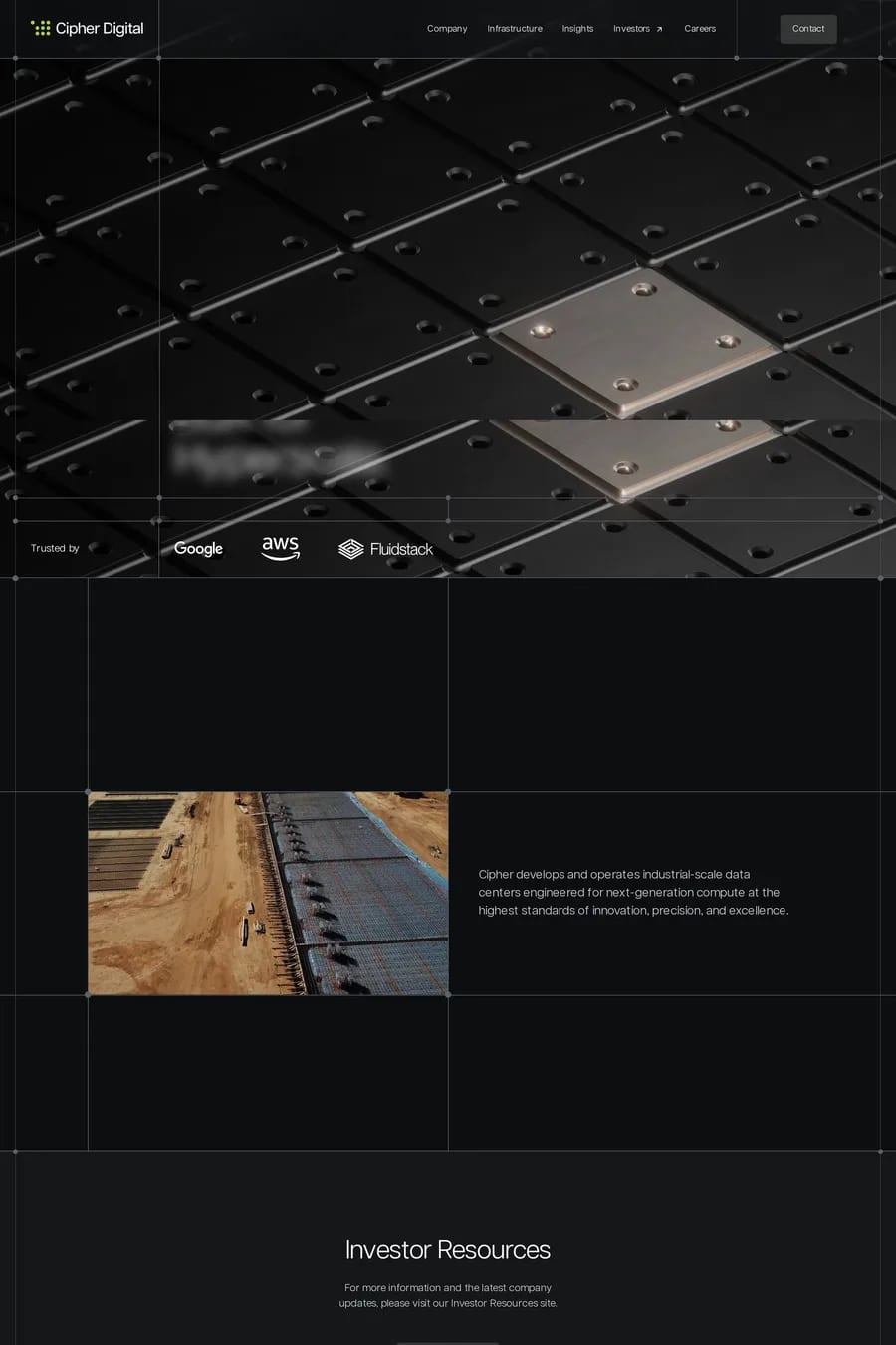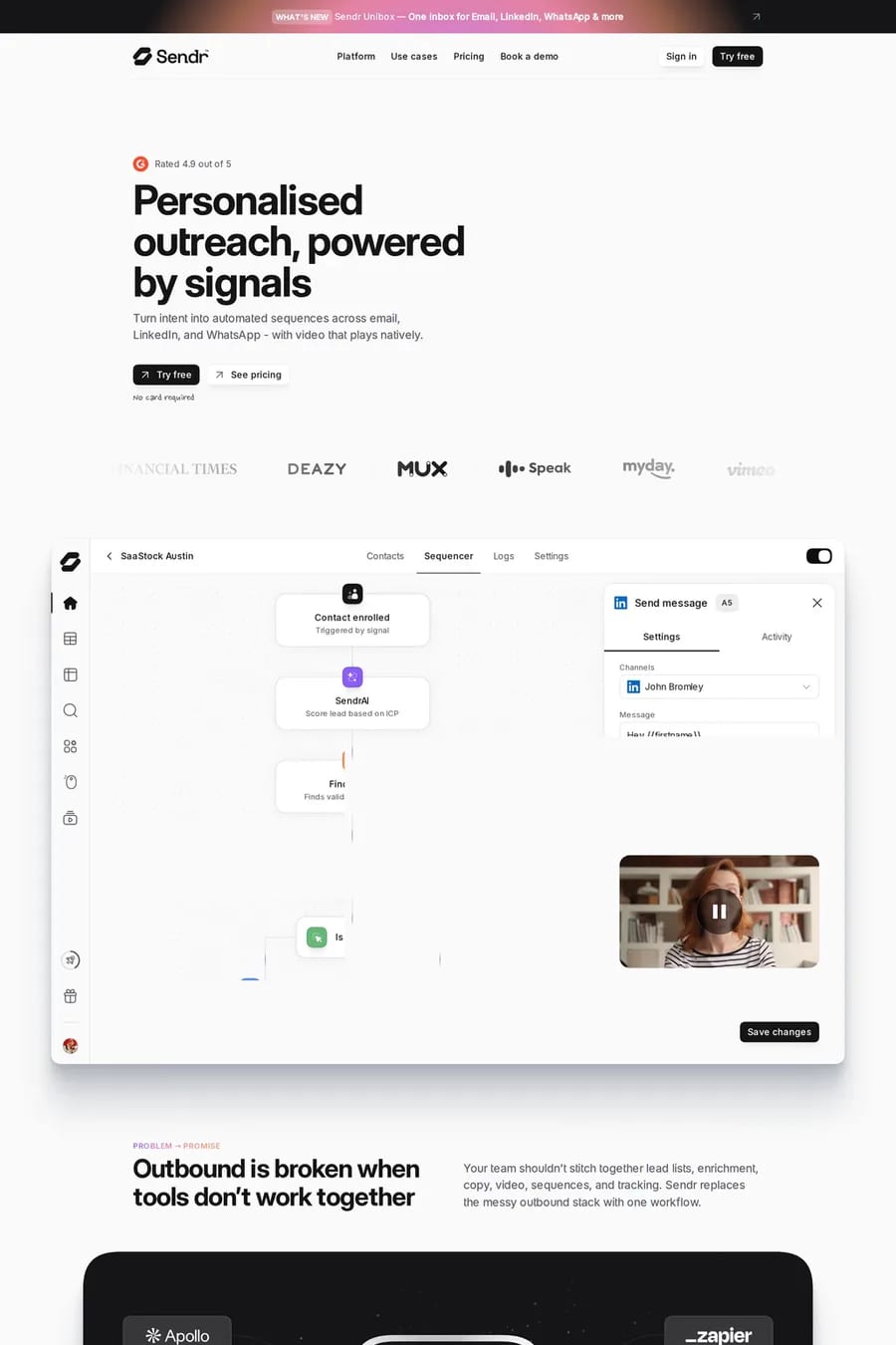
Black is one of the two biggest colour collections on A1, and it’s because black does two jobs at once. It reads as premium — fashion, luxury, automotive, studios — and it reads as technical, which is why most software and AI sites use it. The sites here range from portfolios like Soren and Daniel Sun, where black is a gallery wall for the work, to products like Legora and Zamp, where it’s the default dark-mode UI carried onto the marketing site. What separates the good ones is what they do with the black. Most aren’t pure #000. They sit a few steps up, in a dark grey with a hint of warmth or cool, so the page has depth and the type doesn’t glow. The accent colour does the heavy lifting: one colour, used for buttons and links and nothing else. Photography is either dark itself or given a border, so it doesn’t float. And type runs a weight heavier than it would on white, because thin type on black vibrates. Black is also the easiest colour to get wrong through laziness — a black background with white text and no other decisions isn’t a design. Look at dark landing pages, dark software and black and white design sites for narrower cuts, or the dark style collection, which overlaps heavily with this one.