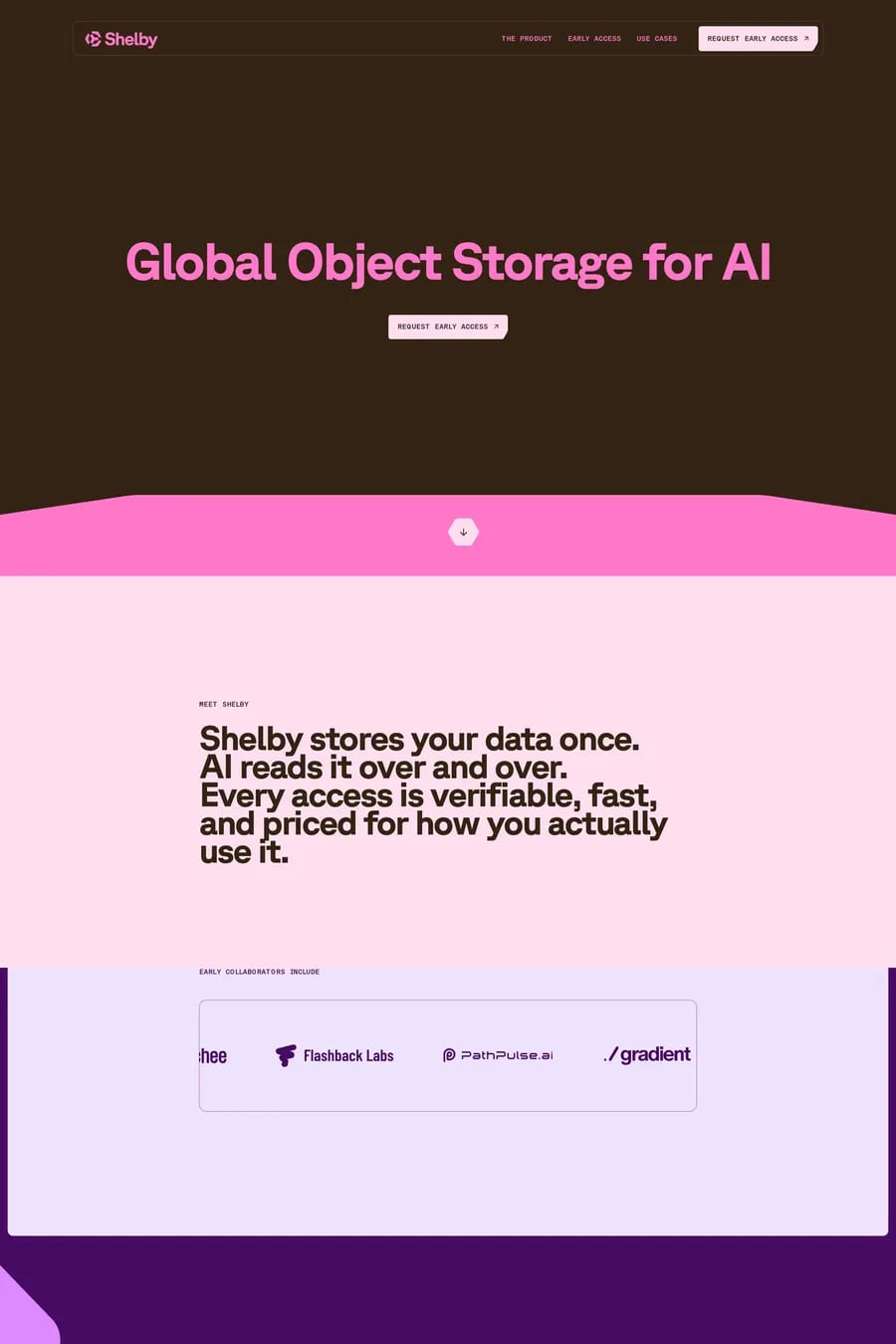
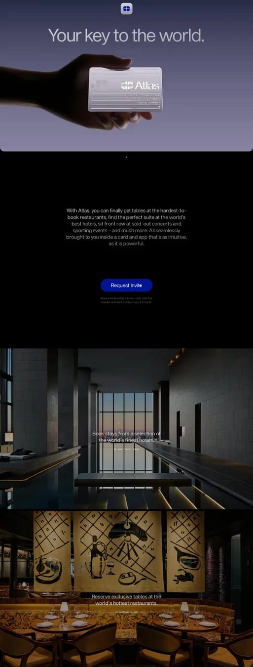
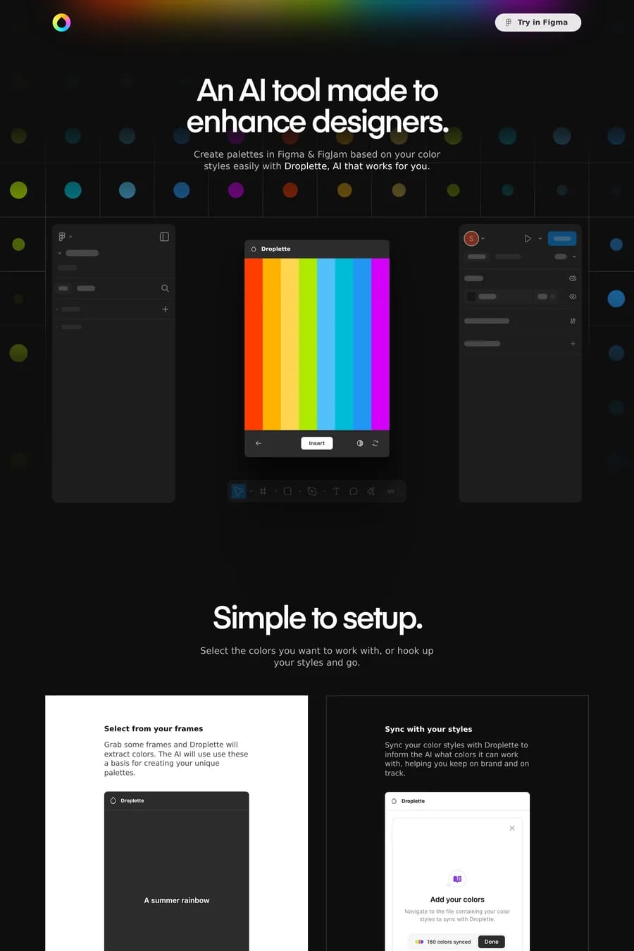
Waitlist pages are promises. The best ones in this collection make the promise specific enough to be exciting; the weakest ones make it vague enough that no one believes it. There’s a structural reason waitlist pages are hard: you’re asking someone to give you their email in exchange for *the right to be told about something later*. The exchange only works if the something is described concretely enough that the visitor can imagine wanting it. Look at how the strongest examples open. They don’t lead with "we’re building something exciting" or "join the waitlist for our launch." They lead with the *specific problem they’re going to solve* and then make a *specific promise about how* they’re going to solve it. The visitor leaves the page knowing what the product is, who it’s for, and approximately when it’s arriving. That specificity is the entire game. Watch how the strongest waitlist pages handle proof. The product doesn’t exist yet, so they can’t show product screenshots or testimonials — they have to create credibility from other materials. Founder backgrounds, design fidelity, the quality of the page itself, the specificity of the description, sometimes a teaser video. The waitlist page *is* the proof. If it’s a thoughtful, well-built page, that signals the product will be too. If it’s a generic Mailchimp embed, that signals the opposite. Browse waitlist templates for examples that earn the email, or compare against landing pages which face similar conversion challenges with a real product to show.