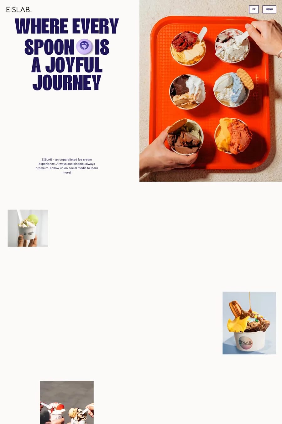
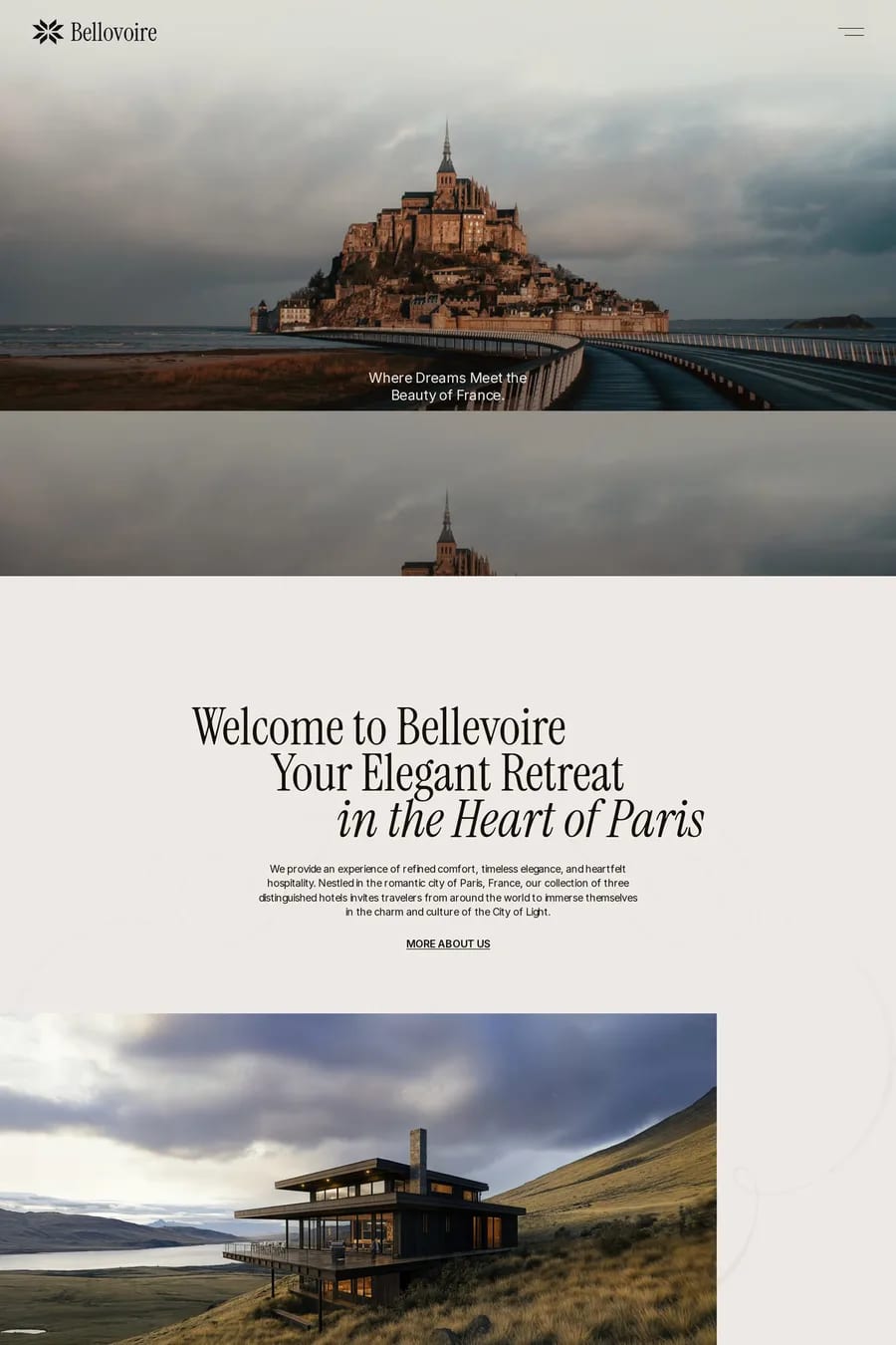
Photography-led sites give the images the whole stage. Full-bleed heroes, galleries with almost no chrome, type that stays out of the way. The design’s job is to frame the pictures and then disappear. The sites here that get it right — Airspace, Provider, Primer School — share a few habits. The photography is consistent. Same lighting, same grade, same distance from the subject, so a grid of twelve images reads as one body of work instead of twelve stock downloads. The layout is simple, usually a two or three column grid with generous gaps, or a single column at full width. And the type is restrained: one family, two sizes, neutral colour. Anything more competes. The other thing to look at is loading. These are heavy pages by nature, and the good ones don’t feel it. Responsive images with srcset, AVIF or WebP, a blurred placeholder while the full image arrives, and lazy loading for everything below the fold. Browse photography portfolios, photography landing pages, photography shops or photography agency sites, or look at the video collection for sites that use motion instead of stills.