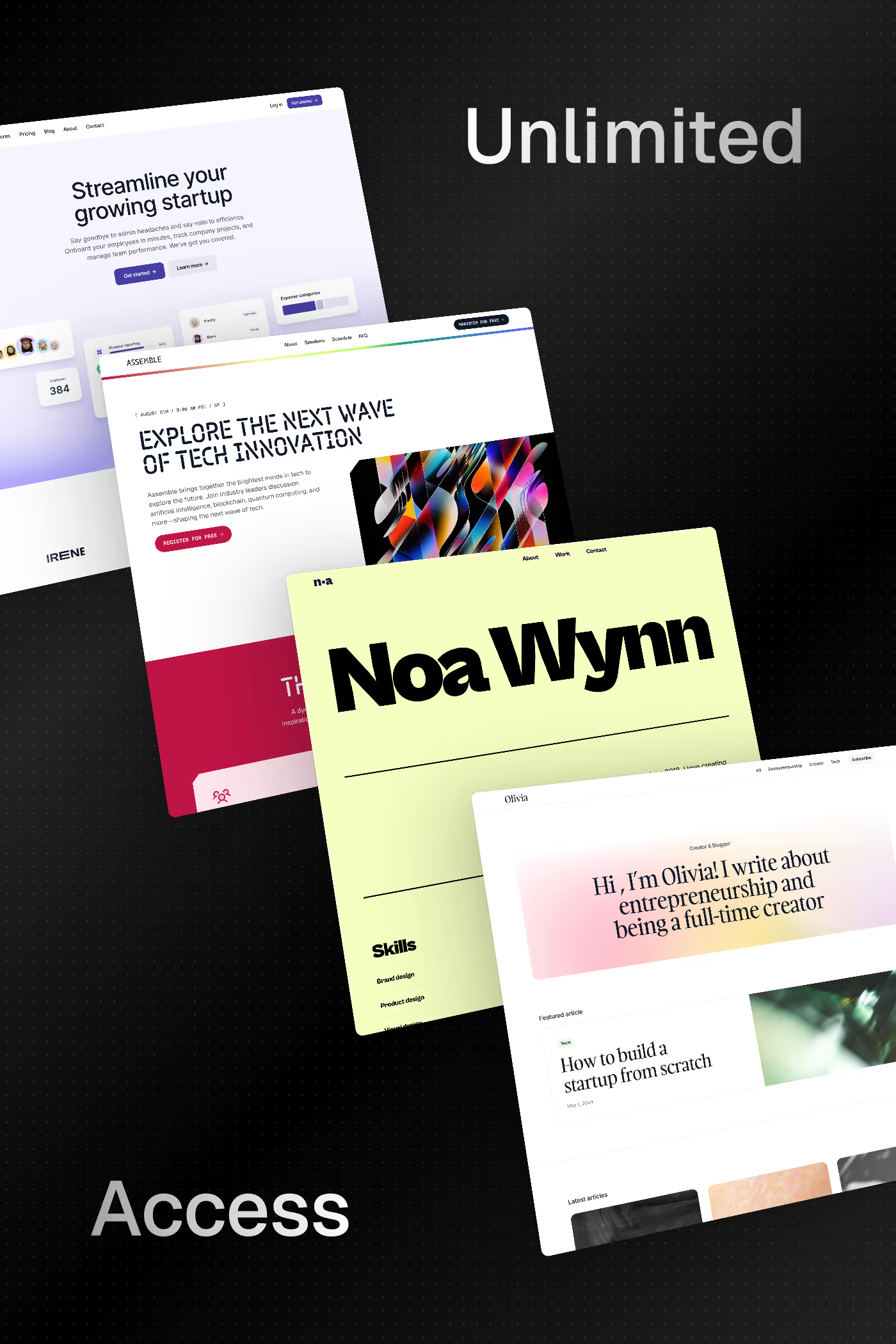
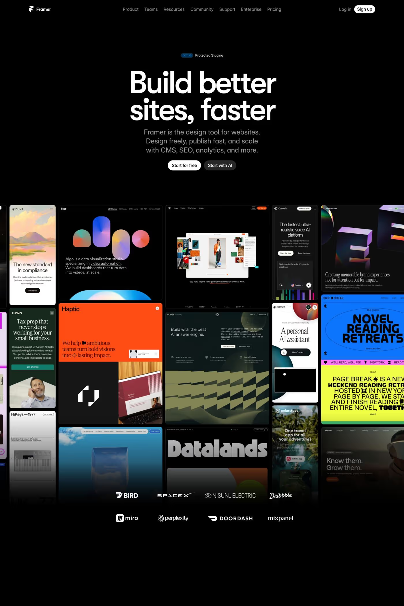
Grid-based web design makes the underlying structural grid a visible and defining feature of the layout. These sites celebrate order and modularity, using explicit grid lines, uniform cells, and systematic spacing to create highly organised, often gallery-like presentations.
Curated inspiration sent every Tuesday
Unsubscribe at any time
While most websites use an invisible grid for alignment, grid-style design makes the grid itself visible — through borders, alternating backgrounds, or consistent gutters. The mathematical structure becomes the aesthetic, creating visual rhythm and predictable spatial relationships.
Portfolios, image galleries, product catalogues, and directory-style content all thrive in grids. The format excels when users need to scan and compare multiple items of similar type, providing equal visual weight and a clear browsing pattern.