
The best blue and white websites
Updated





Get the best blue and white websites each week
Curated inspiration sent every Tuesday
Unsubscribe at any time
Blue and white website FAQs
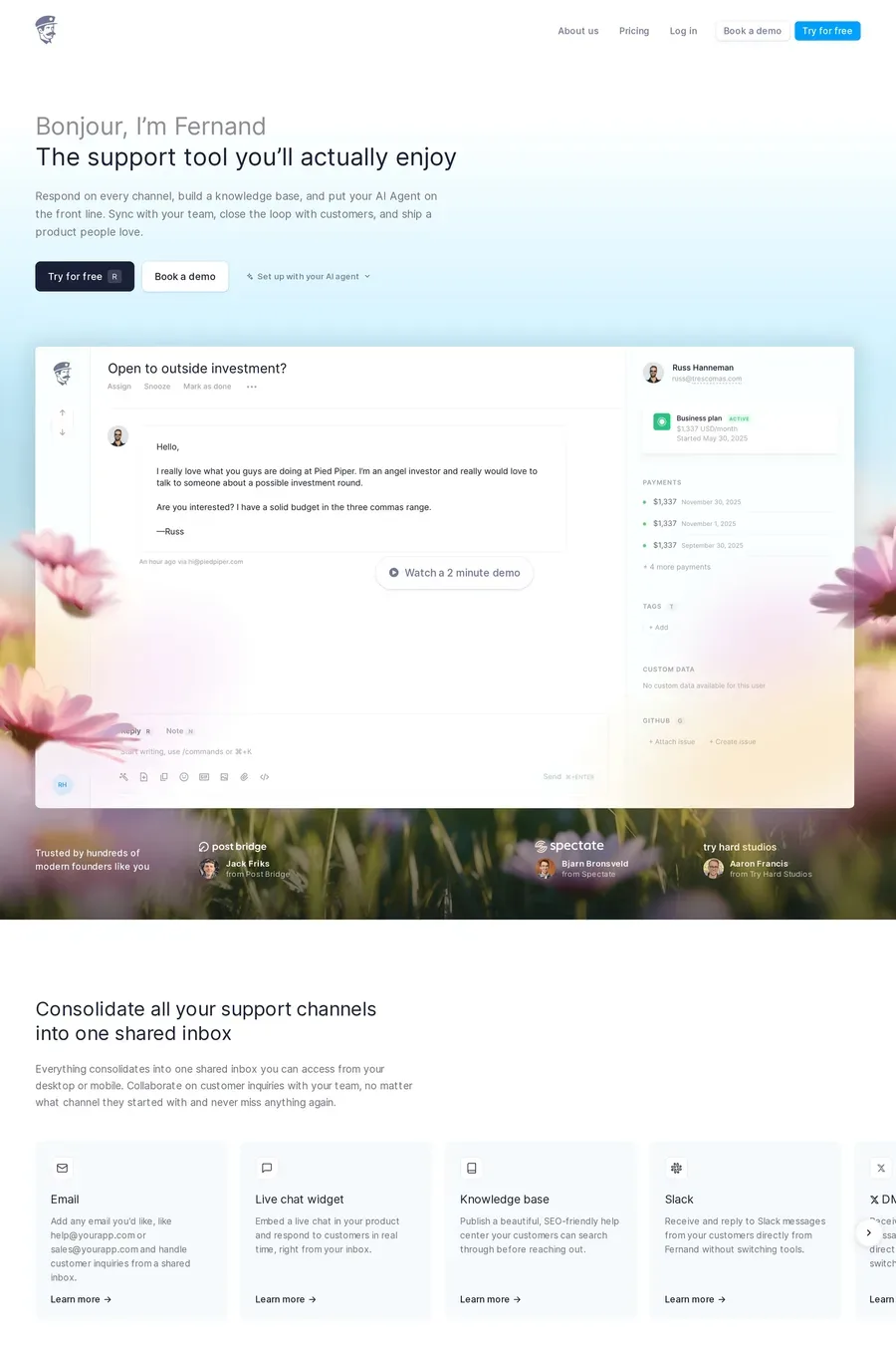
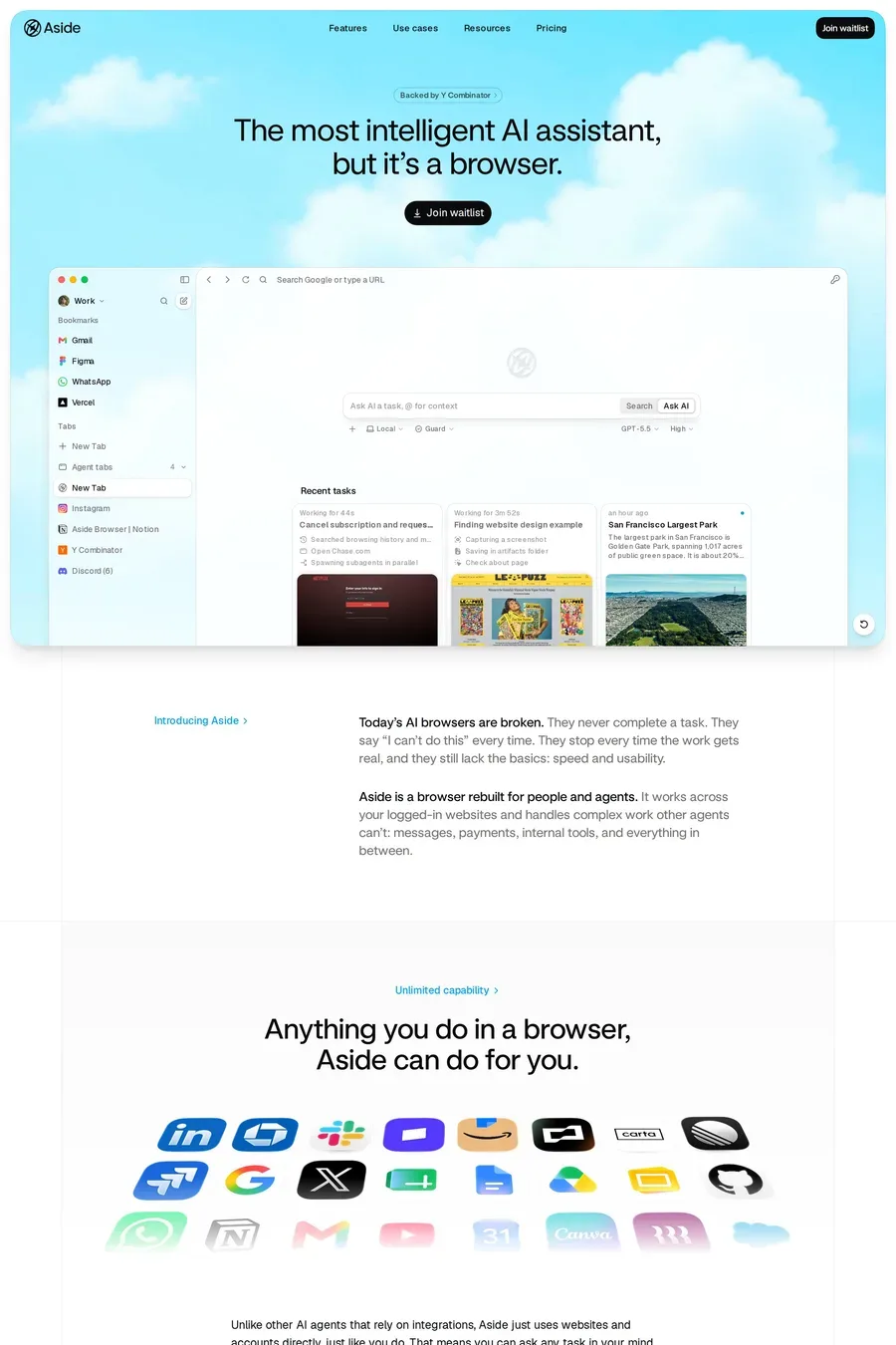
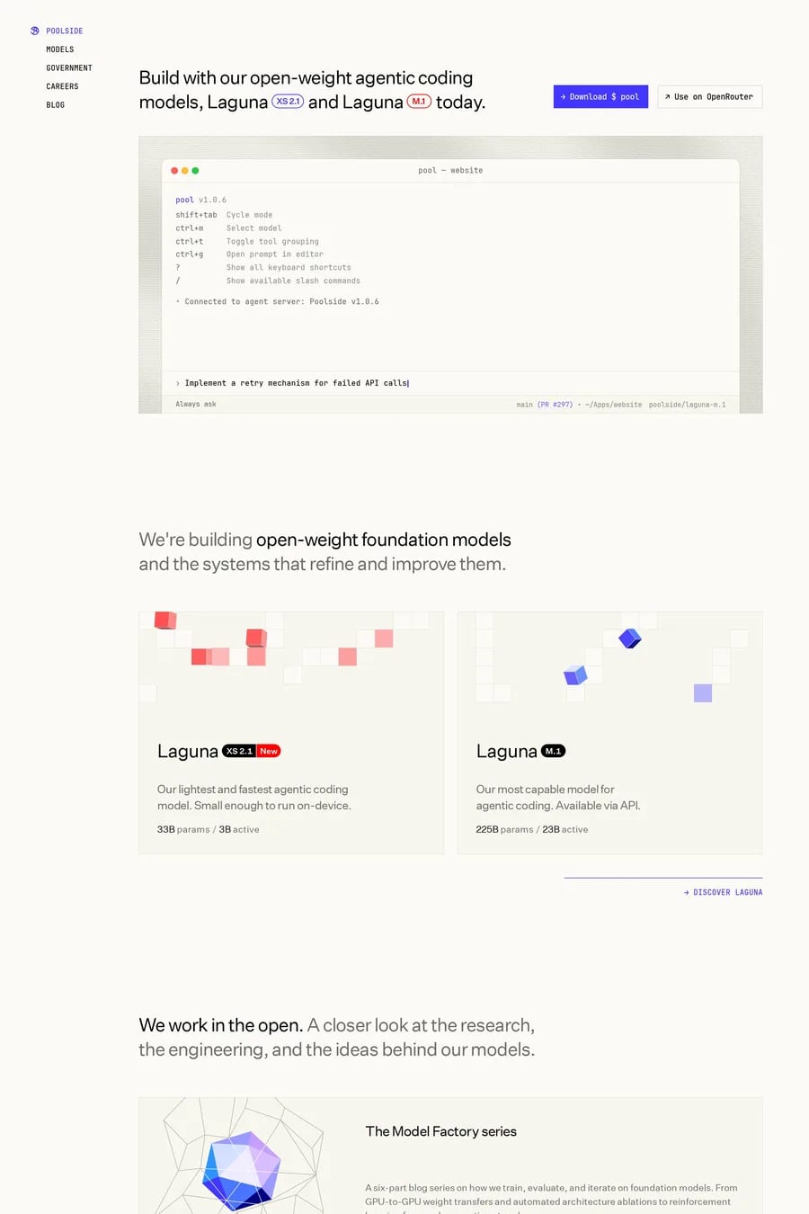
Blue reads as safe and reliable, and white keeps the page clean. For a product that asks for your card details or your data, that matters. It’s also the easy choice, so the palette alone won’t make a site stand out.
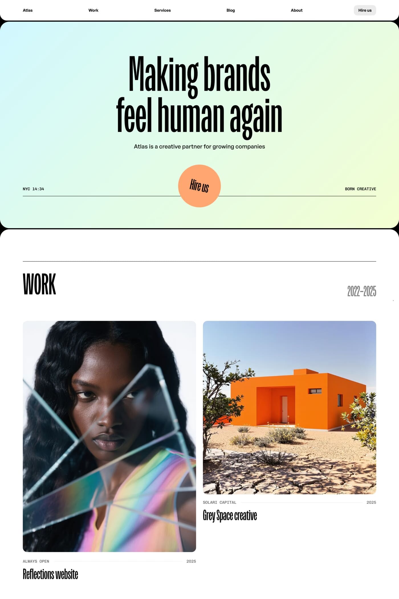
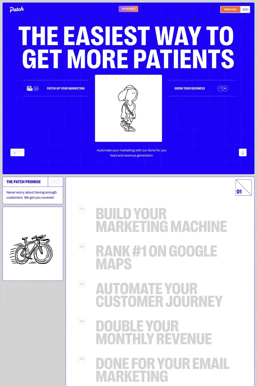
Pick an unusual blue and use it big — a full-width hero, a coloured footer, blue type at display size. Add one warm accent, like orange or yellow, for buttons. Use real photography or illustration so the page isn’t only interface.
Mid to dark blues for text and buttons — navy, cobalt and royal blue all keep strong contrast. Light and sky blues work as section backgrounds or large shapes, but they’re too pale for body text on white.