
51 of the best sign-up pages

Sign-up pages FAQs
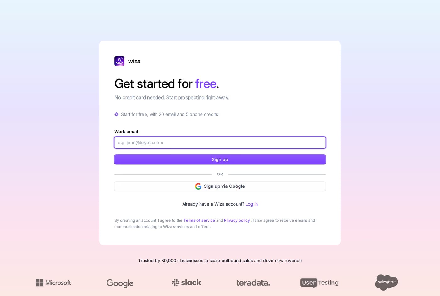
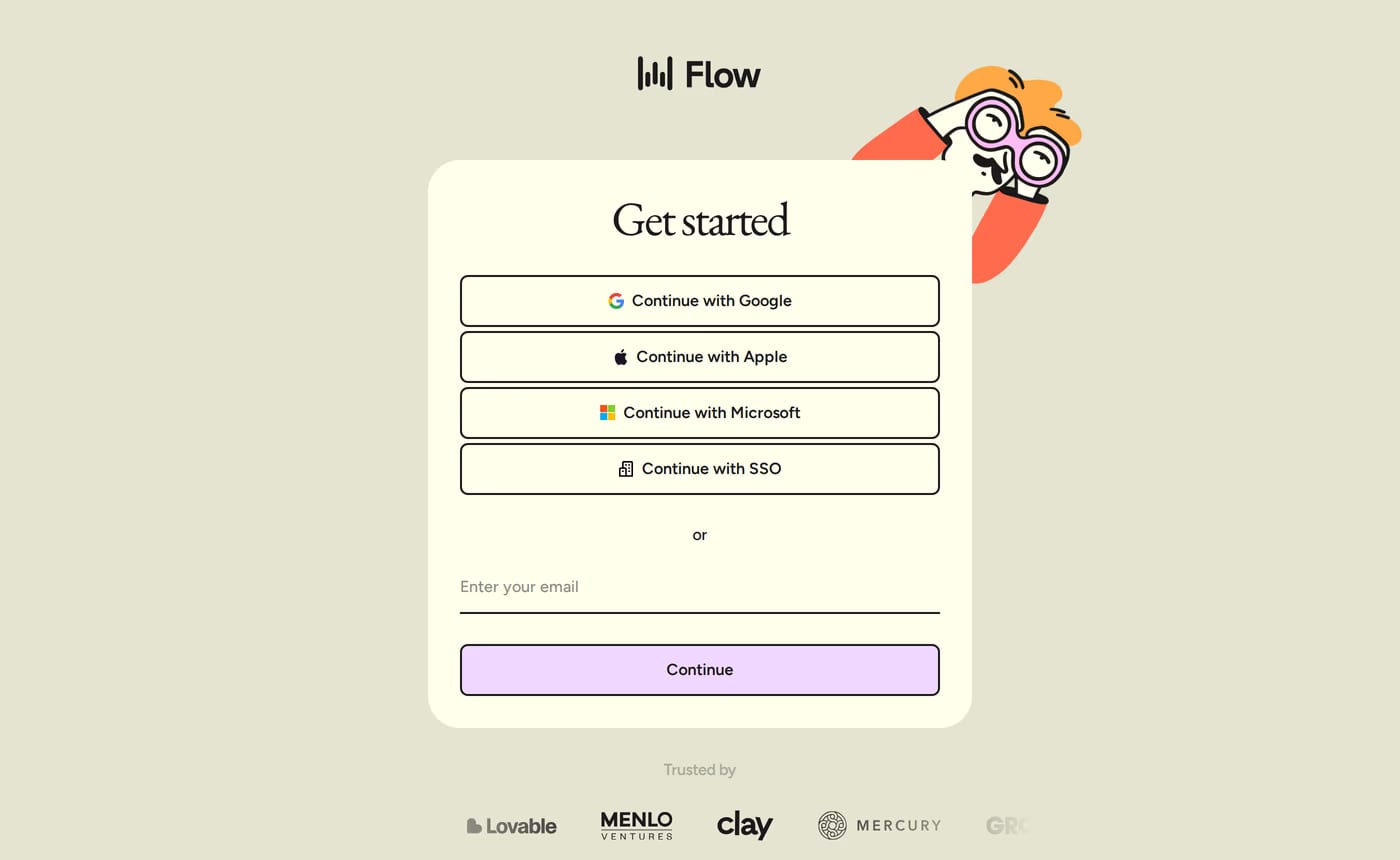
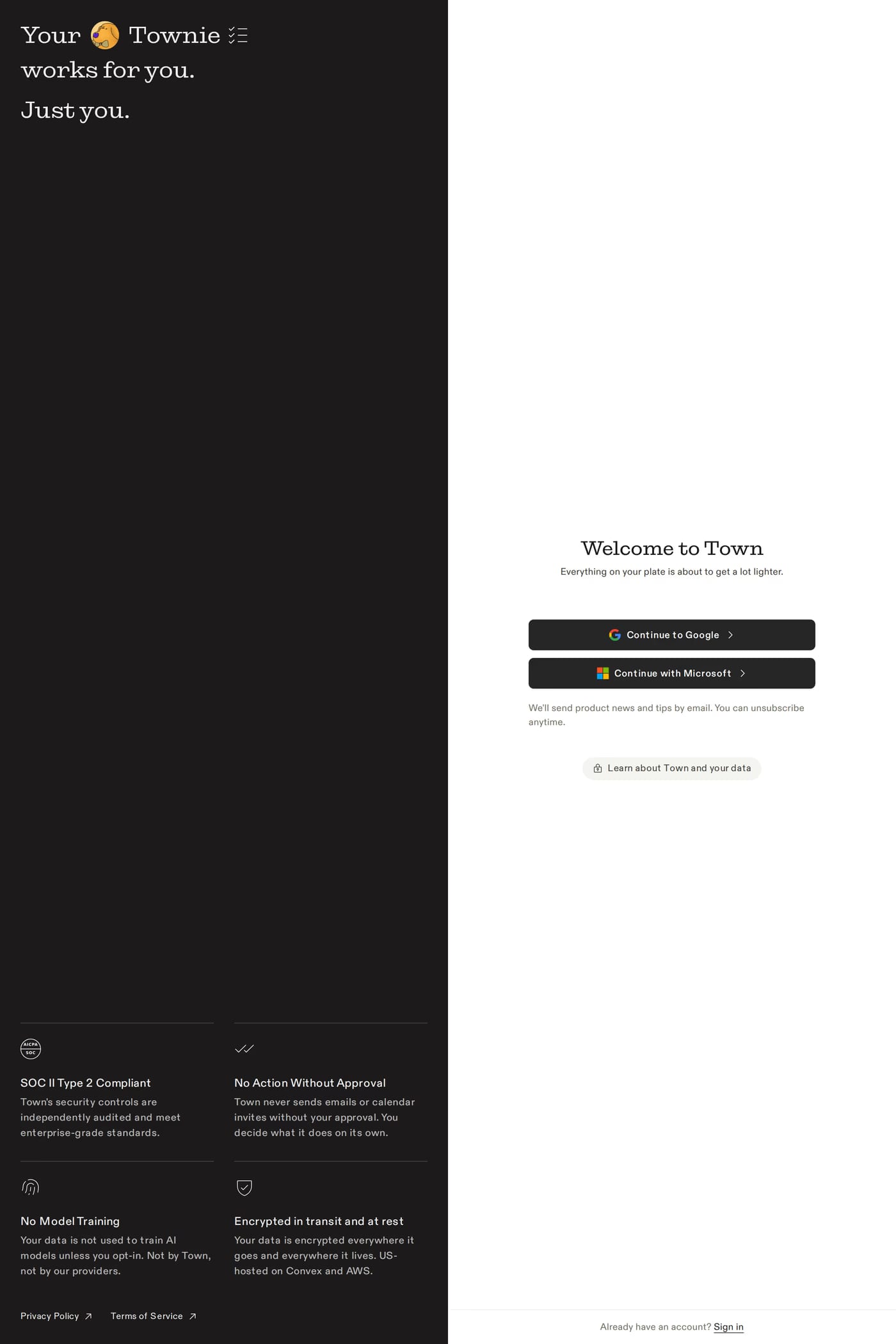
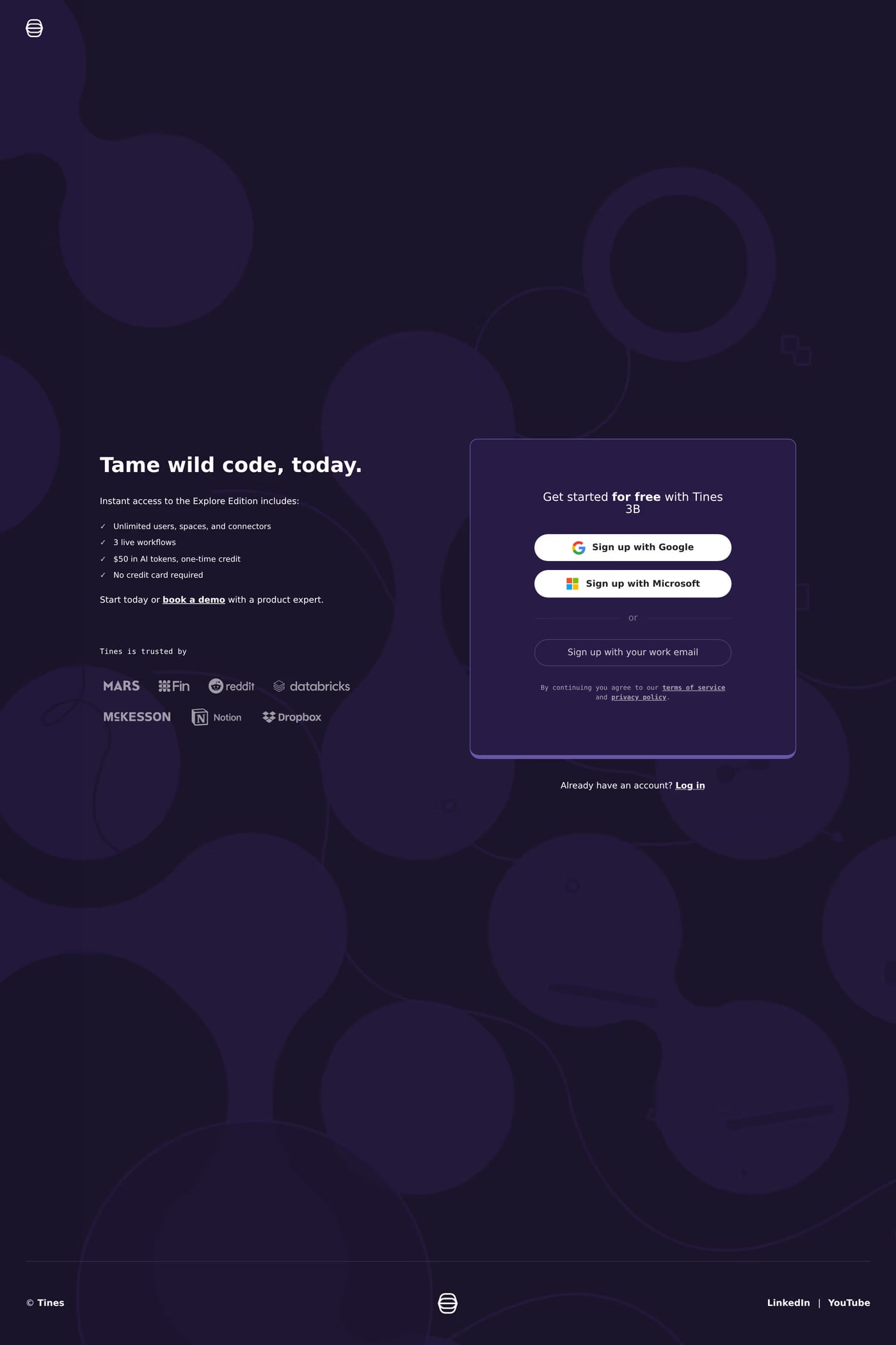
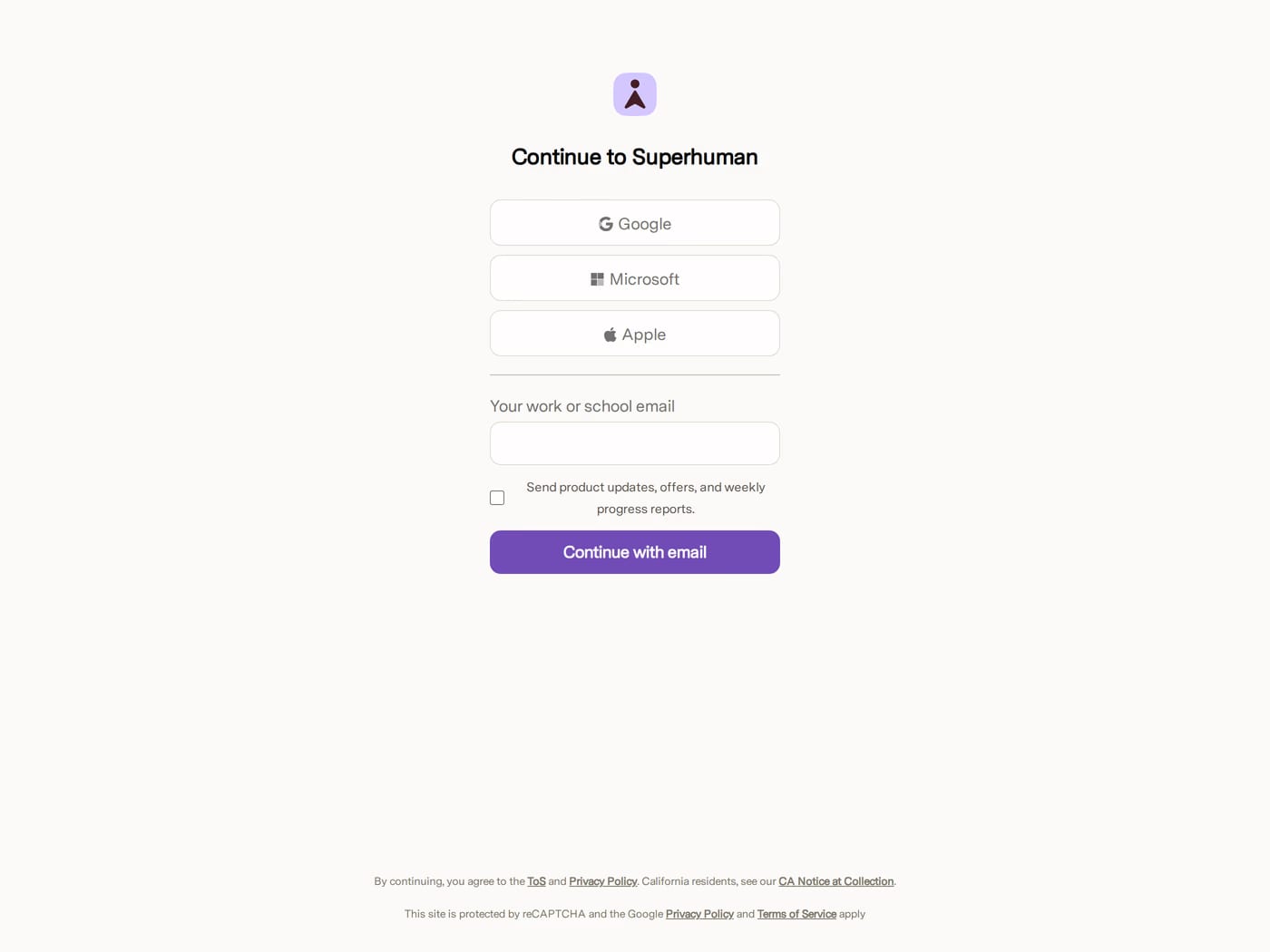
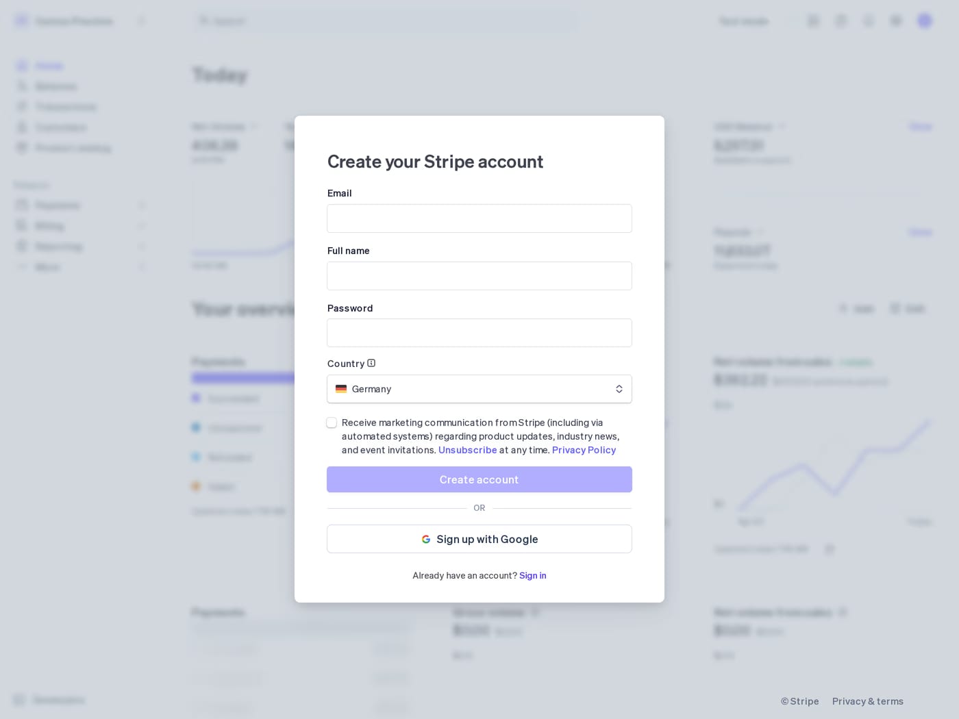
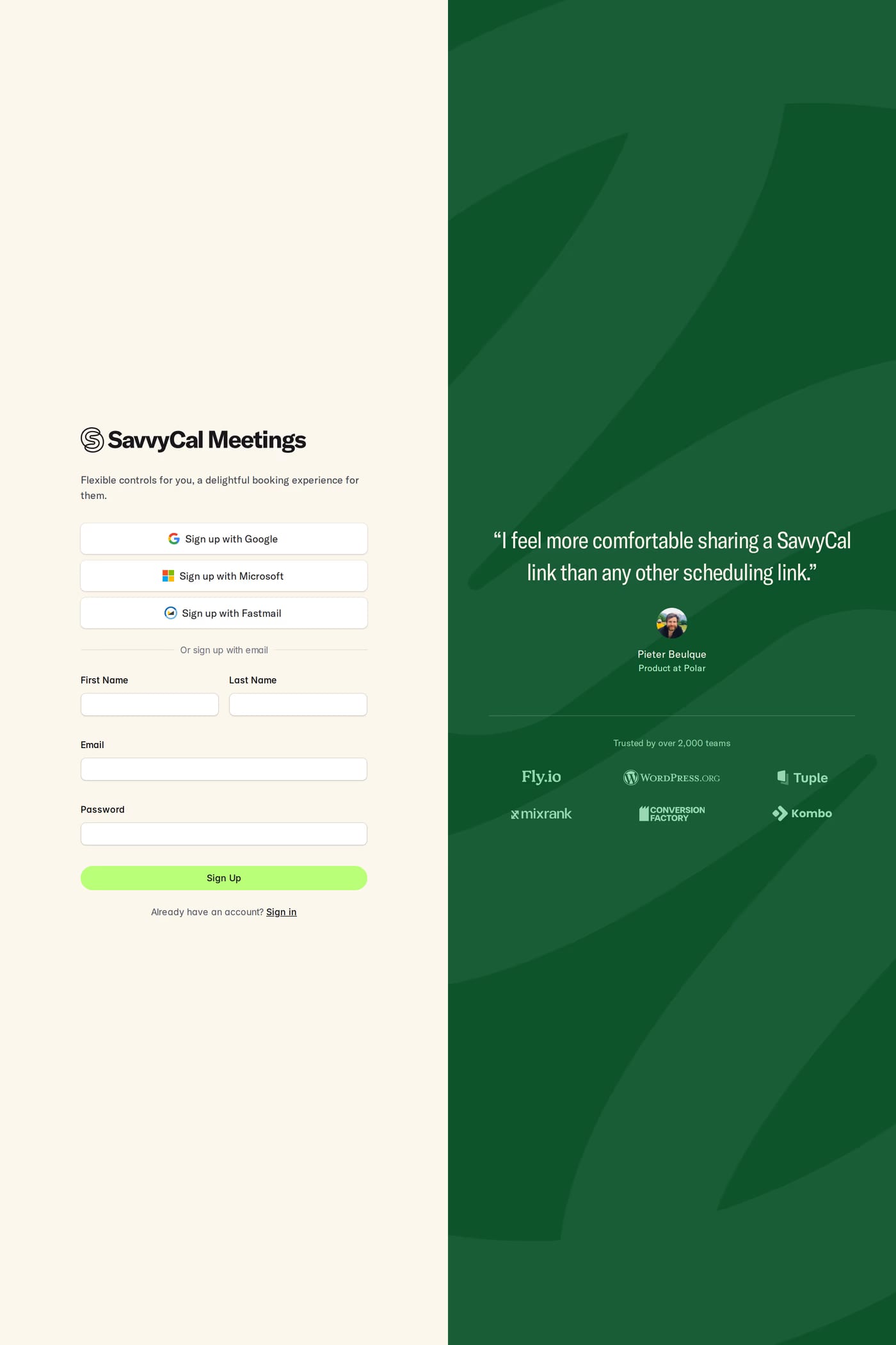
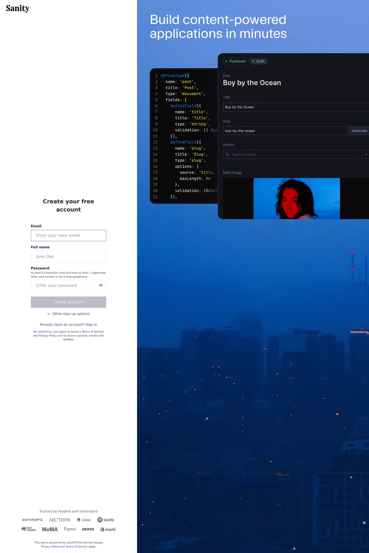
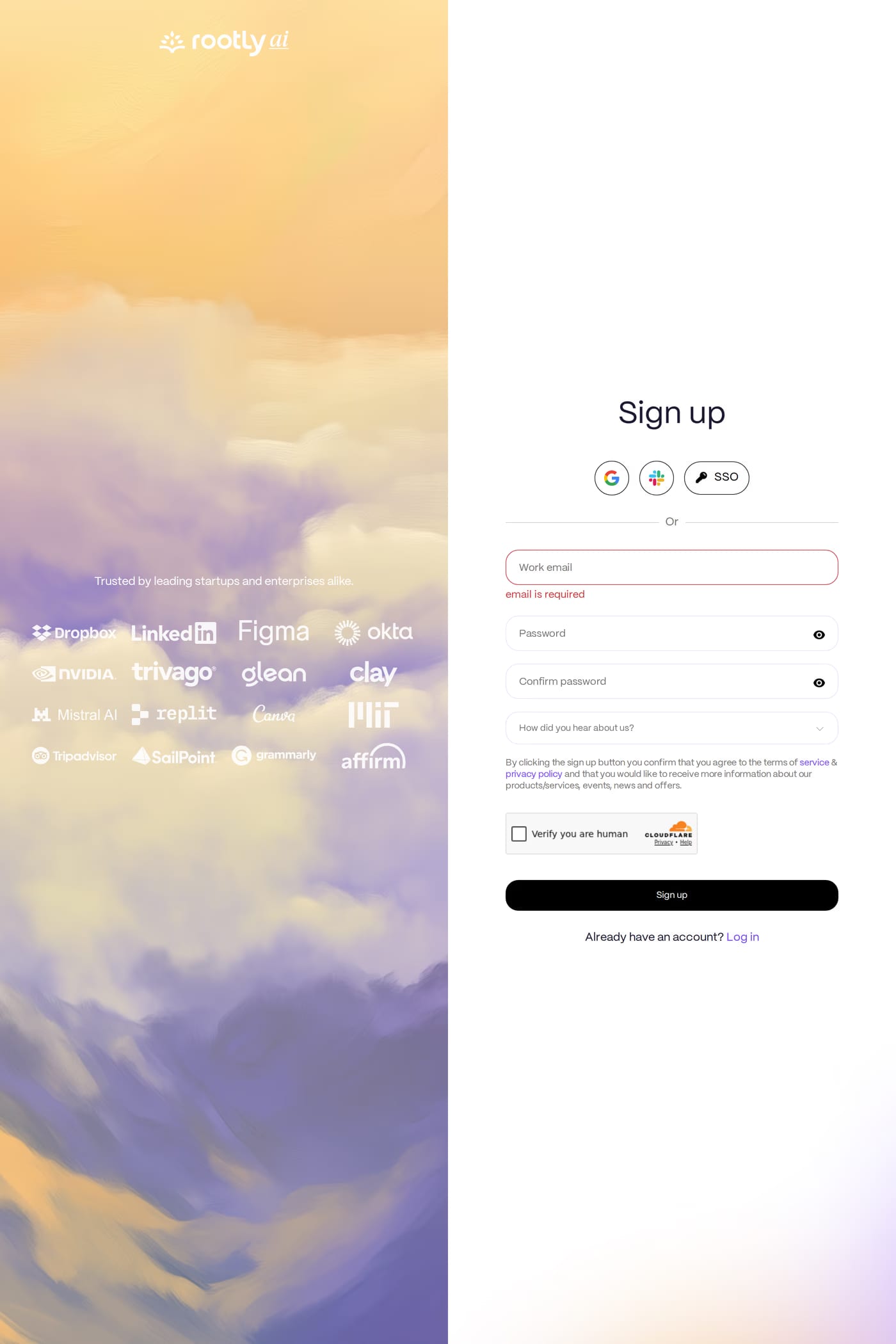
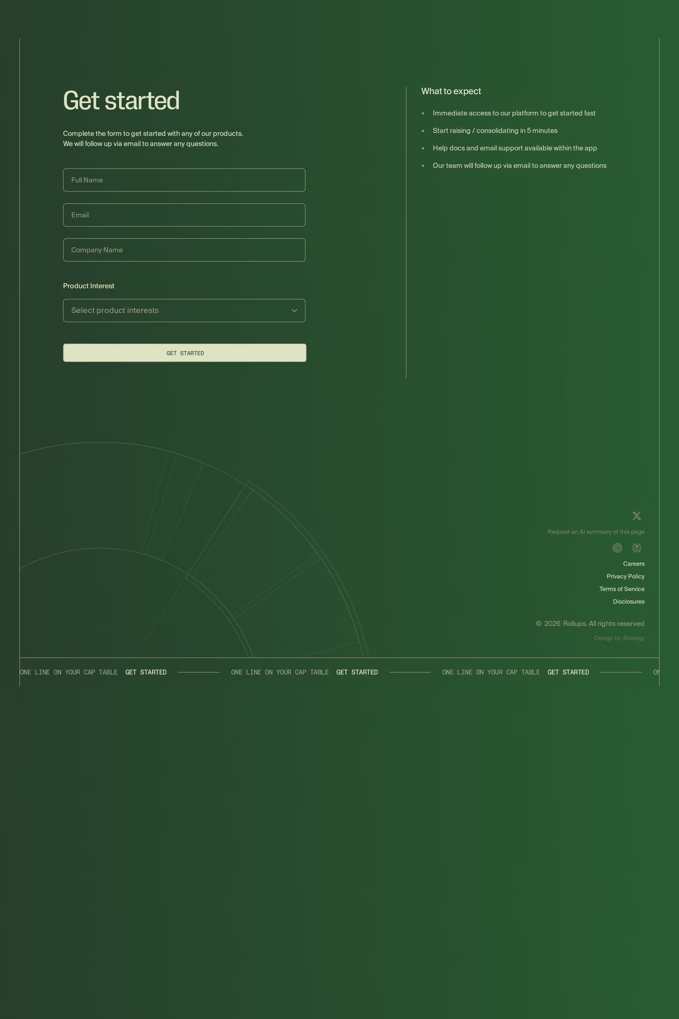
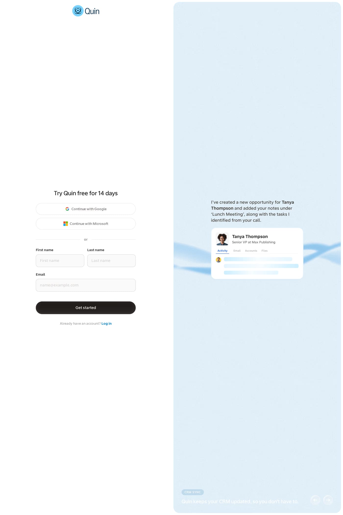
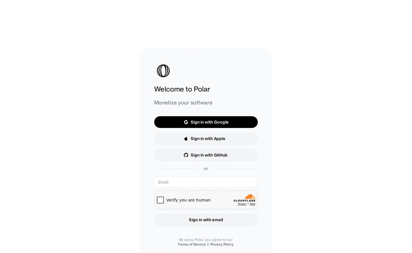
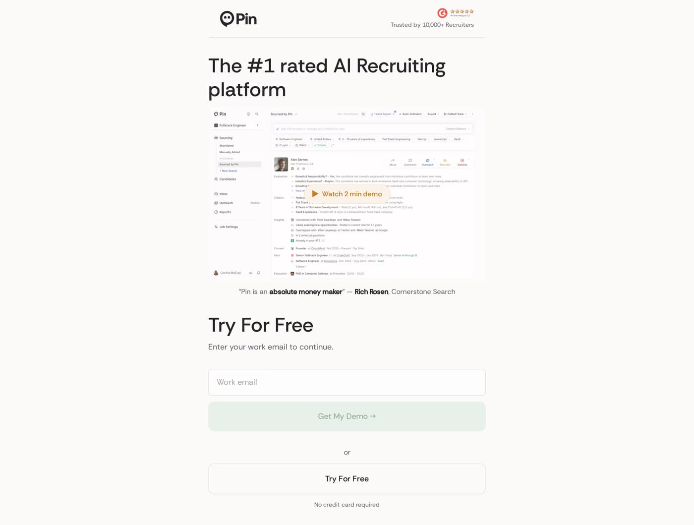
Asking for the minimum and showing the payoff. The strongest examples drop every field that isn’t essential, offer a one-click social option, and keep a reminder of the value right beside the form so the reason to finish never leaves the screen.
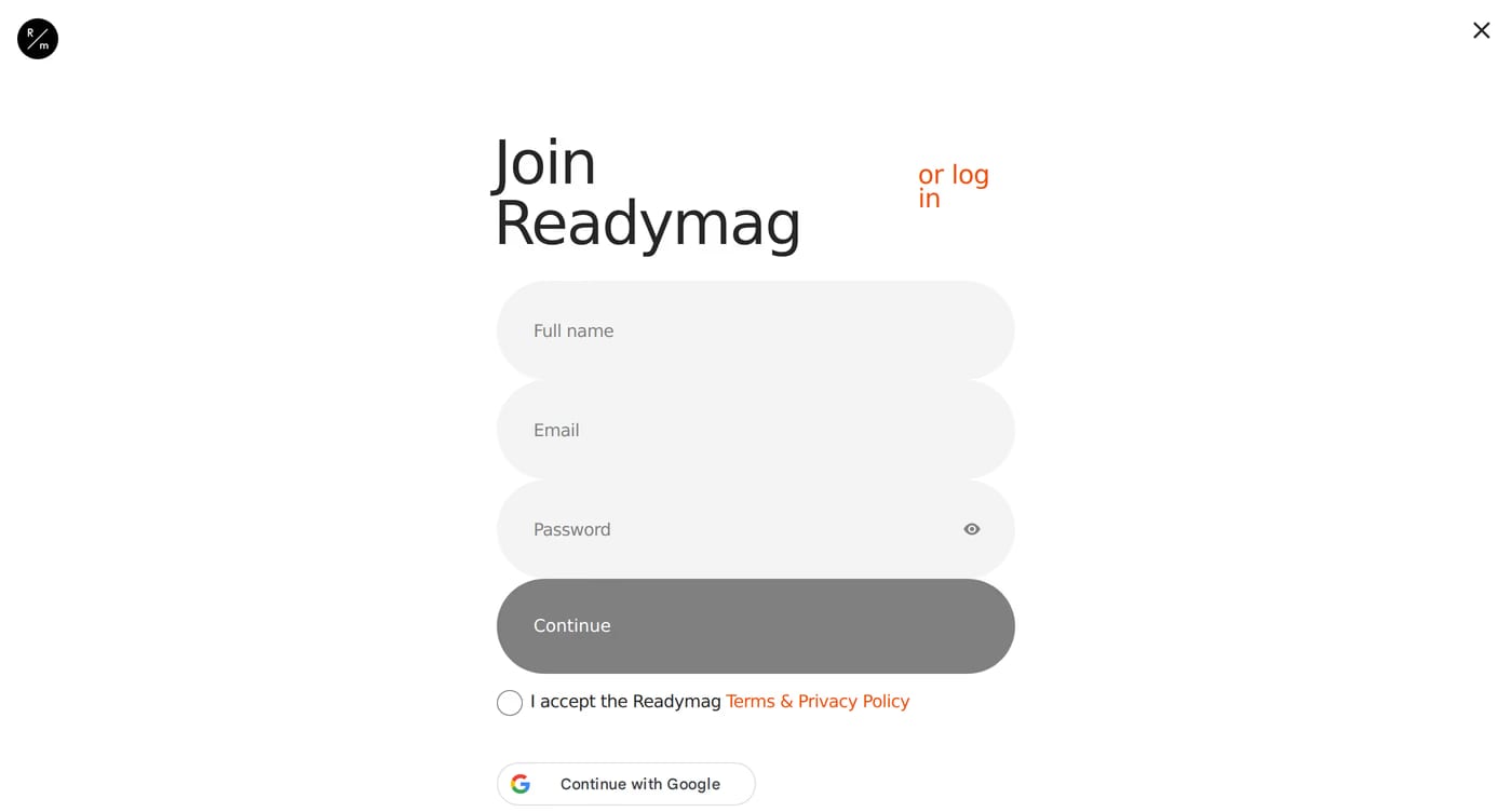
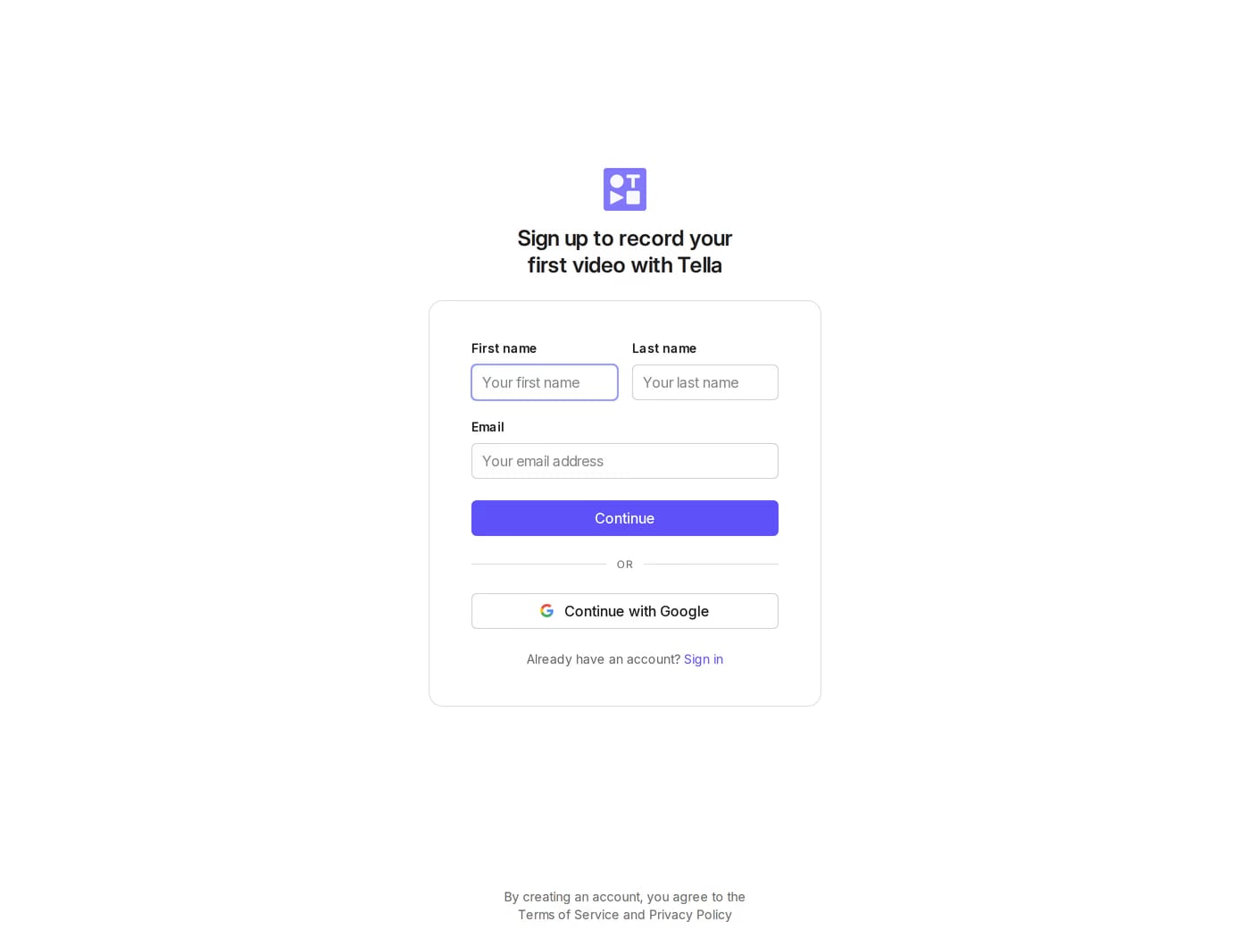
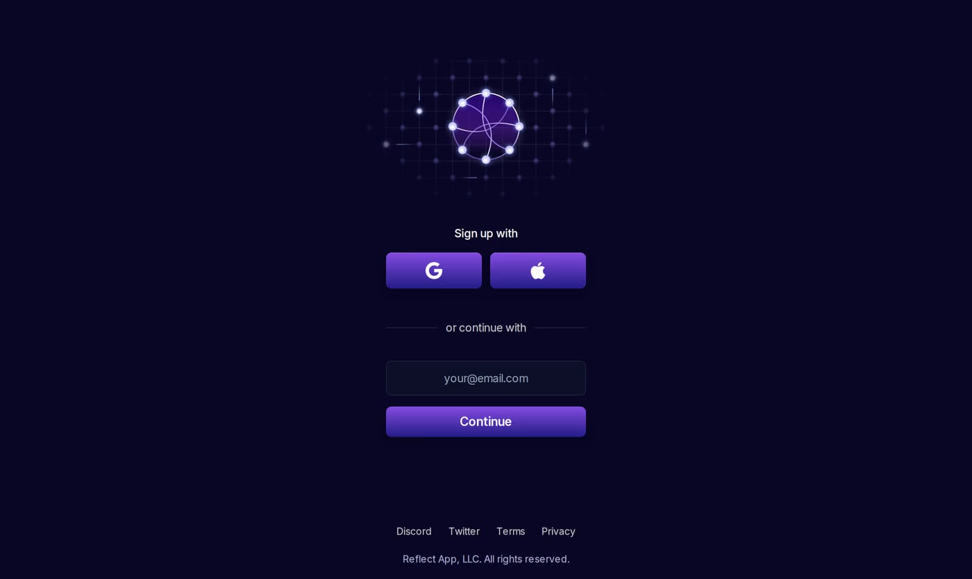
As little as gets someone in the door — often just an email, or a single social button. Name, company, and use case are better asked once they’re already inside and invested, not at the gate.
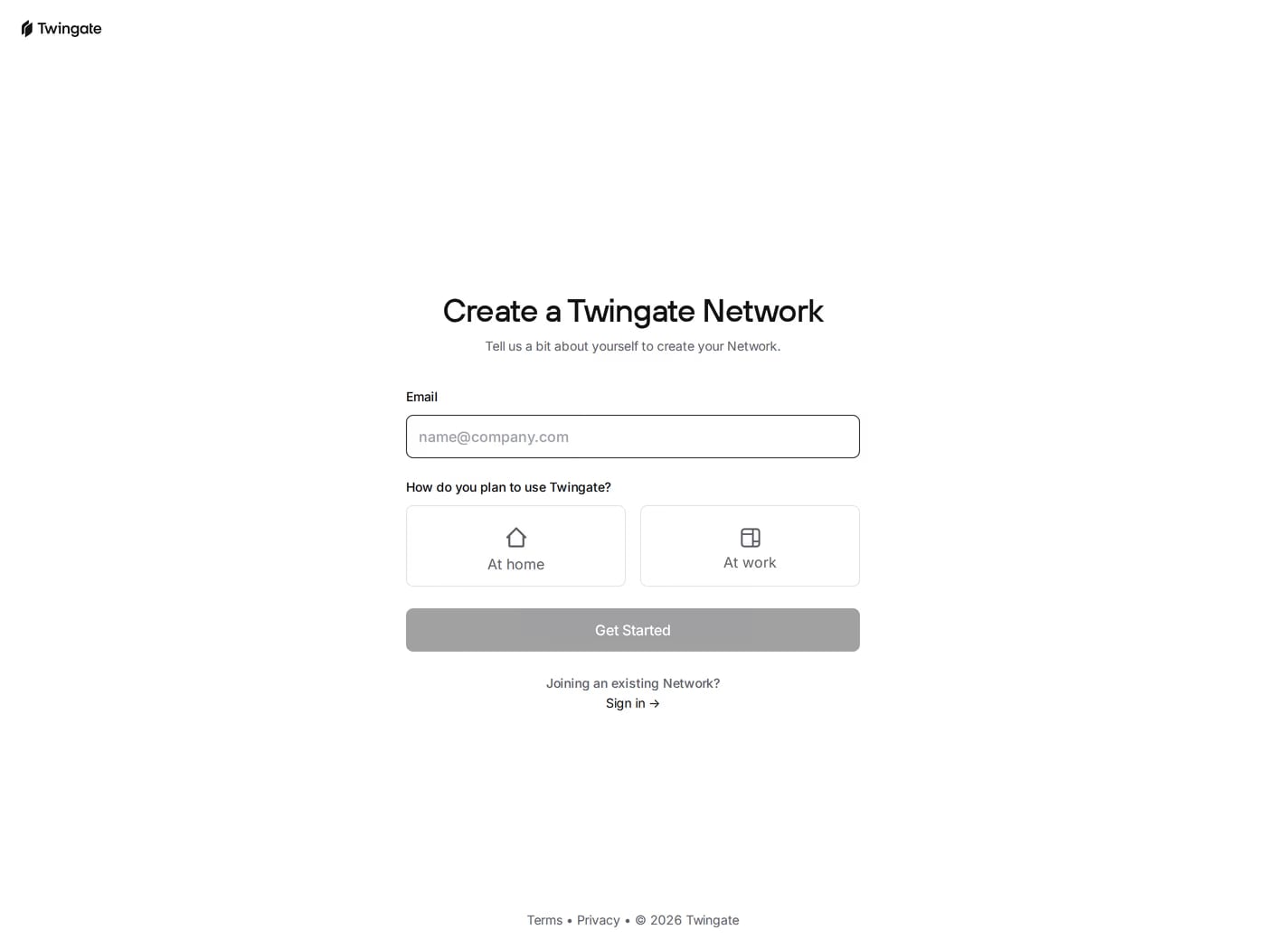
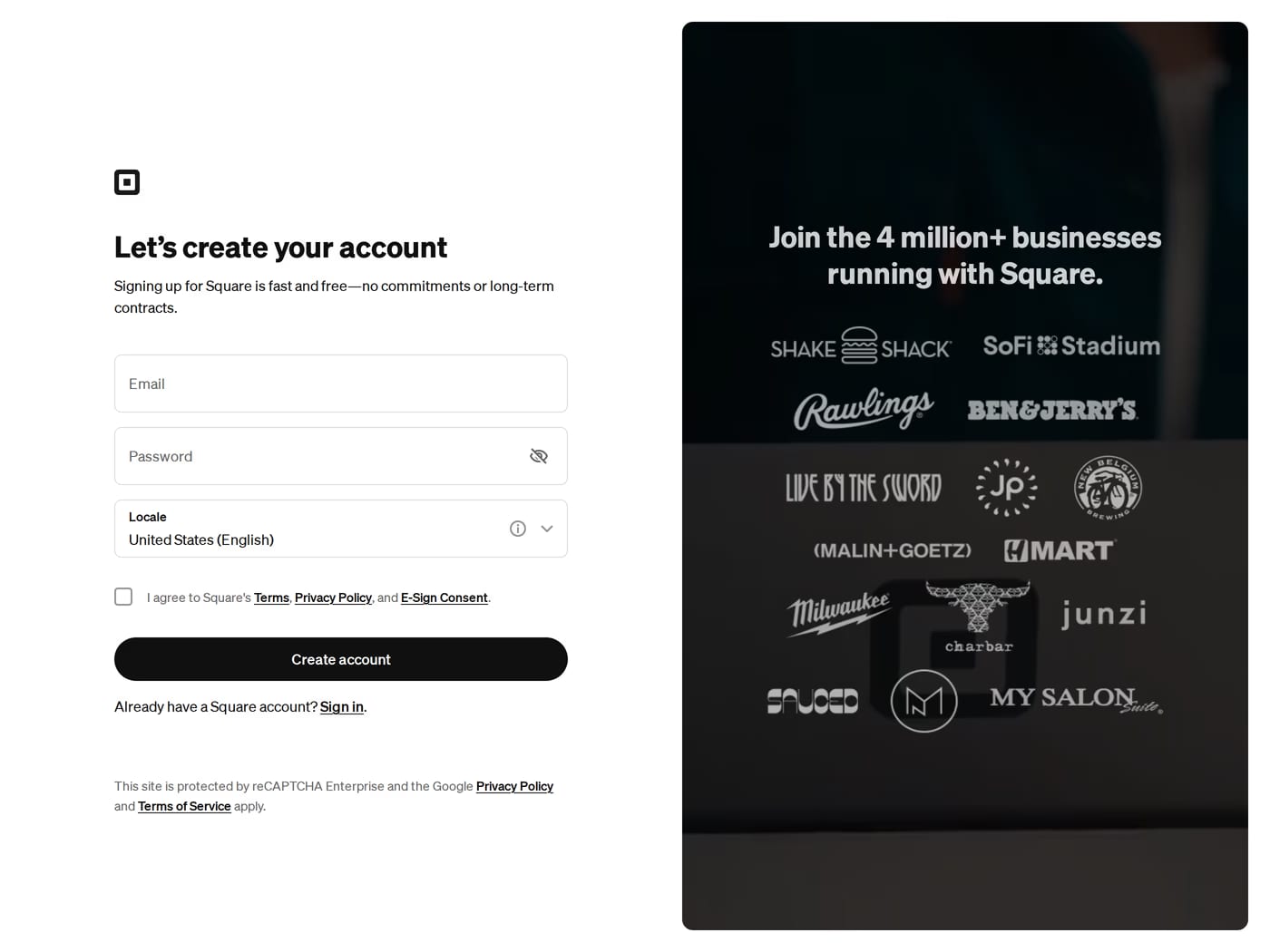
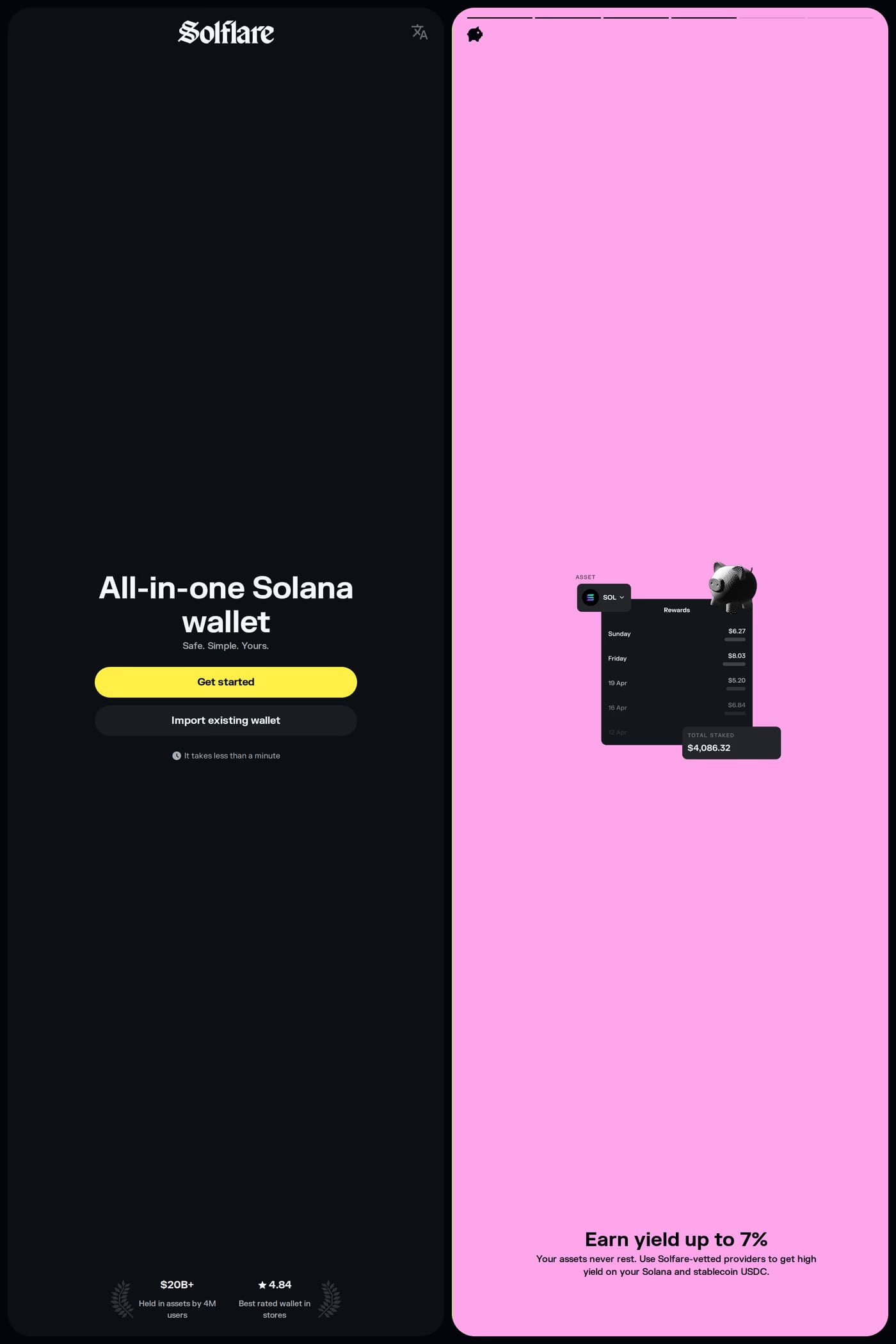
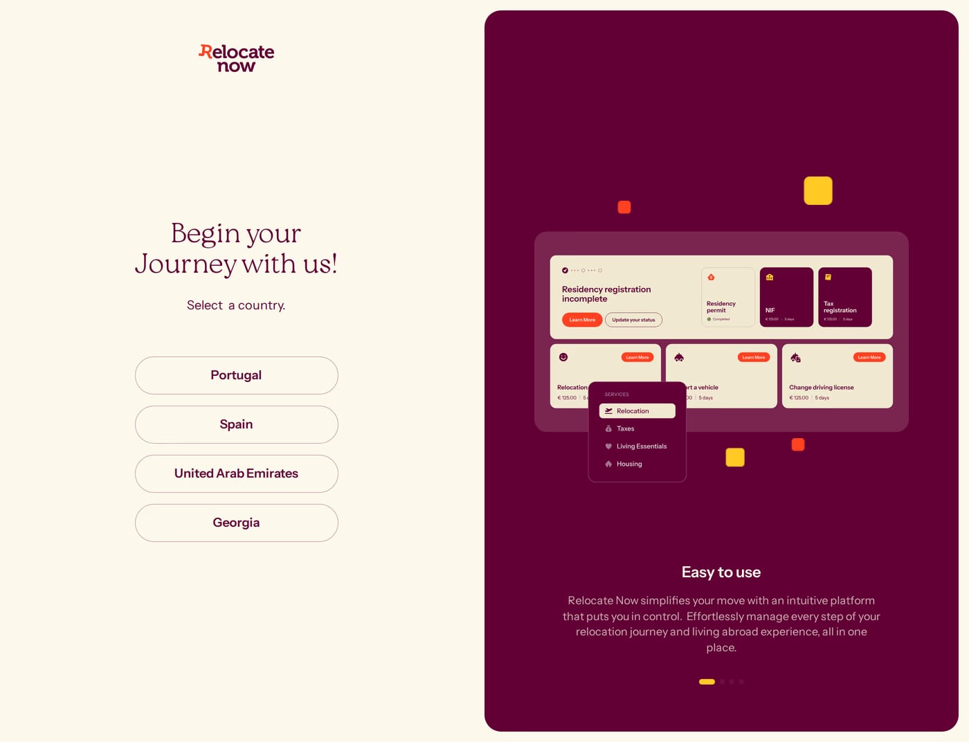
Split-screen is popular for a reason: the form sits on one side while the other carries a testimonial, product shot, or value prop. A clean centred form works too, as long as the branding and reassurance are still there.