The starting point of Self Modern were specimens of traditional serif Japanese typefaces, called "Mincho", found in magazines & books that I brought back from Japan in 2015. I added to these references my researches on automatic composition systems, the “Self Spacing Types” in particular. The typeface is also designed to work with Japanese characters at the same size and weight. The Book, Semi-Bold and Bold versions, drawn in collaboration with Roxane Gataud, were added in 2021.
1,400+ designers get inspired every Tuesday
Unsubscribe at any time


The starting point of Self Modern were specimens of traditional serif Japanese typefaces, called "Mincho", found in magazines & books that I brought back from Japan in 2015. I added to these references my researches on automatic composition systems, the “Self Spacing Types” in particular. The typeface is also designed to work with Japanese characters at the same size and weight. The Book, Semi-Bold and Bold versions, drawn in collaboration with Roxane Gataud, were added in 2021.
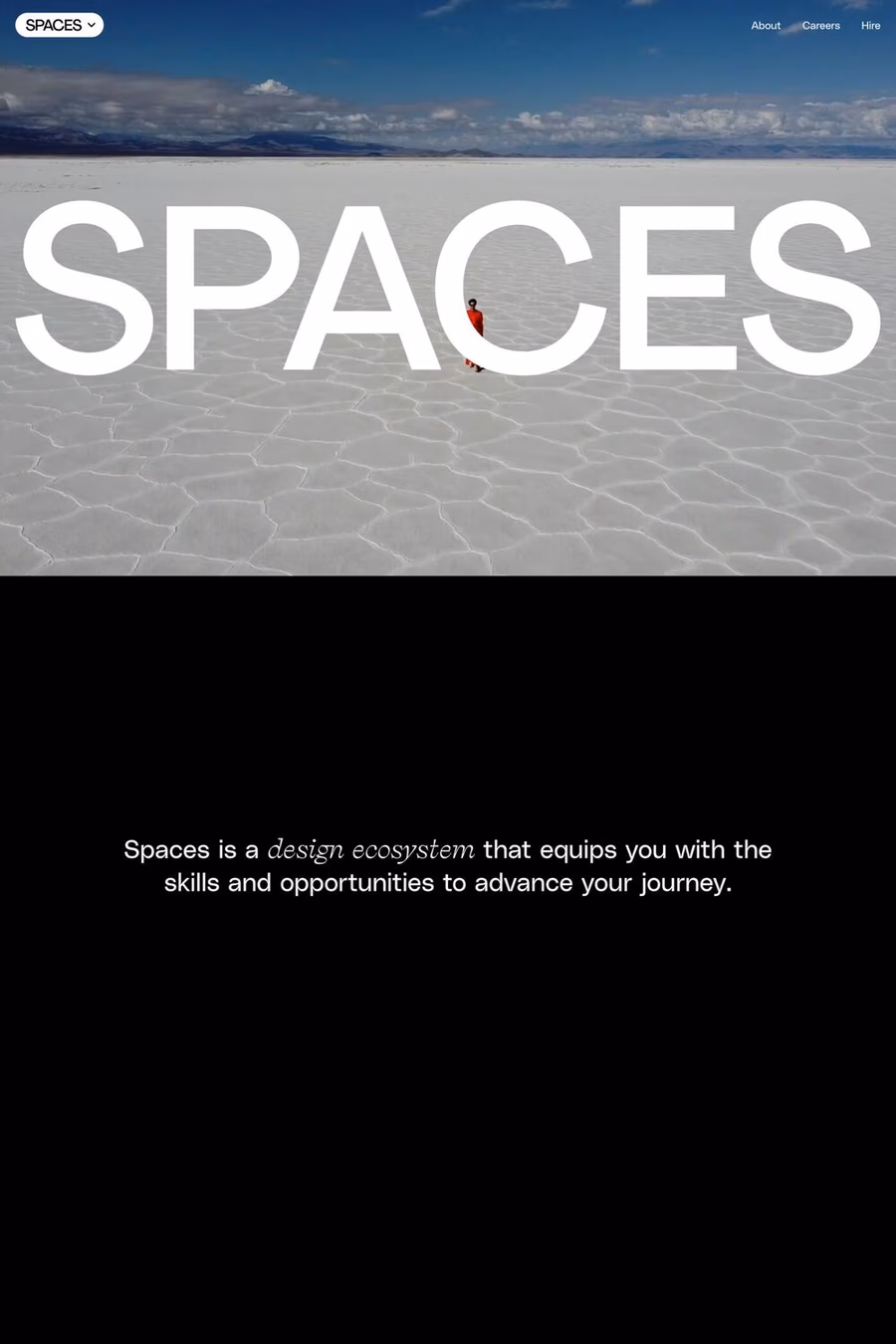
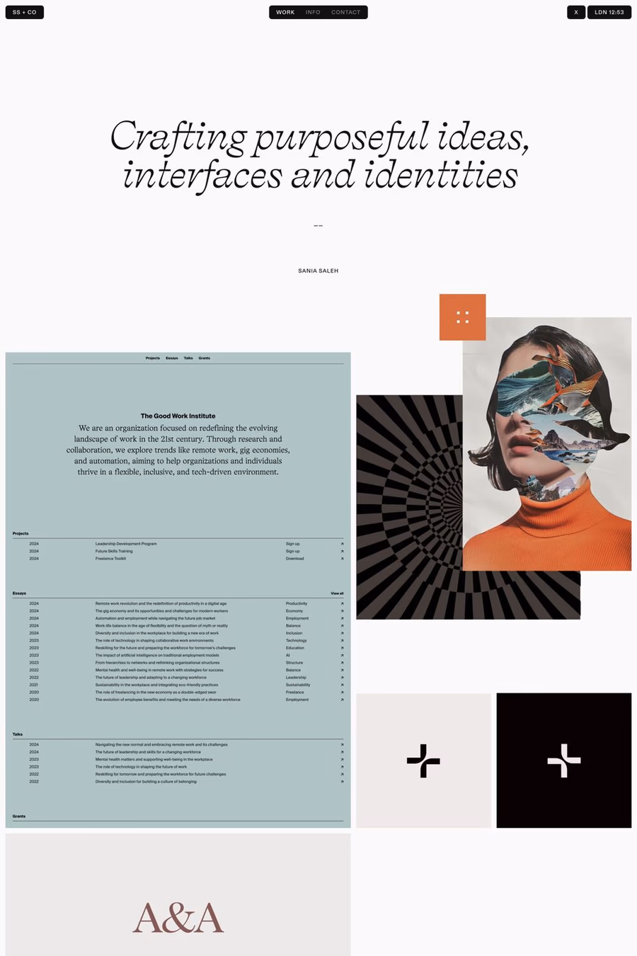
A1 features 2 websites using Self Modern, including Sania Saleh and Spaces. Browse these examples to see how designers pair it with different styles and layouts.
Websites using Self Modern on A1 tend towards Typographic, Overlapping, and Varied layout design styles. They’re most commonly built with Webflow.
You can get Self Modern from the link above. Many fonts are available through Google Fonts, Adobe Fonts, or as web font files.