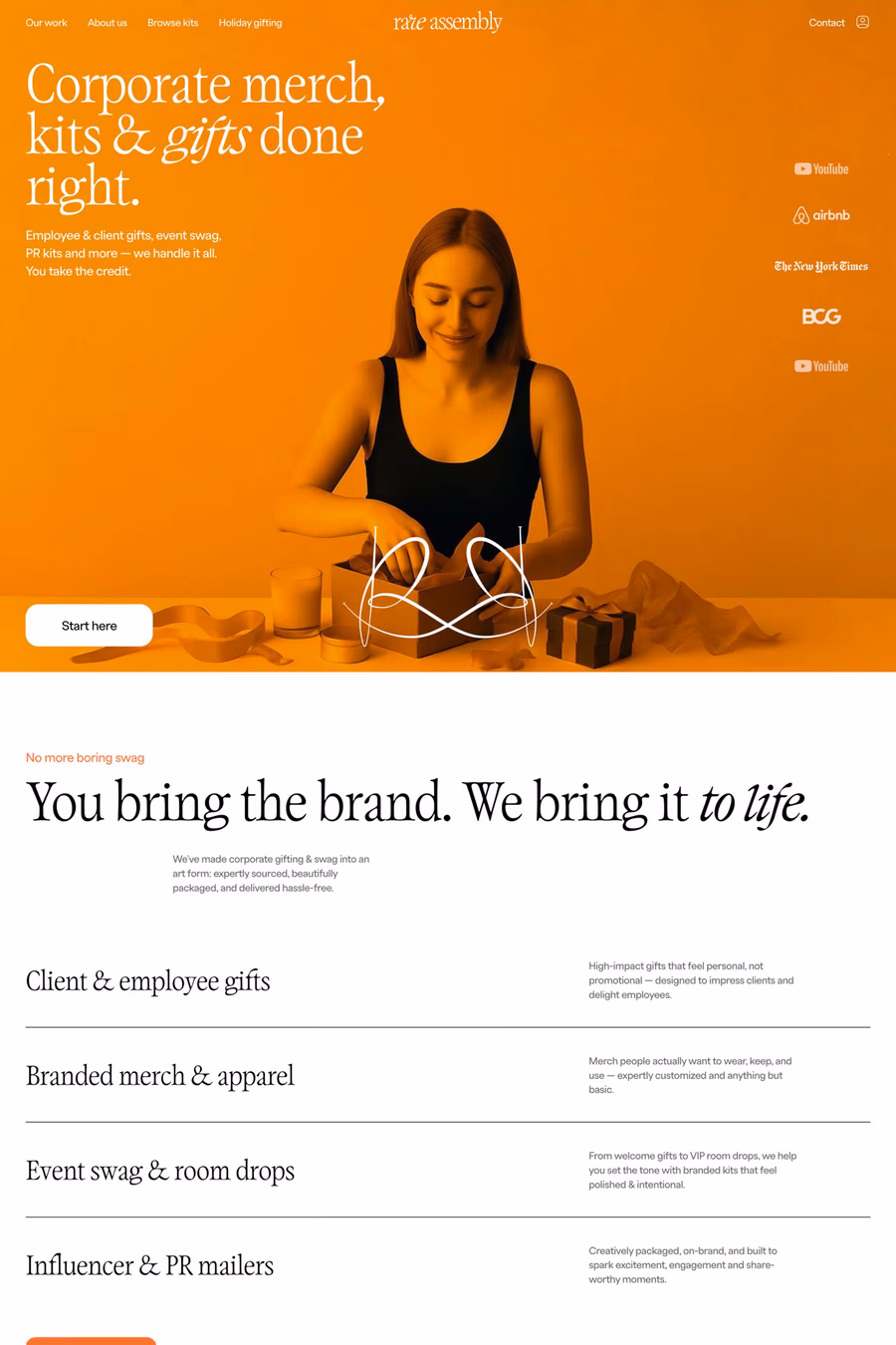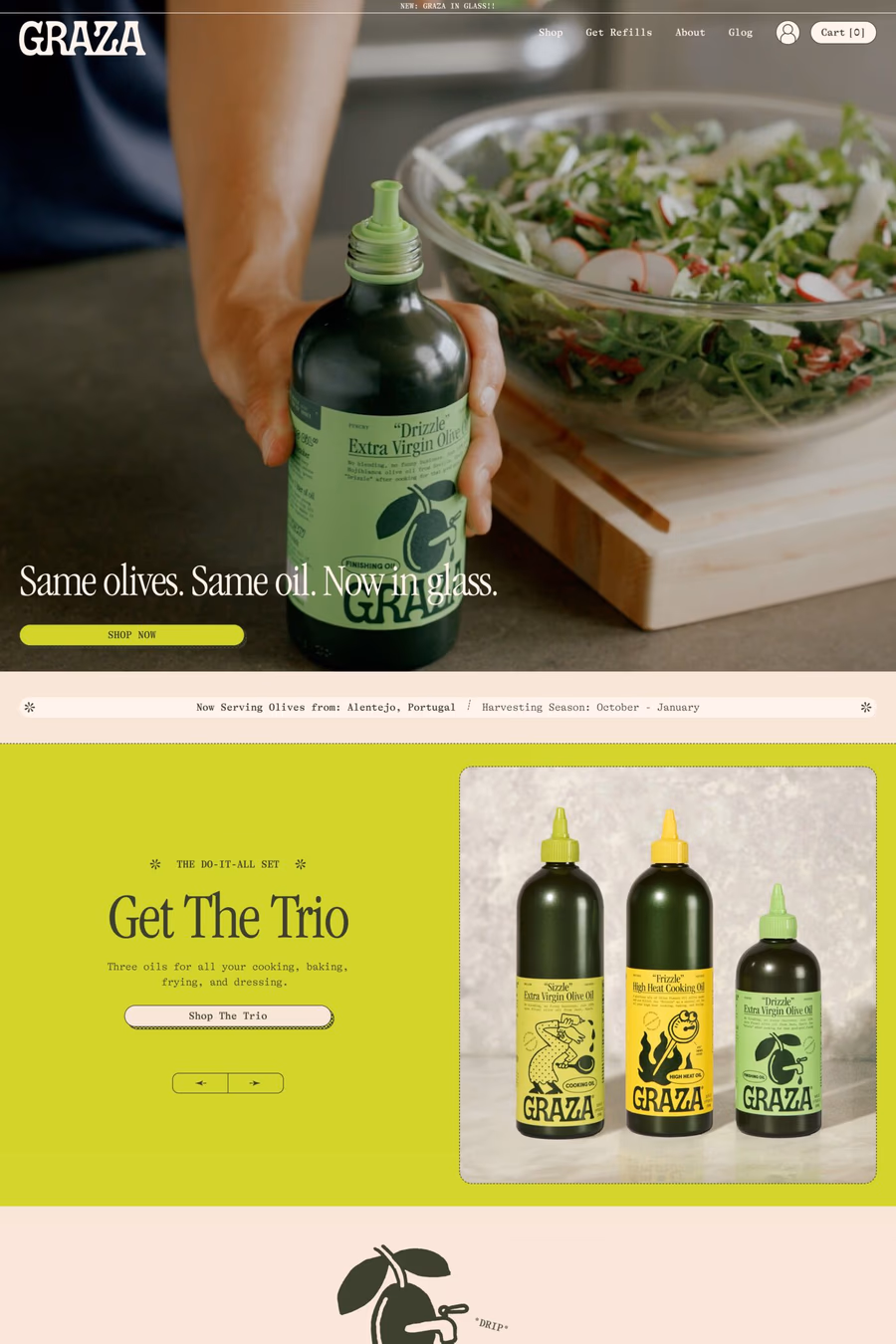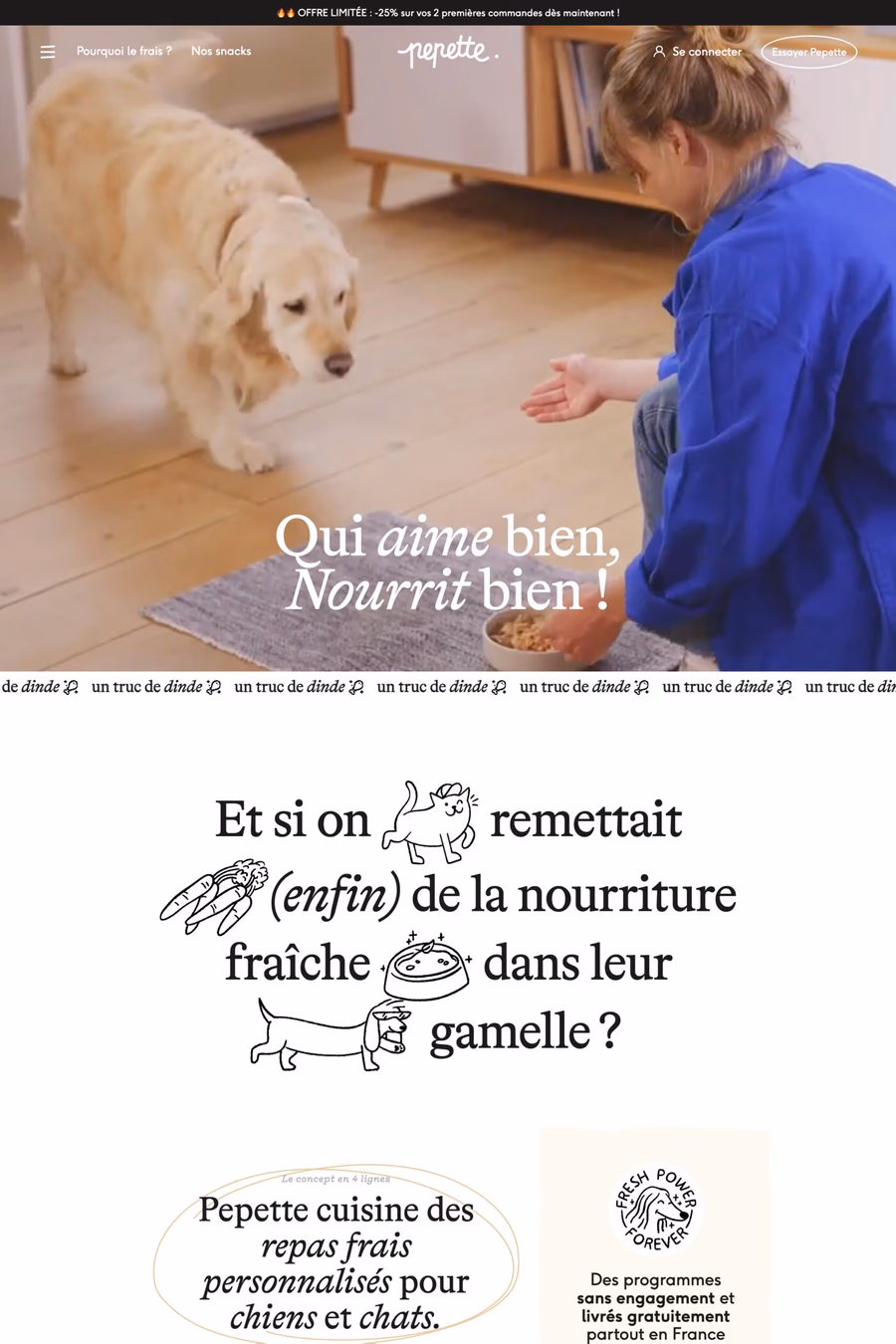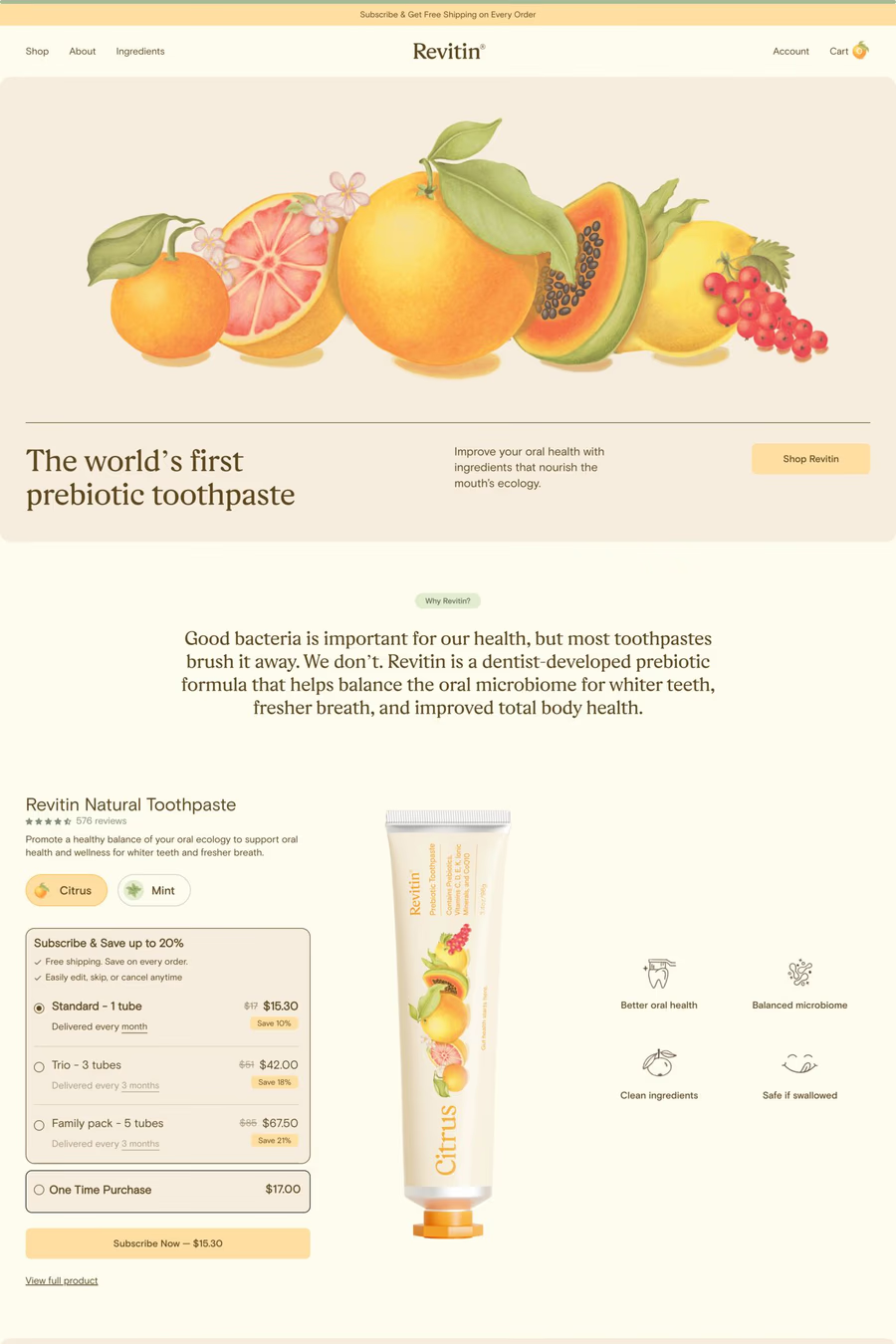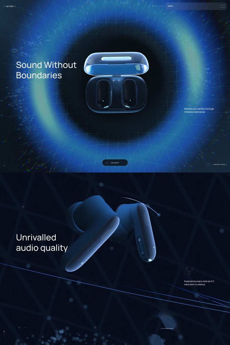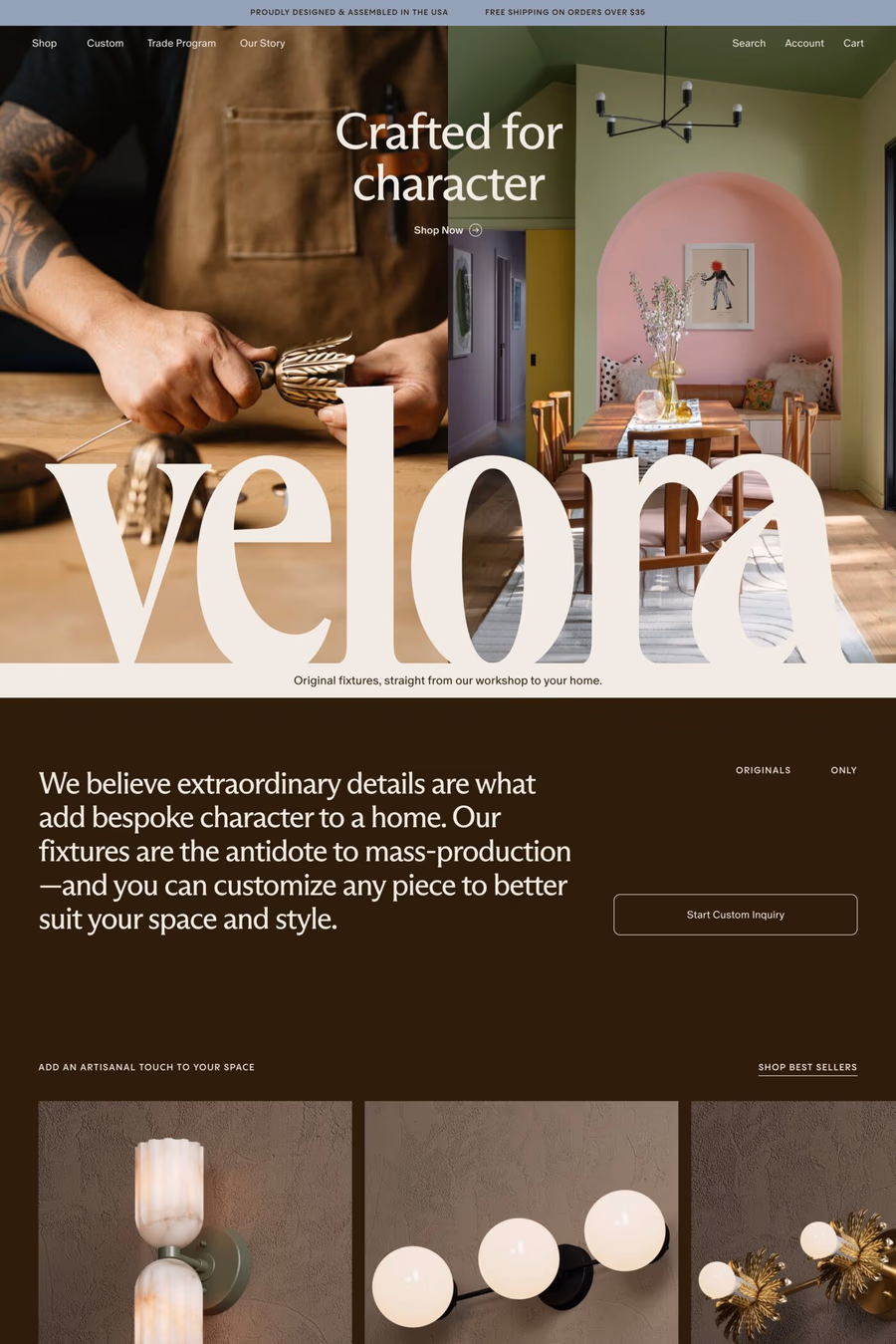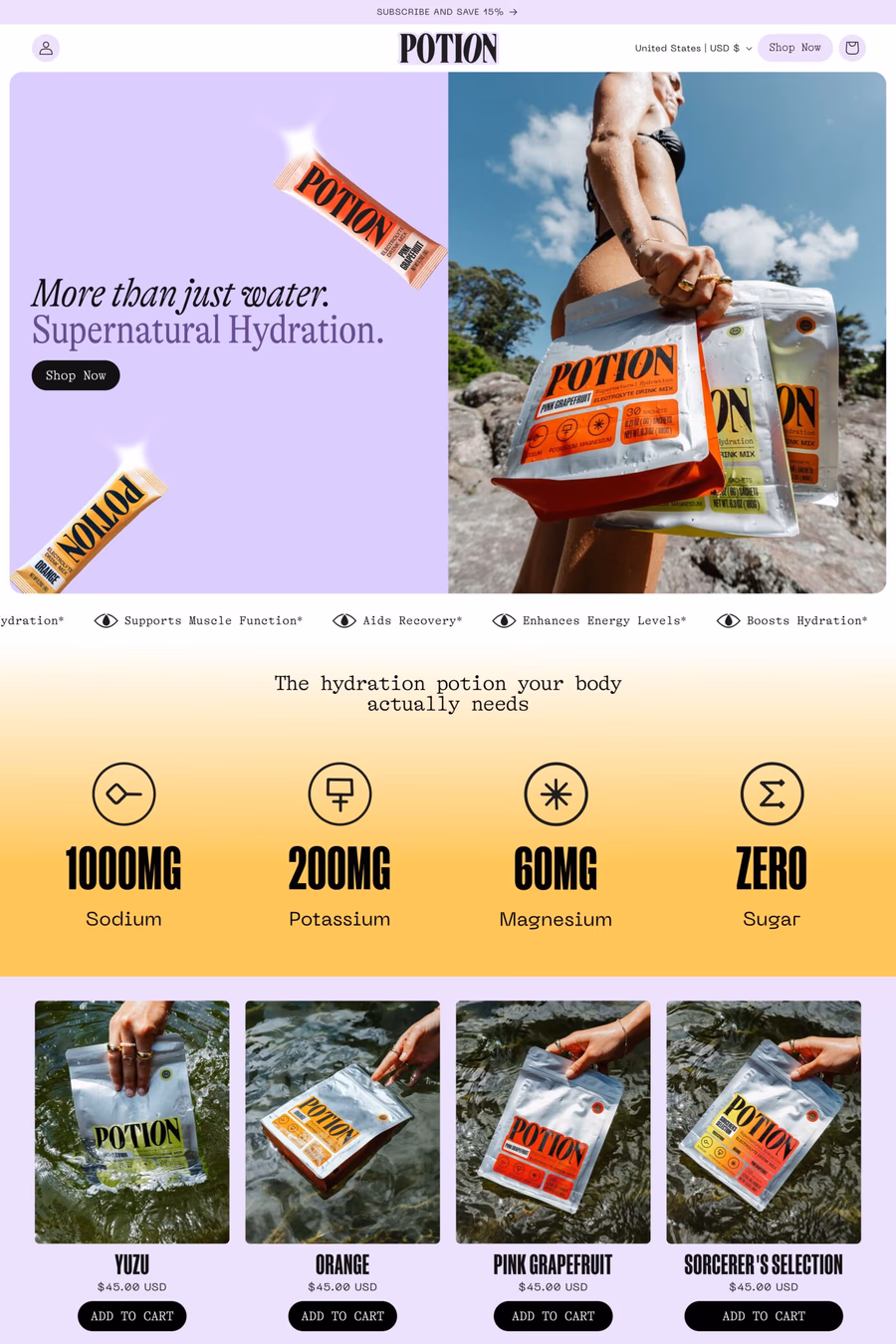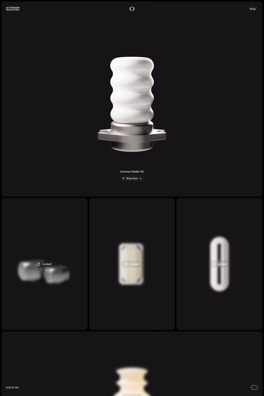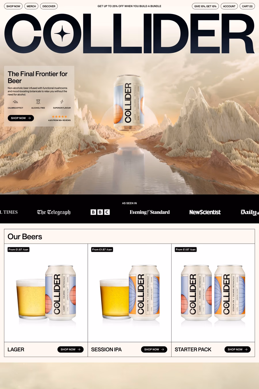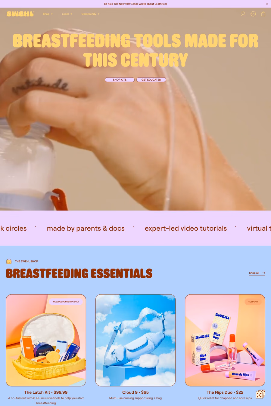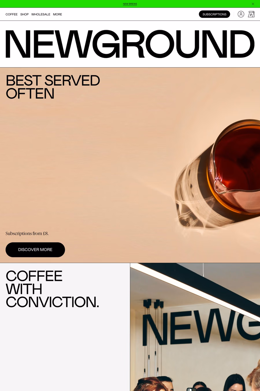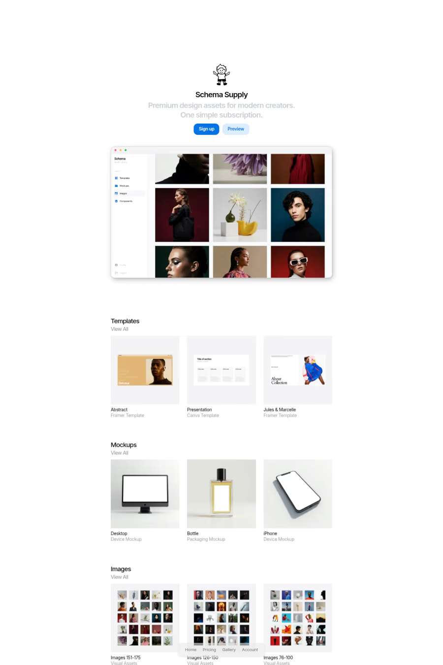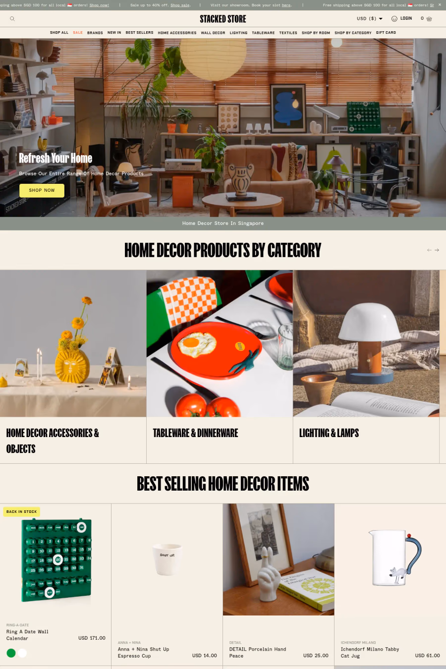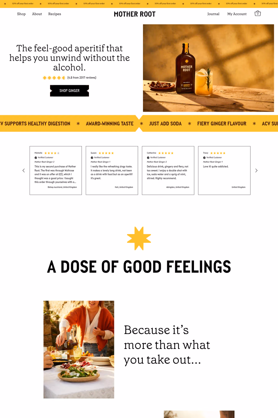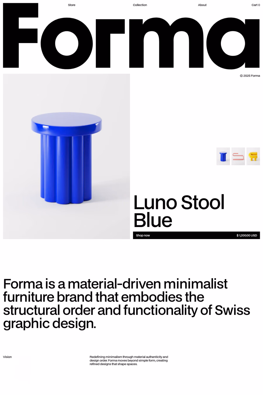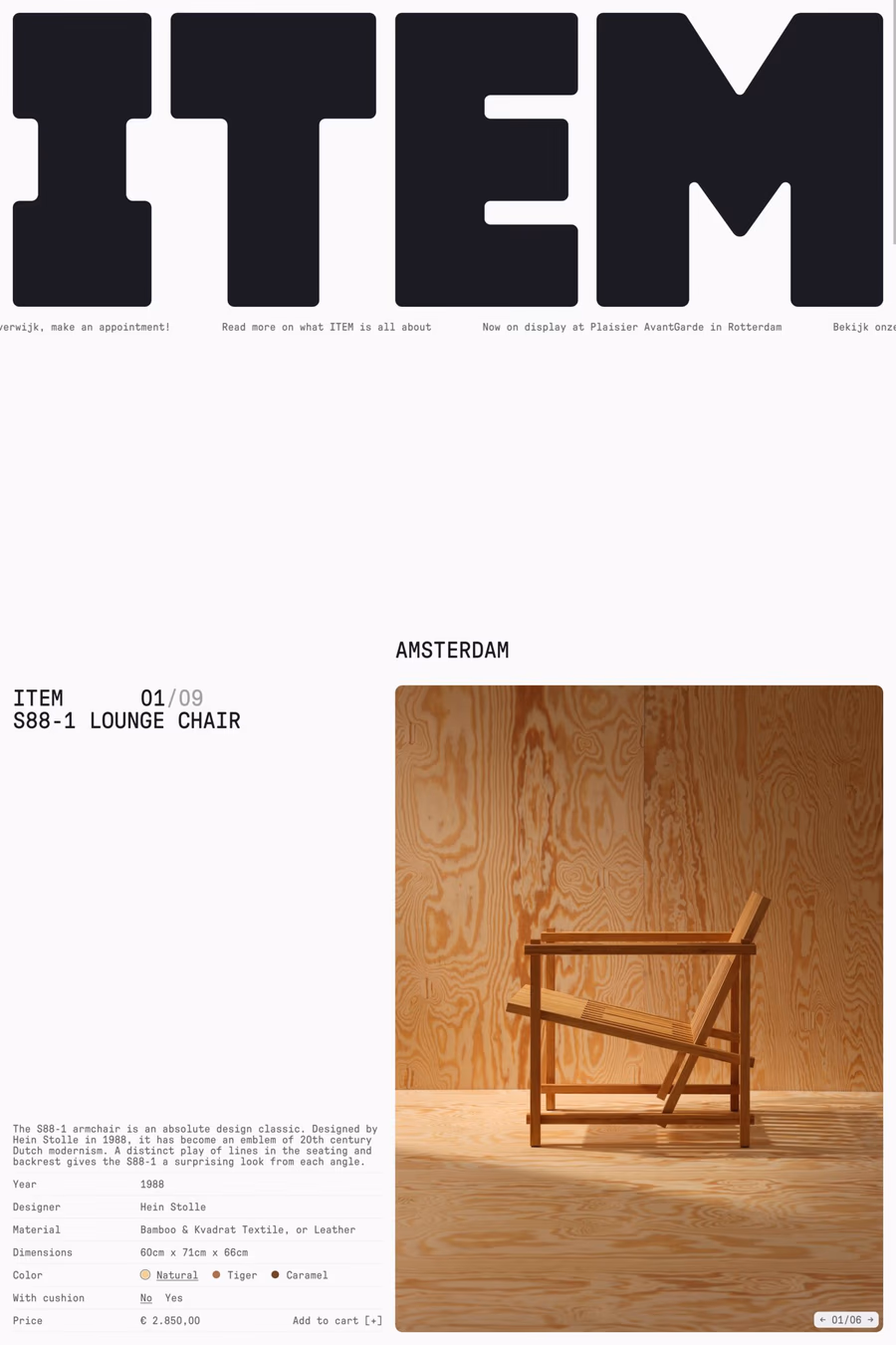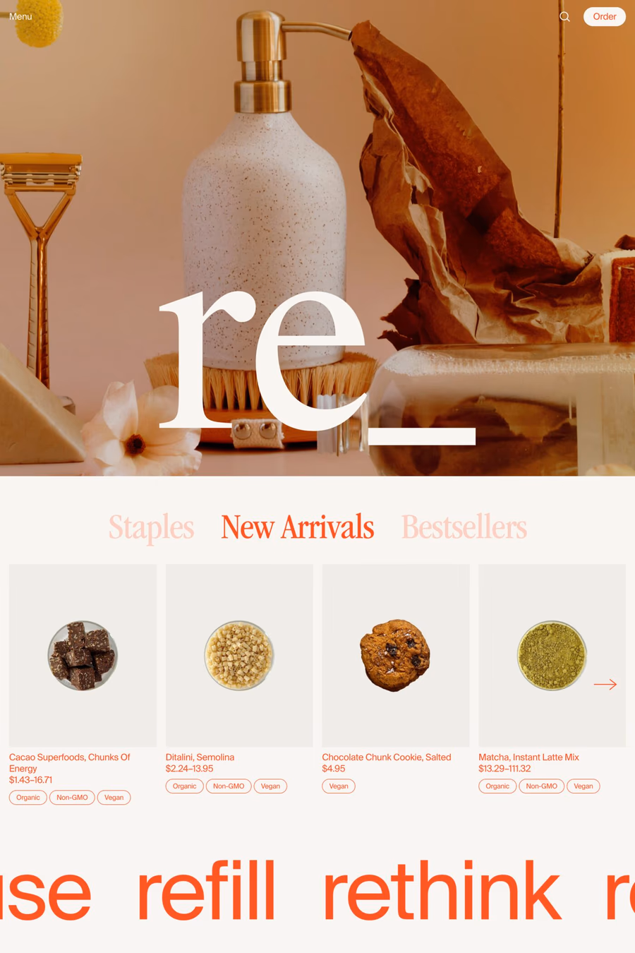
Shop websites live in tension between brand and conversion. The best ones in this collection don’t resolve the tension — they *use* it. Brand expression makes the conversion feel earned; conversion infrastructure makes the brand feel real. The weakest shop sites pick one side and lose the other: pure brand sites that look beautiful but bury the cart, or pure conversion sites that hit every Shopify-default best practice and feel like every other Shopify-default store. Look at how the strongest examples handle the product page. It’s the highest-stakes screen on any e-commerce site, and the best ones treat it as such — the photography is doing real work, the type sets a confident tone, the size and colour selectors don’t require thinking, the add-to-cart is unambiguous, and the supporting content (materials, dimensions, shipping) is present without being overwhelming. The weakest product pages are essentially identical to the Shopify default with a logo swap. Watch how the strongest shops handle their brand voice in the smallest details — confirmation pages, transactional emails, 404 pages, return policy copy. These are the surfaces that tell you whether the brand actually committed or just bought a theme. The strongest brands in this collection have a recognisable voice in their order confirmation emails. The weakest ones use the Shopify default. Shopify powers most of the strongest examples in this collection, but a Shopify site that looks like Shopify is the failure mode — the platform should be invisible, the brand should be loud. Browse Shopify shop examples for shops that escape the template feel.