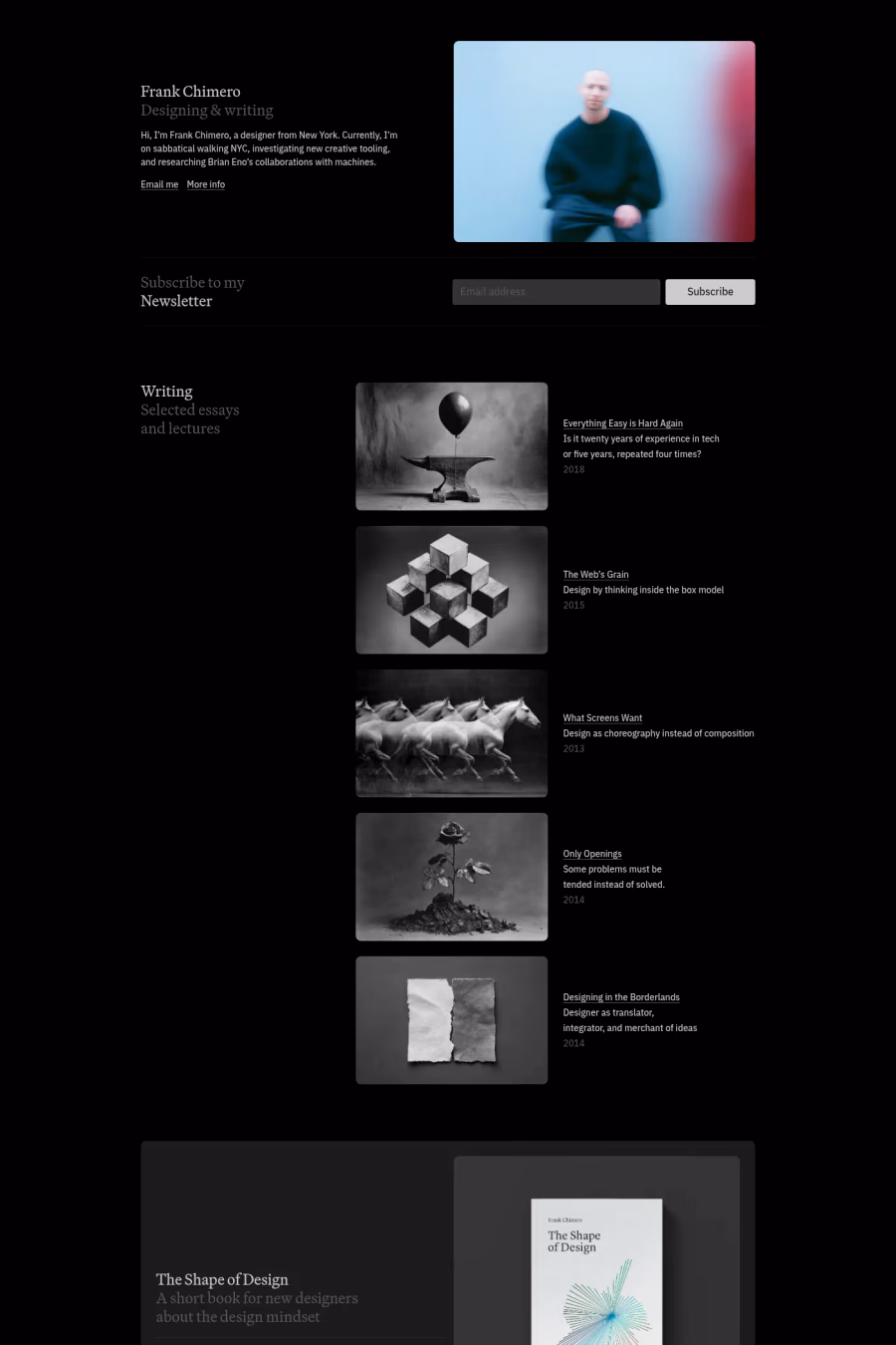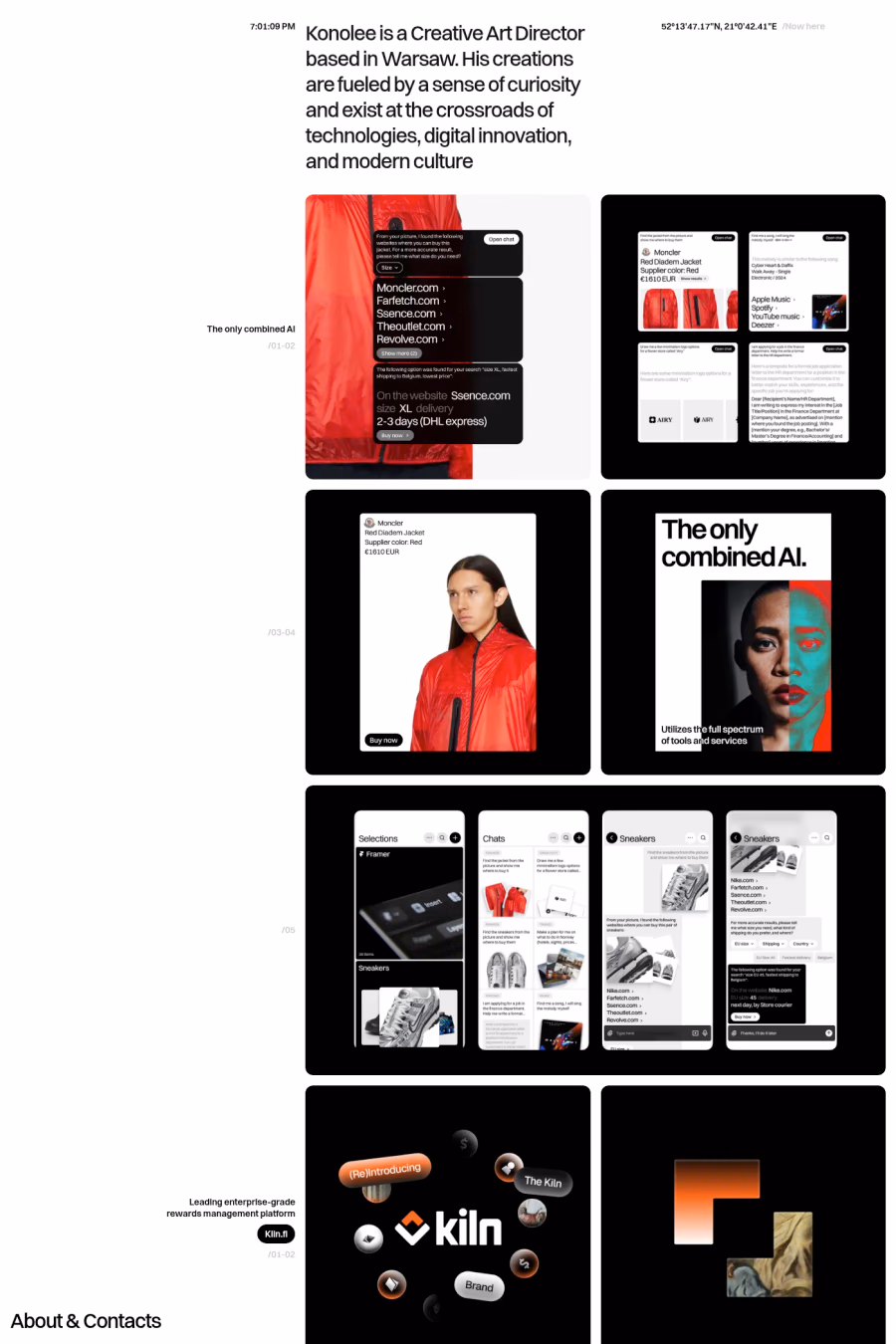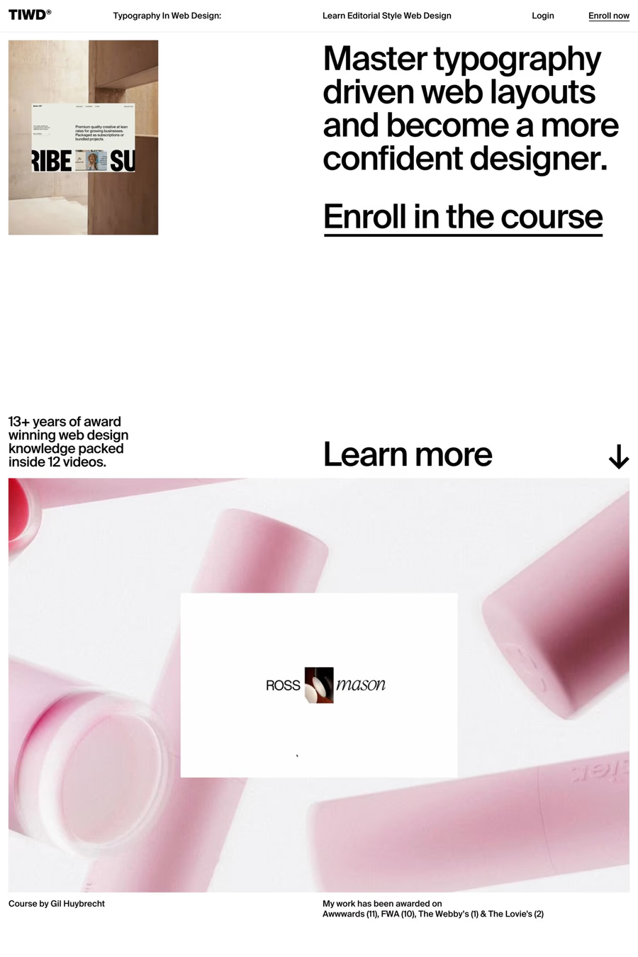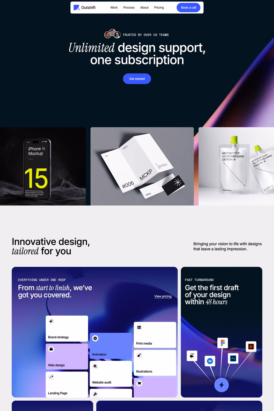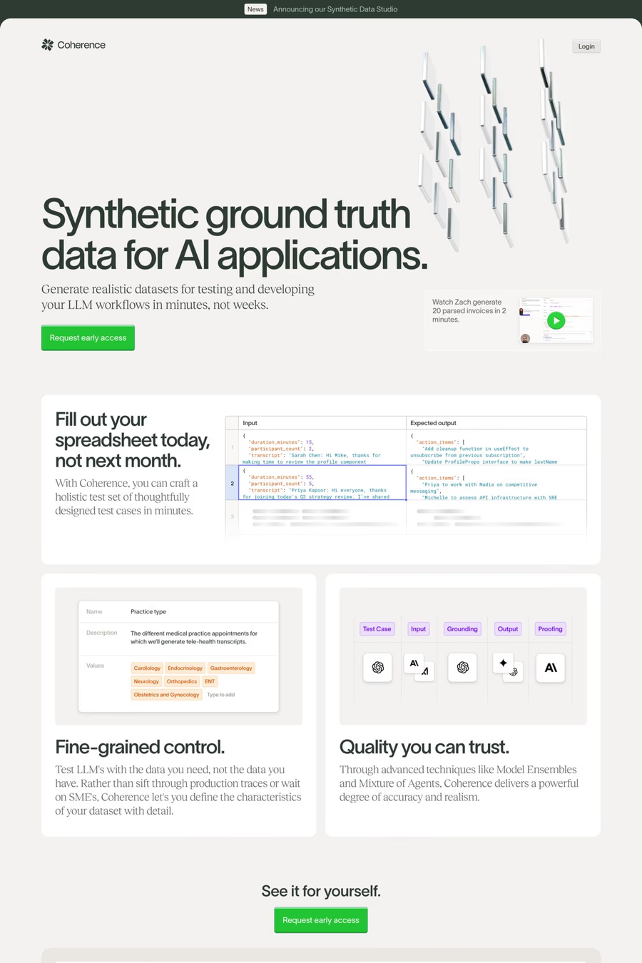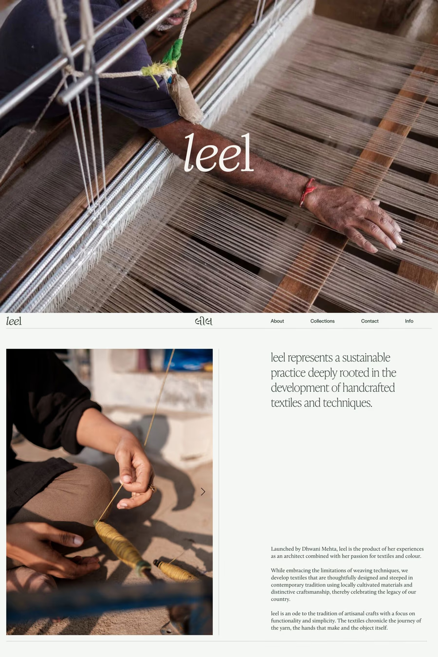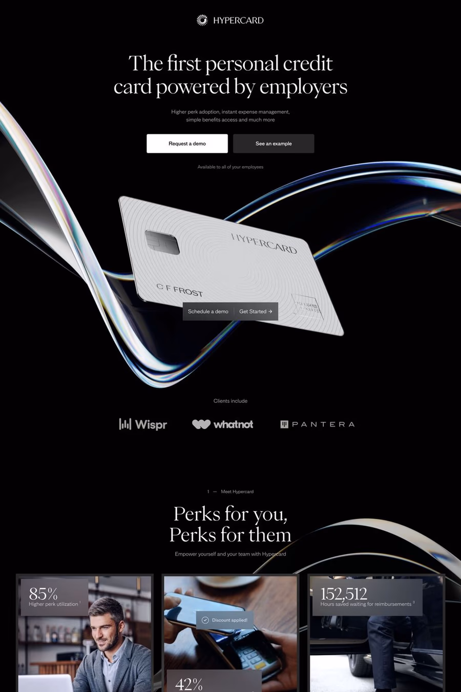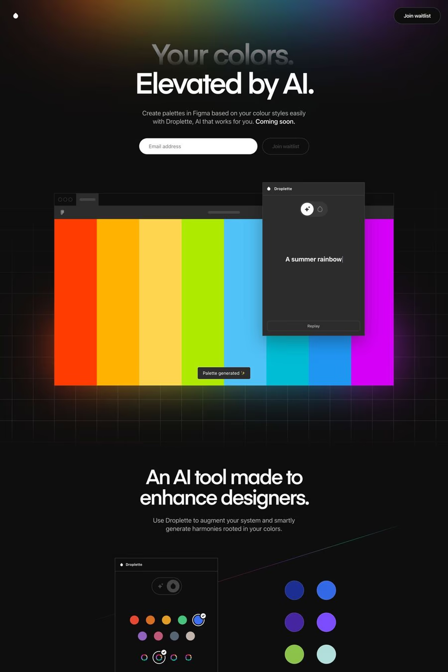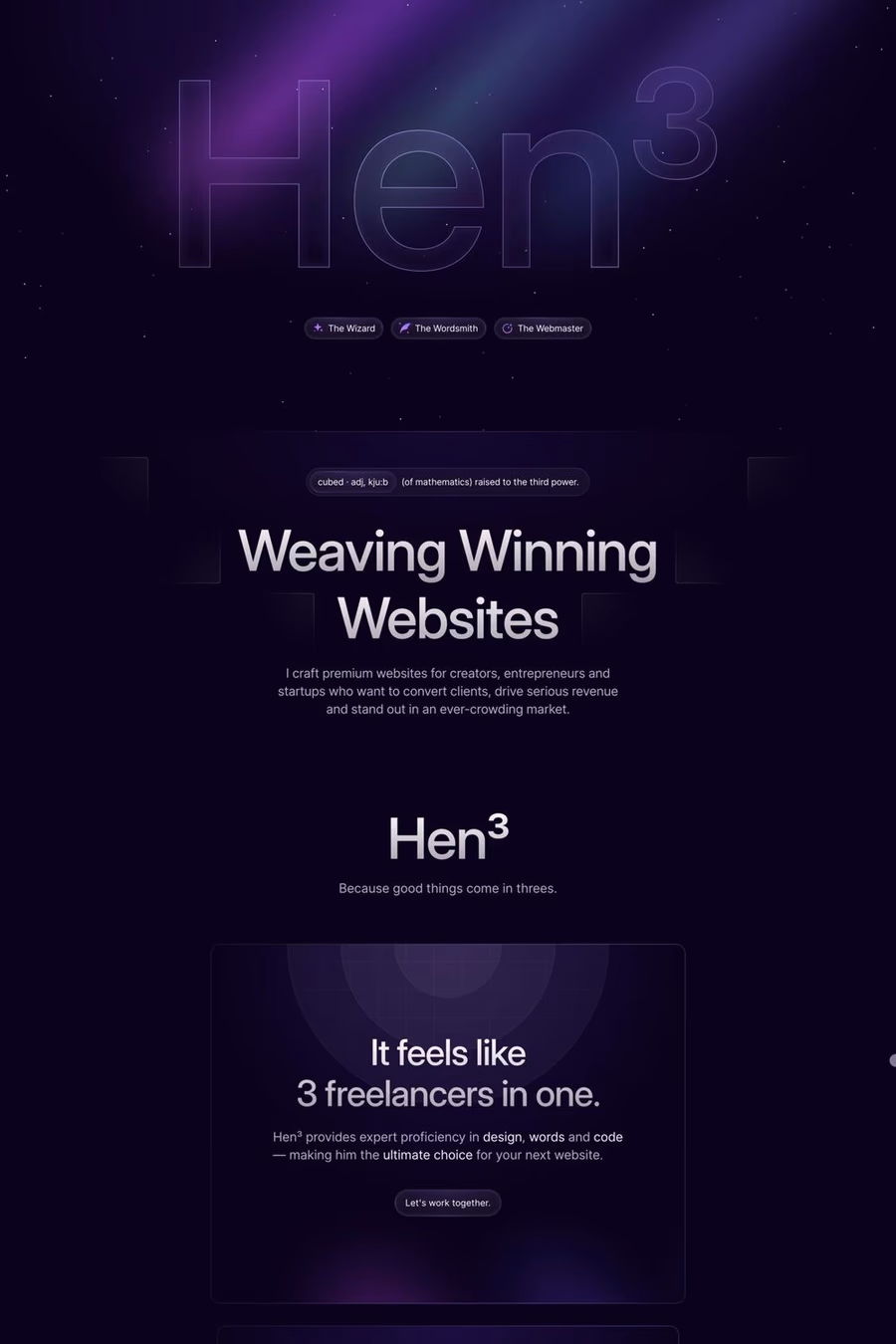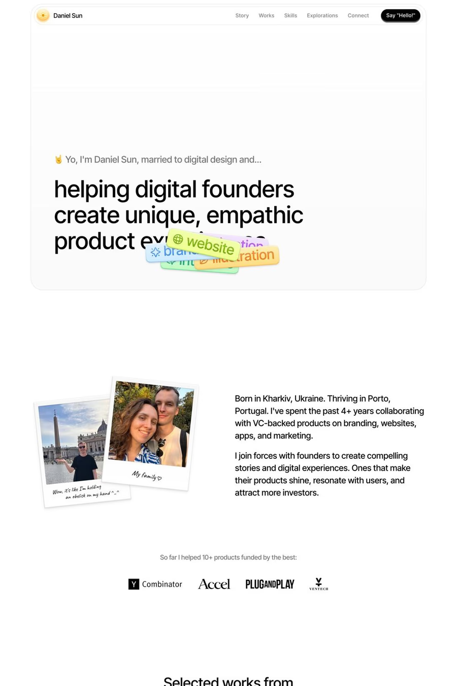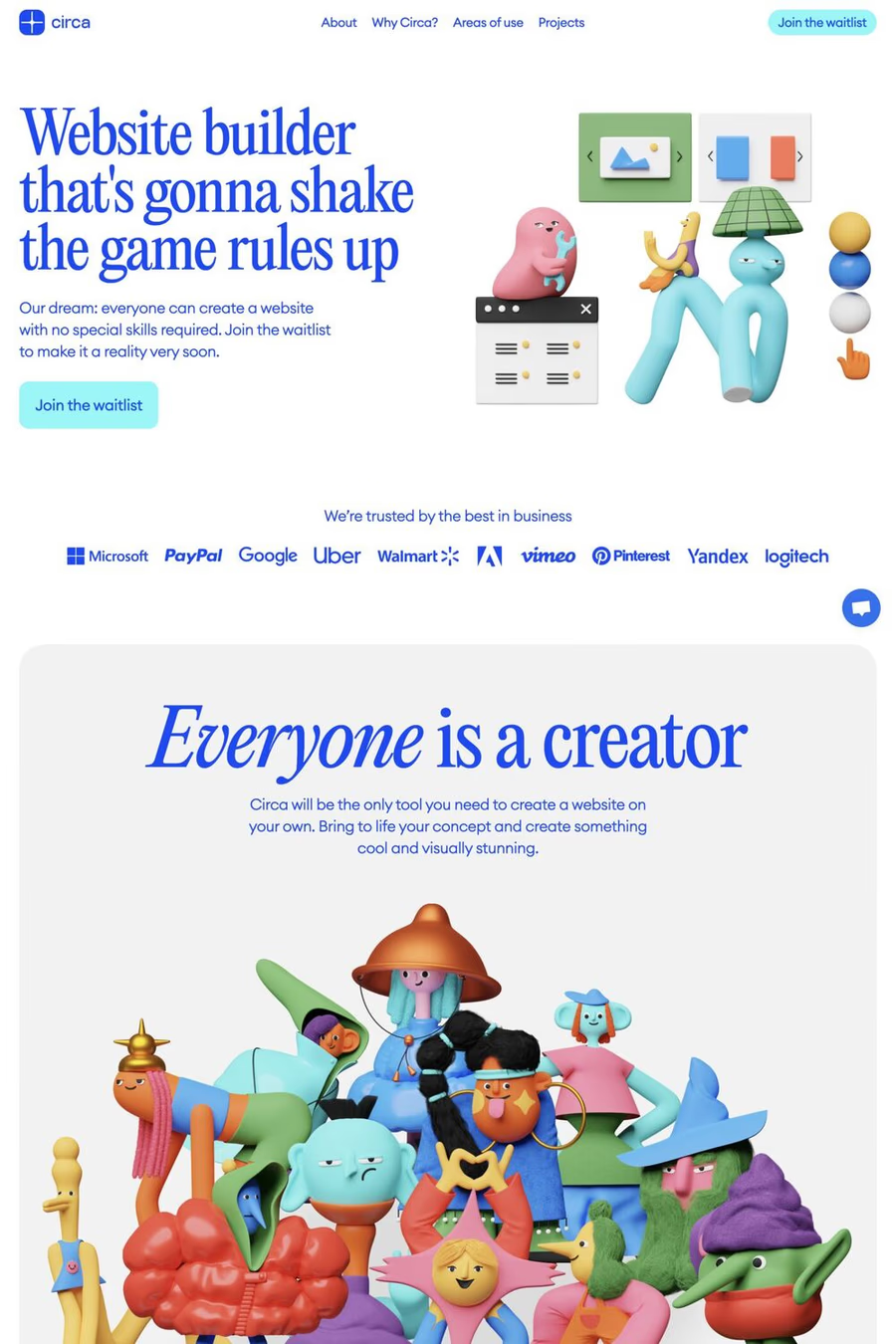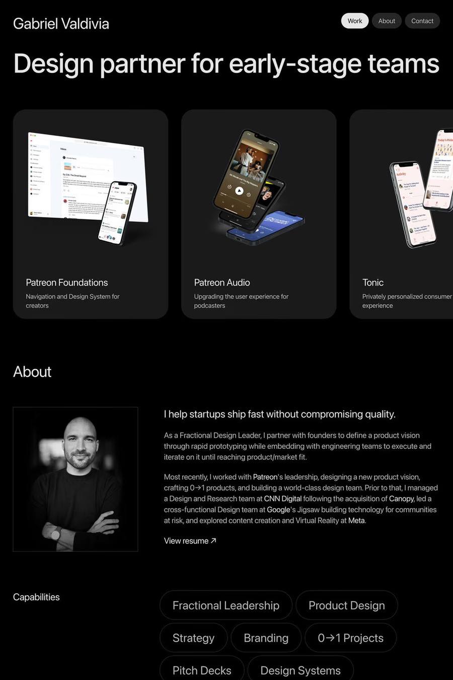
One-page websites are best when the constraint is the point. The best examples in this collection use the single-page format to tell a *linear story* — there’s a beginning, a middle, and an end, and the visitor moves through them in order. The weakest ones use one page because they couldn’t be bothered to design more, cramming what should have been five pages into one giant scroll and calling it a design choice. The difference is intentionality: a one-pager works when the format is deliberate; it fails when the format is laziness. Look at how the strongest examples handle the first viewport: it’s usually almost empty. A bold statement, maybe a single visual, plenty of negative space — because the designer trusts that the visitor will scroll. Weaker one-pagers panic and try to cram every value prop into the hero, defeating the entire point of the format. Watch what they do with section transitions, too. The good ones use scroll as *narrative pacing*; one section ends, a beat of negative space, the next section begins. The bad ones run sections together with no breathing room and the page reads as one undifferentiated wall. One-pagers excel for product launches, event sites, personal portfolios with focused work, and any context where you want visitors to experience the content in a specific order. They struggle for any site that needs internal navigation, deep content, or strong organic search performance — every one-pager only has one URL to rank with. Browse one-page templates for strong examples of the form, or compare against landing pages which face similar constraints from a different angle.