
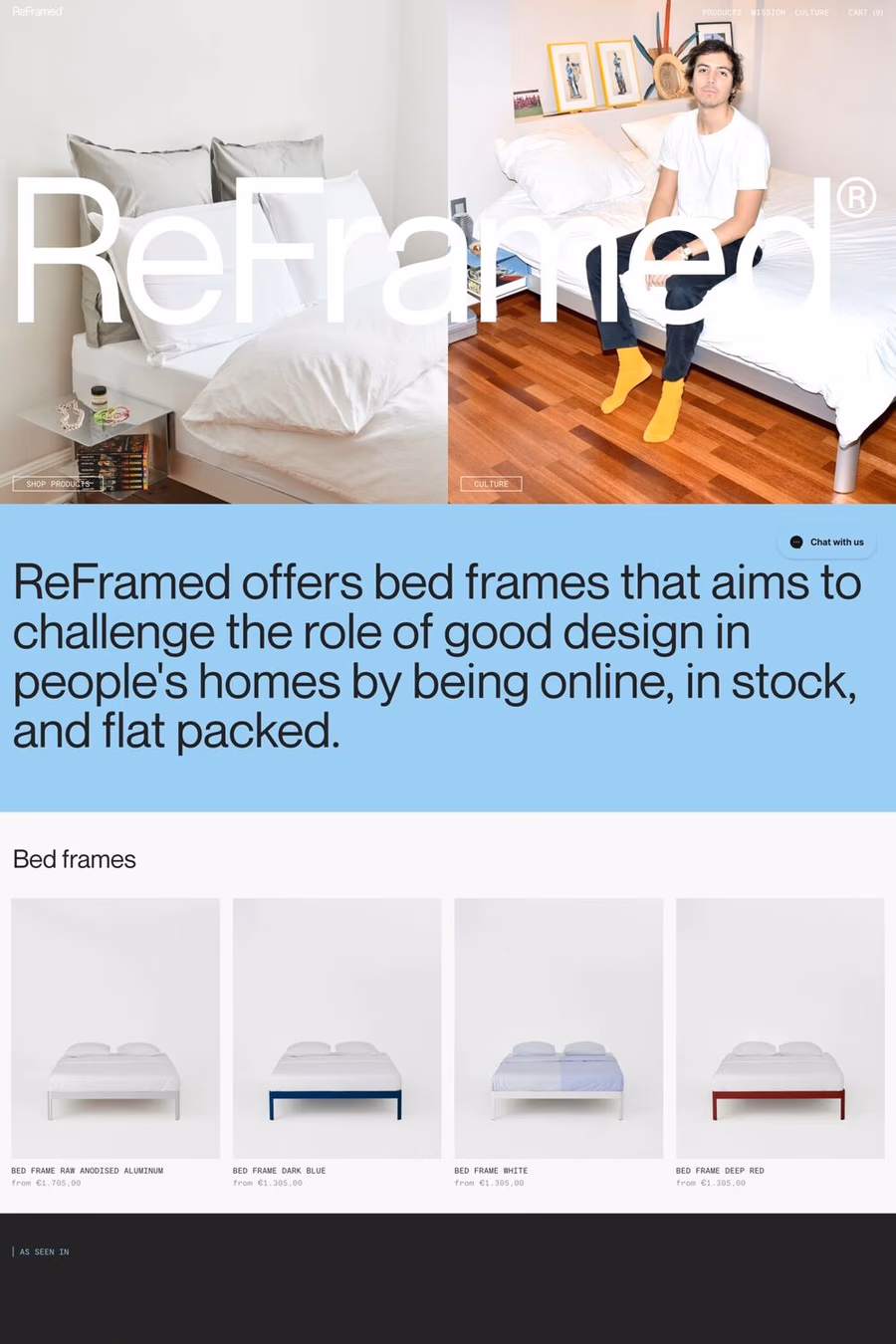
Scandinavian web design reflects Nordic design philosophy — functional minimalism, natural materials, clean lines, and muted, nature-inspired palettes. These sites feel calm and considered, prioritising usability and quiet beauty over decoration or visual complexity.


Curated inspiration sent every Tuesday
Unsubscribe at any time


Abundant whitespace, muted earthy colour palettes (warm greys, soft whites, pale timber tones), clean sans-serif typography, uncluttered layouts, and photography featuring natural light and organic materials. The overall impression is one of thoughtful restraint and quiet sophistication.
The Nordic emphasis on functionality, honesty, and democratic design translates to highly usable interfaces where form follows function. Nothing is decorative without purpose, navigation is intuitive, and the visual language communicates warmth and trustworthiness through simplicity.