Last Studio
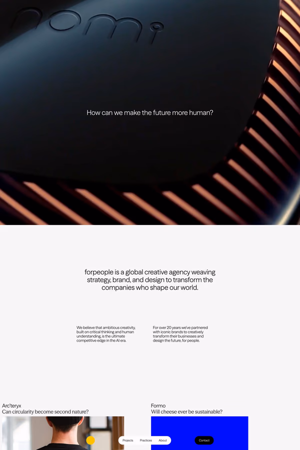
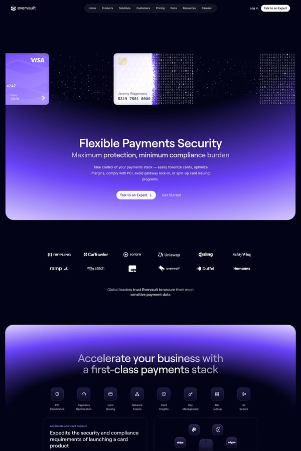
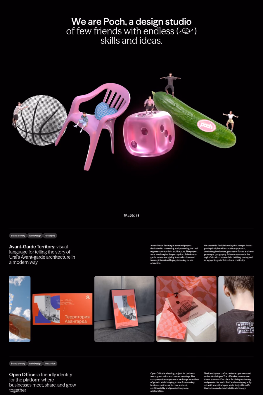
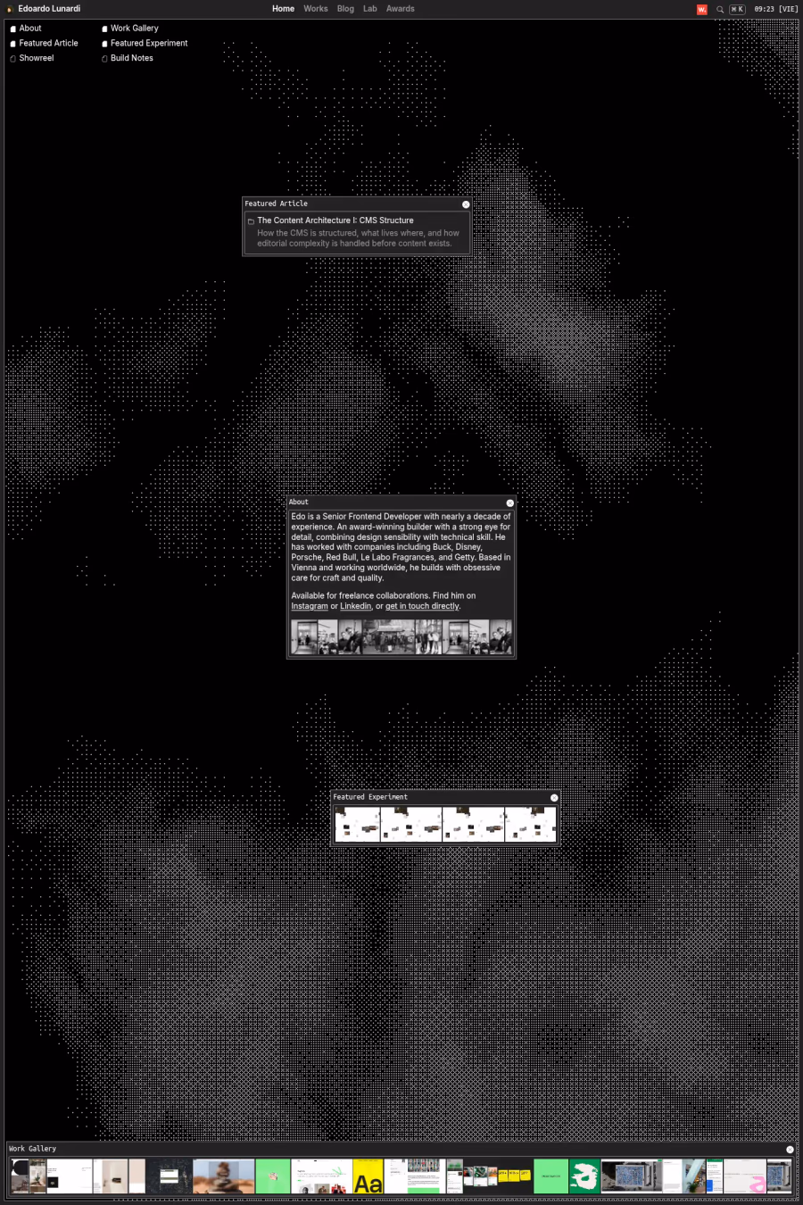
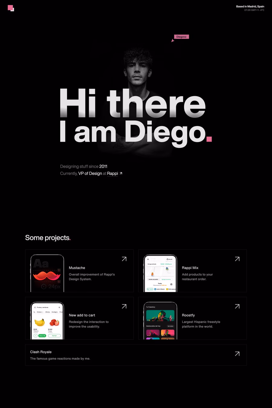
GetBlack-dominant websites create an immediate sense of sophistication, luxury, and visual drama. Dark interfaces allow photography, typography, and colour accents to command attention in a way that lighter backgrounds rarely achieve. See also the dark style and black and white collections for related aesthetics.
Curated inspiration sent every Tuesday
Unsubscribe at any time


Pure black (#000000) on screens can cause eye strain during extended reading, so most designers use very dark greys instead. Ensuring sufficient contrast ratios for body text and interactive elements is essential for accessibility, and care must be taken with thin typefaces that can appear to vibrate against dark backgrounds.
Fashion, luxury goods, automotive, nightlife, and creative agencies gravitate towards black because it signals exclusivity and premium positioning. It also works well for photography and video-centric sites where the dark surround acts as a frame that keeps focus on the media. Browse dark landing pages for examples.