Last Studio
Get
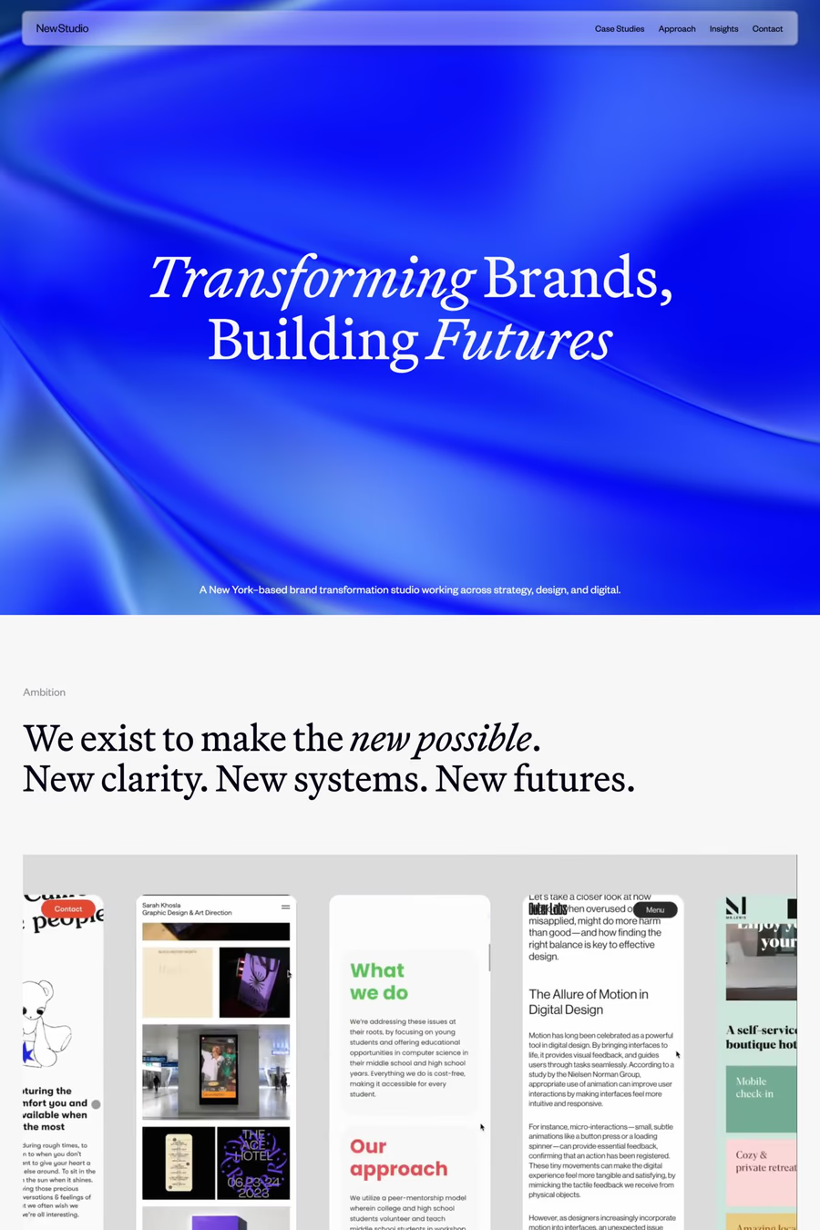
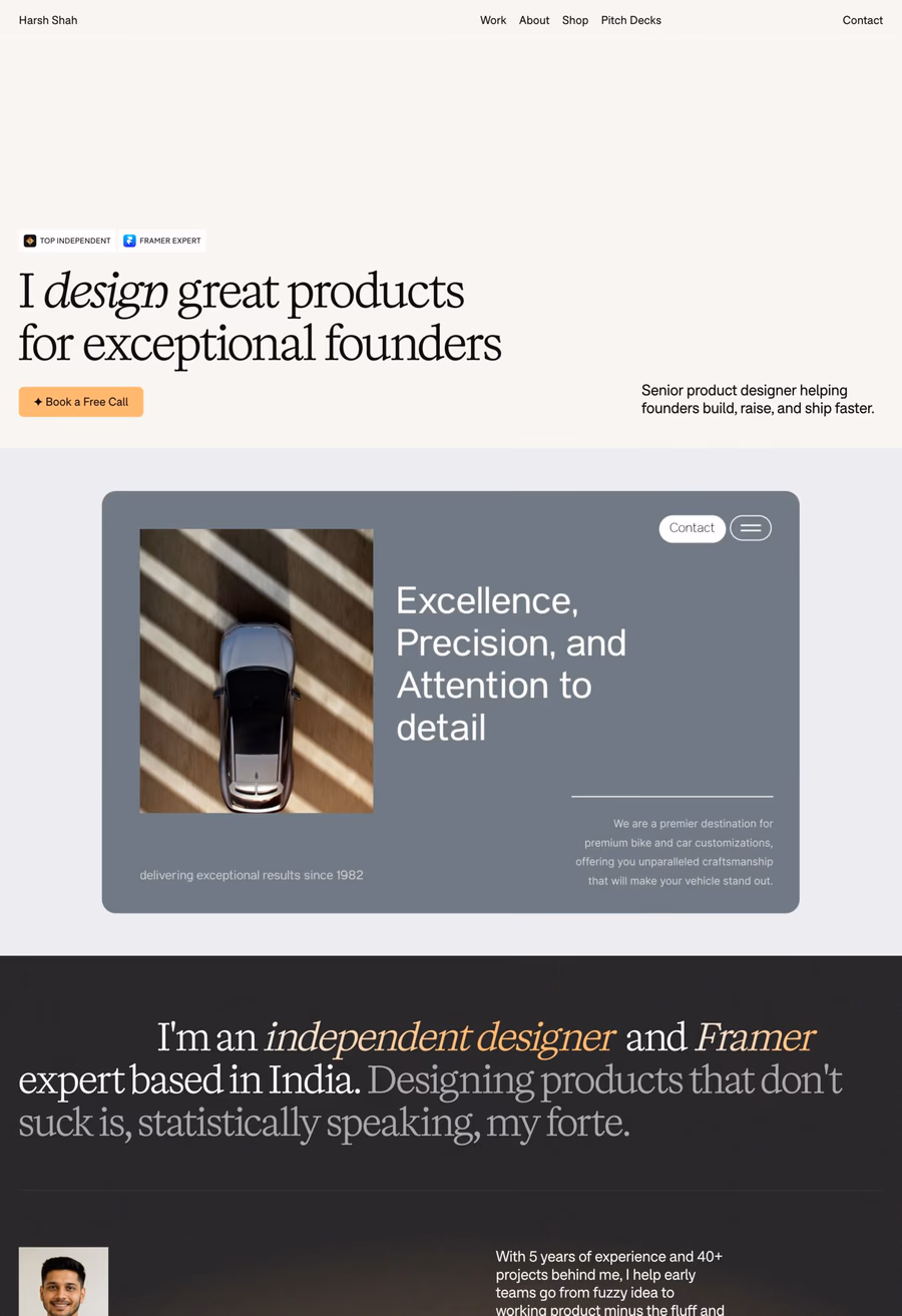
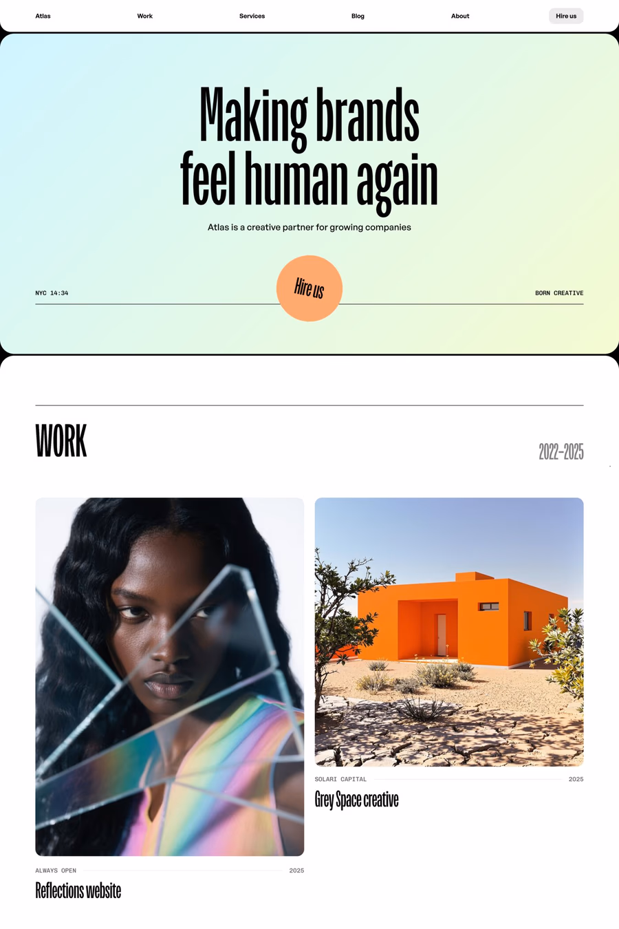
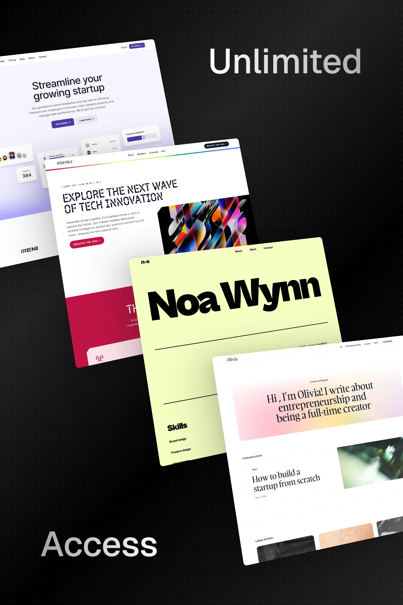
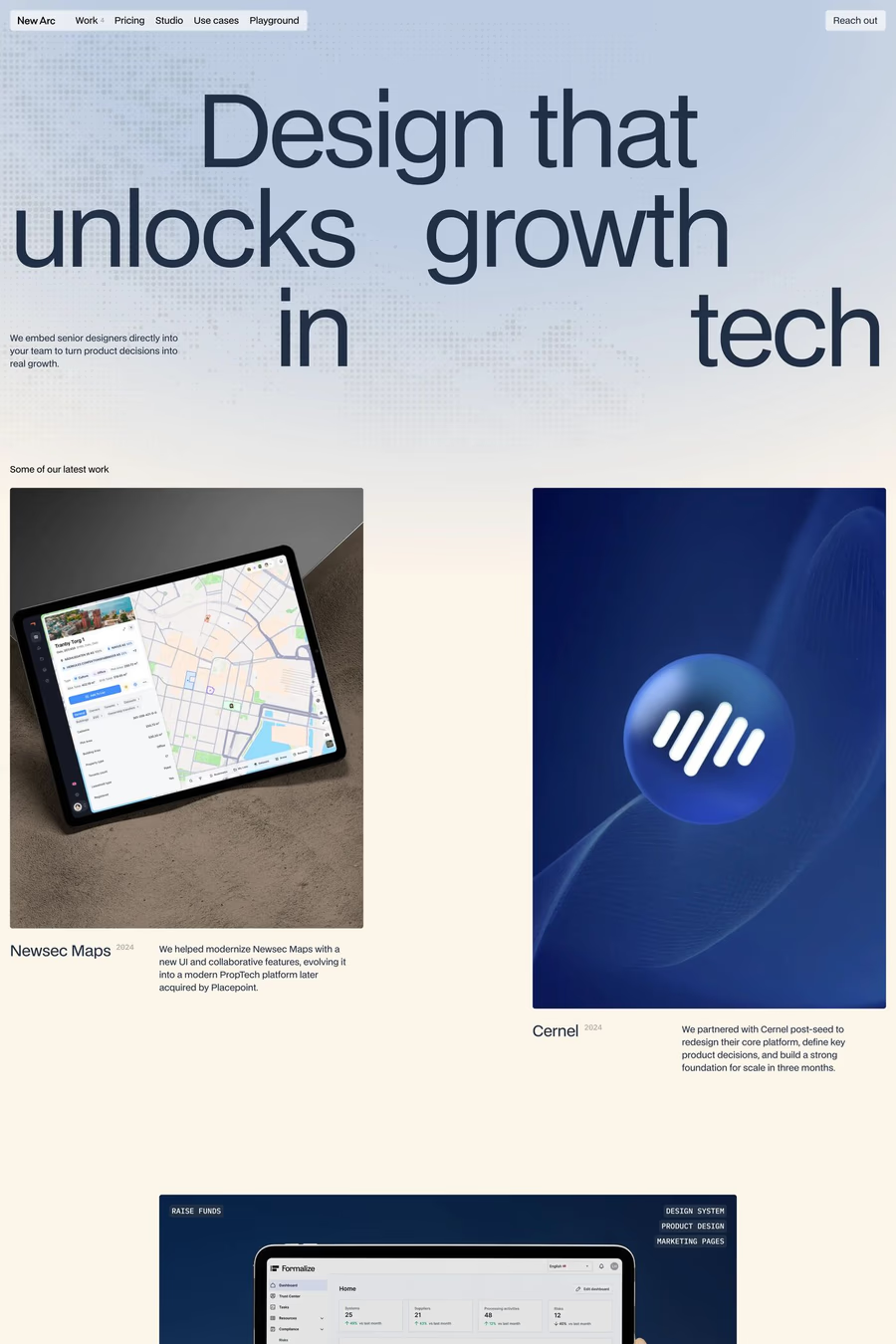
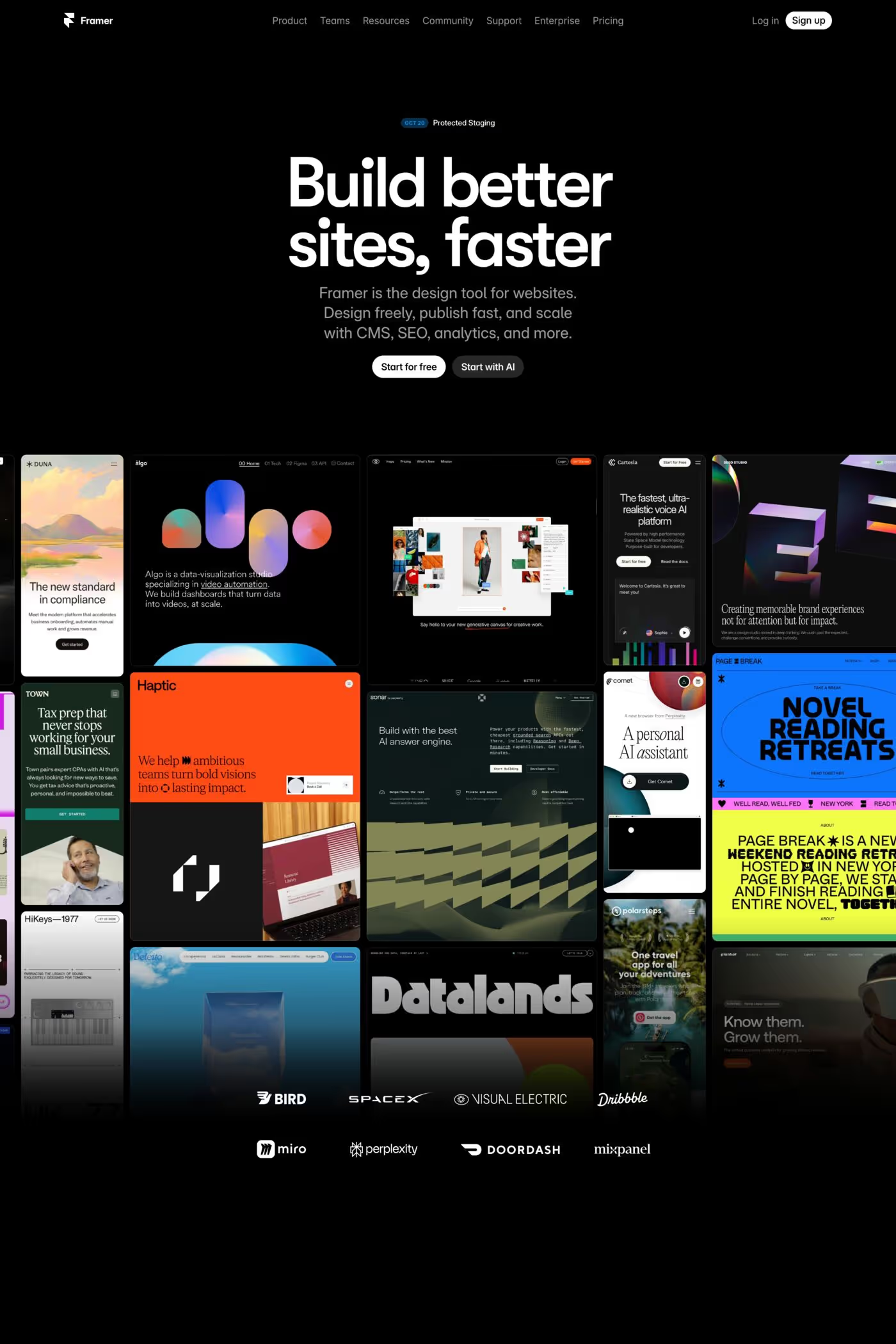
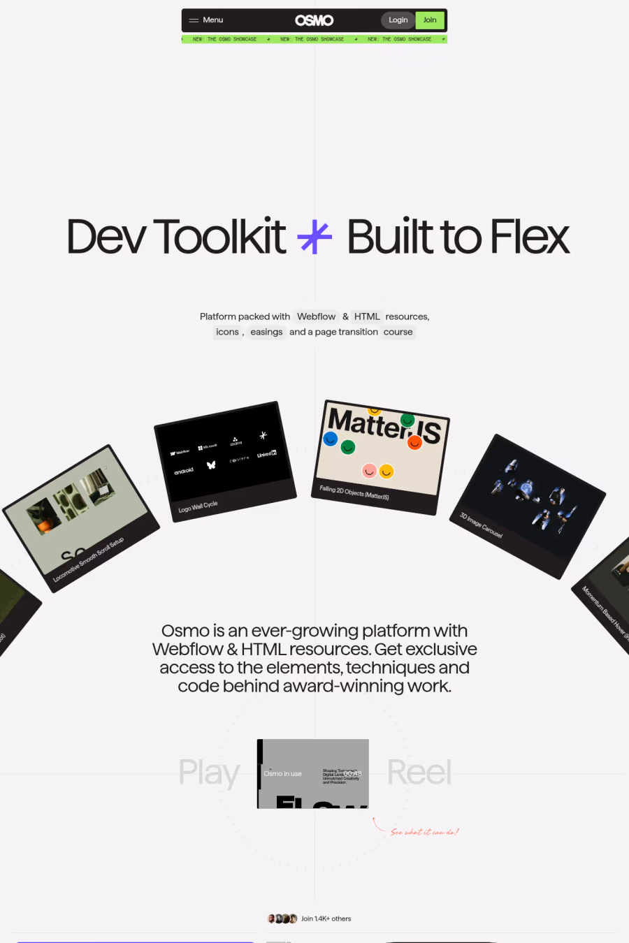
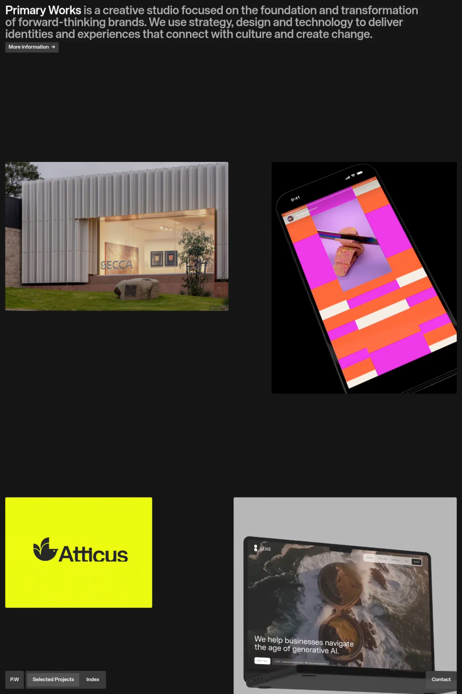
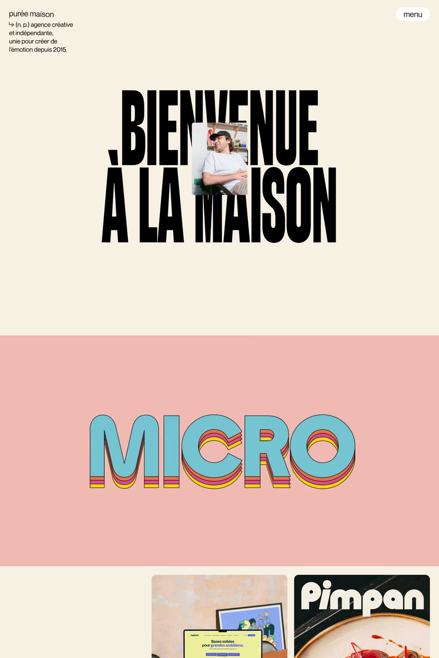
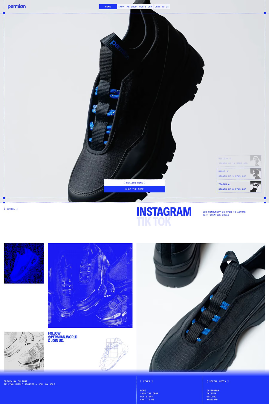
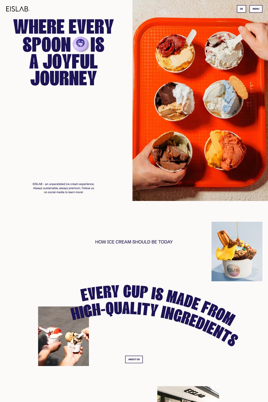
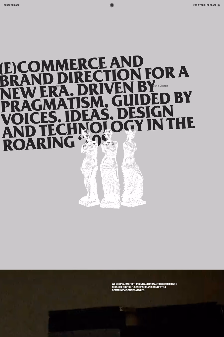
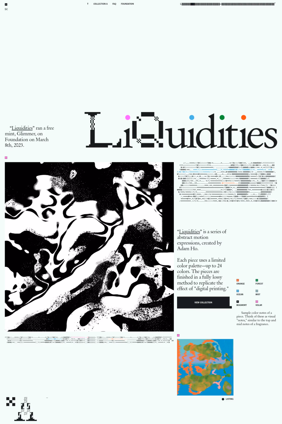
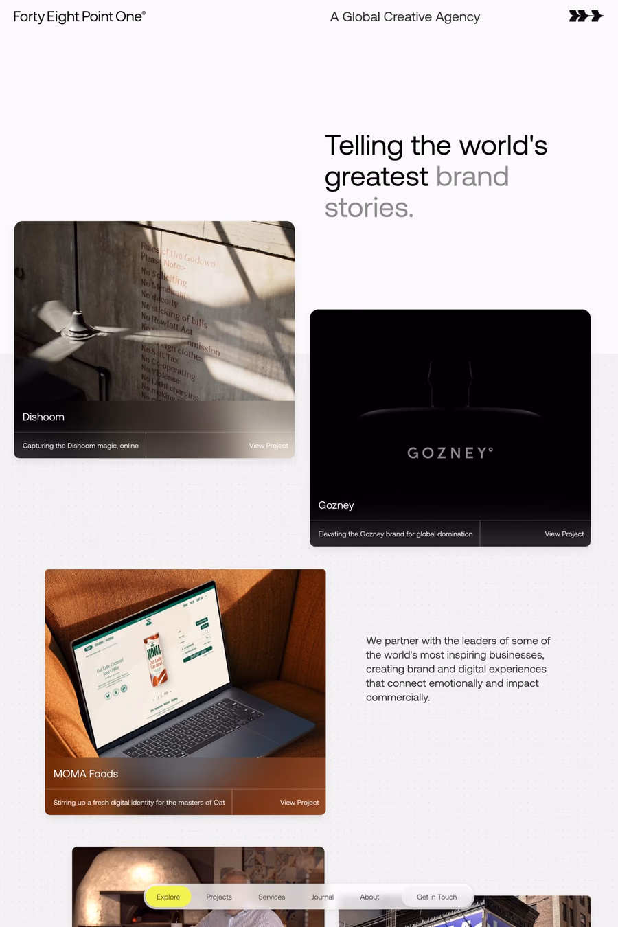
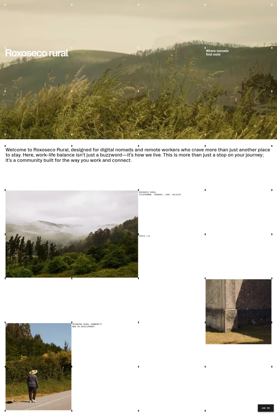
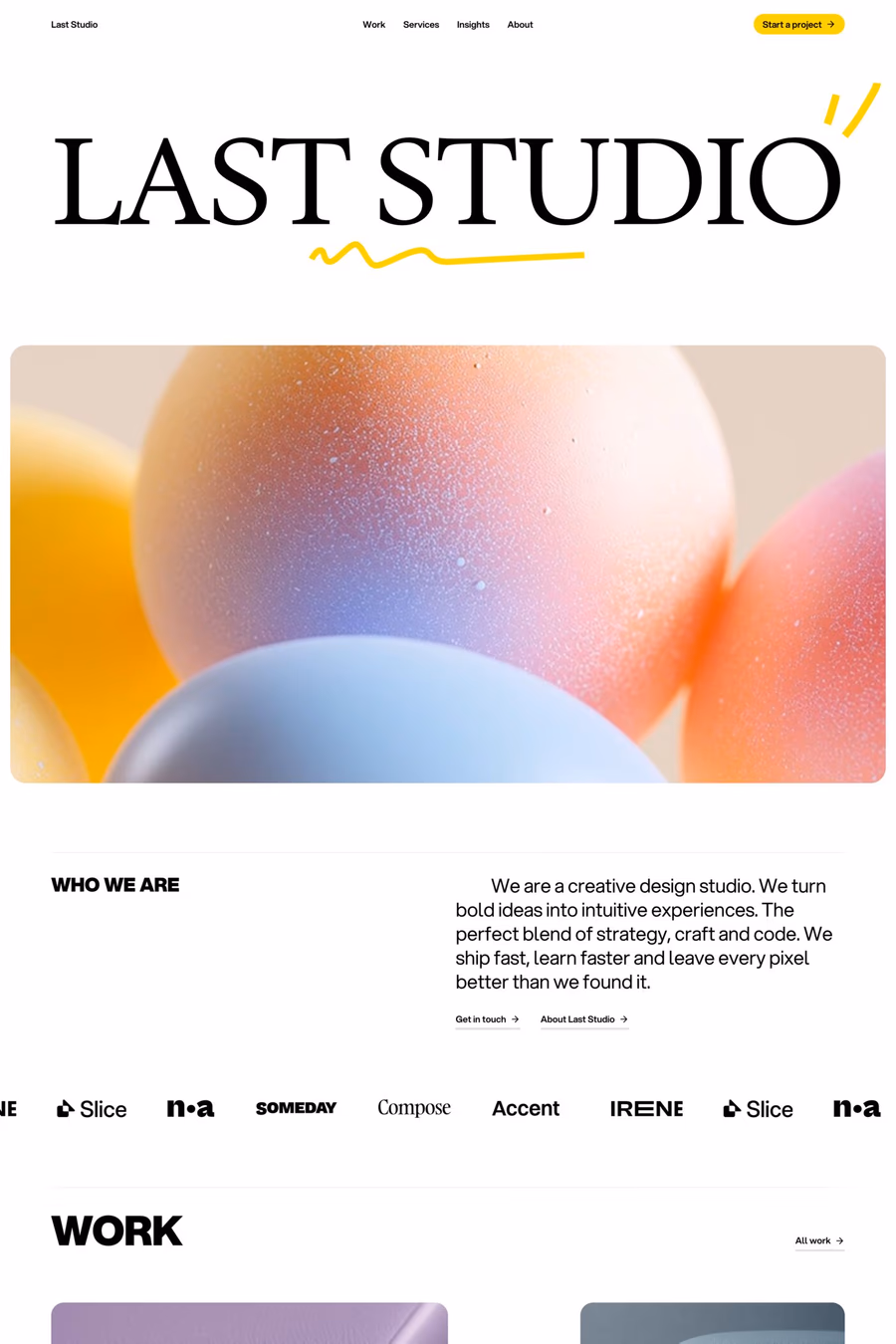
Varied layout design deliberately changes composition from section to section, avoiding the repetitive block structure that defines most websites. Each scroll brings a fresh arrangement of content, creating visual surprise and sustained engagement through unpredictable spatial relationships.
Curated inspiration sent every Tuesday
Unsubscribe at any time


Consistent typography, a shared colour palette, and uniform spacing values tie different layouts together. The grid may shift between sections, but the underlying design system — type scale, spacing rhythm, component styling — provides the unifying thread across varied compositions.
Responsive behaviour becomes complex when each section has unique layout logic. Designers must ensure every variation works at all breakpoints and that the overall page still feels intentional rather than disjointed. Strong art direction and a clear design system are essential.