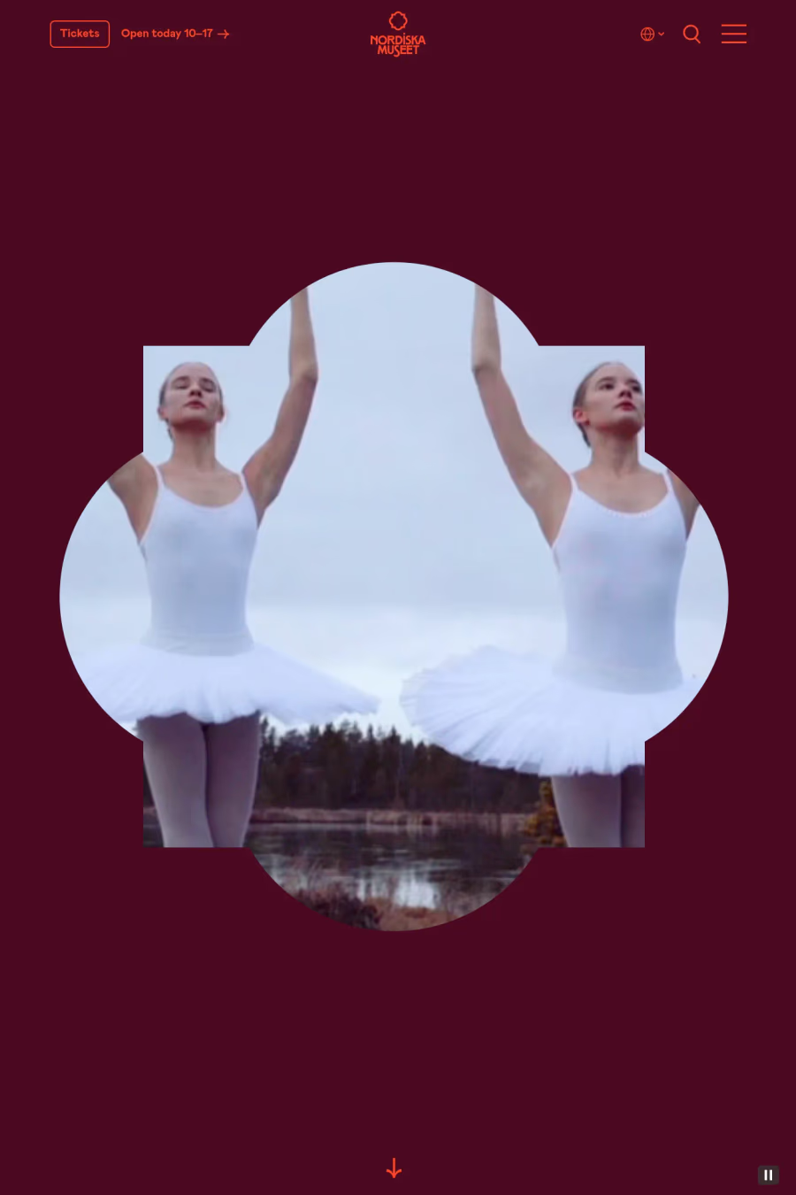
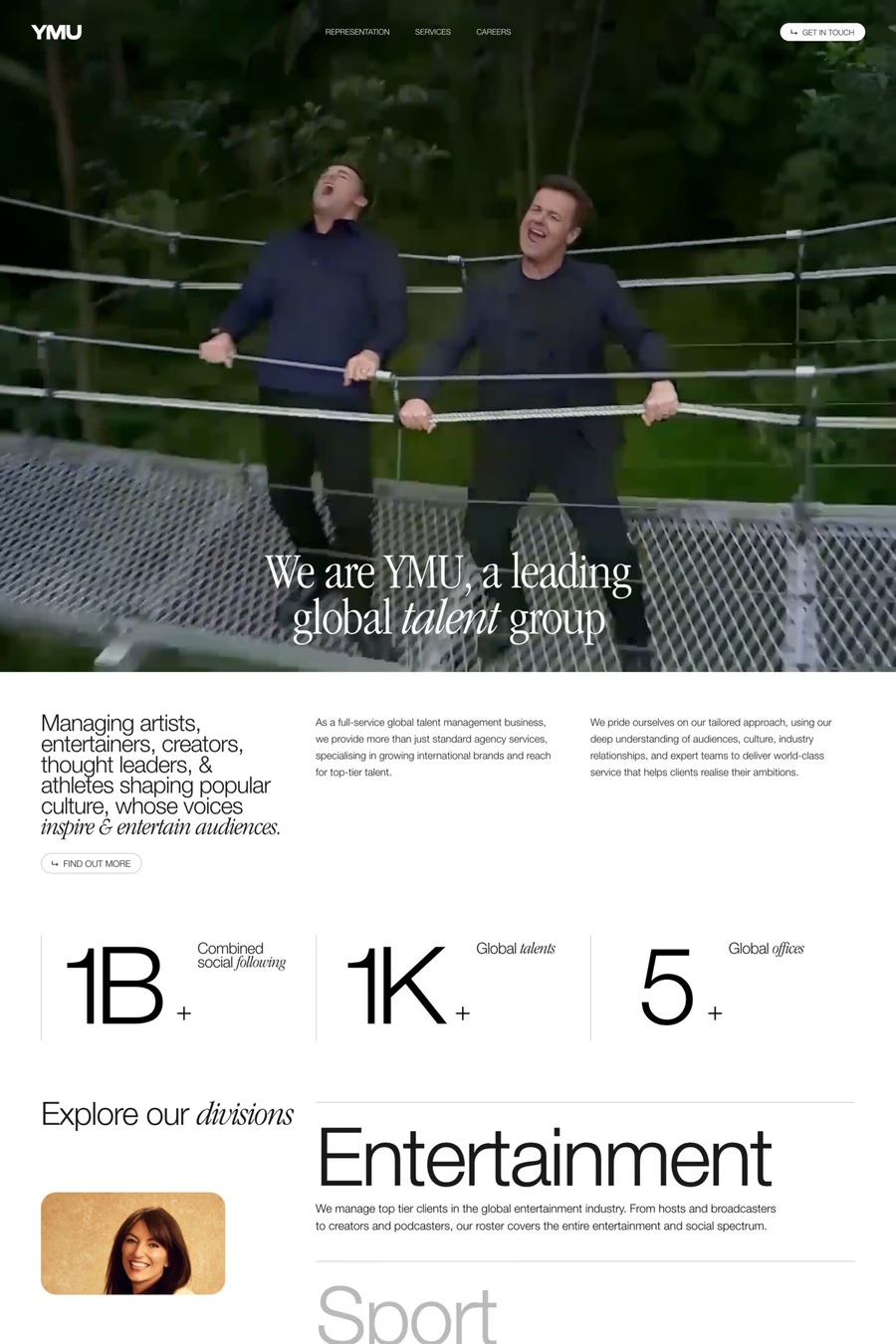
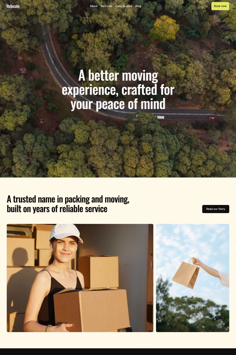
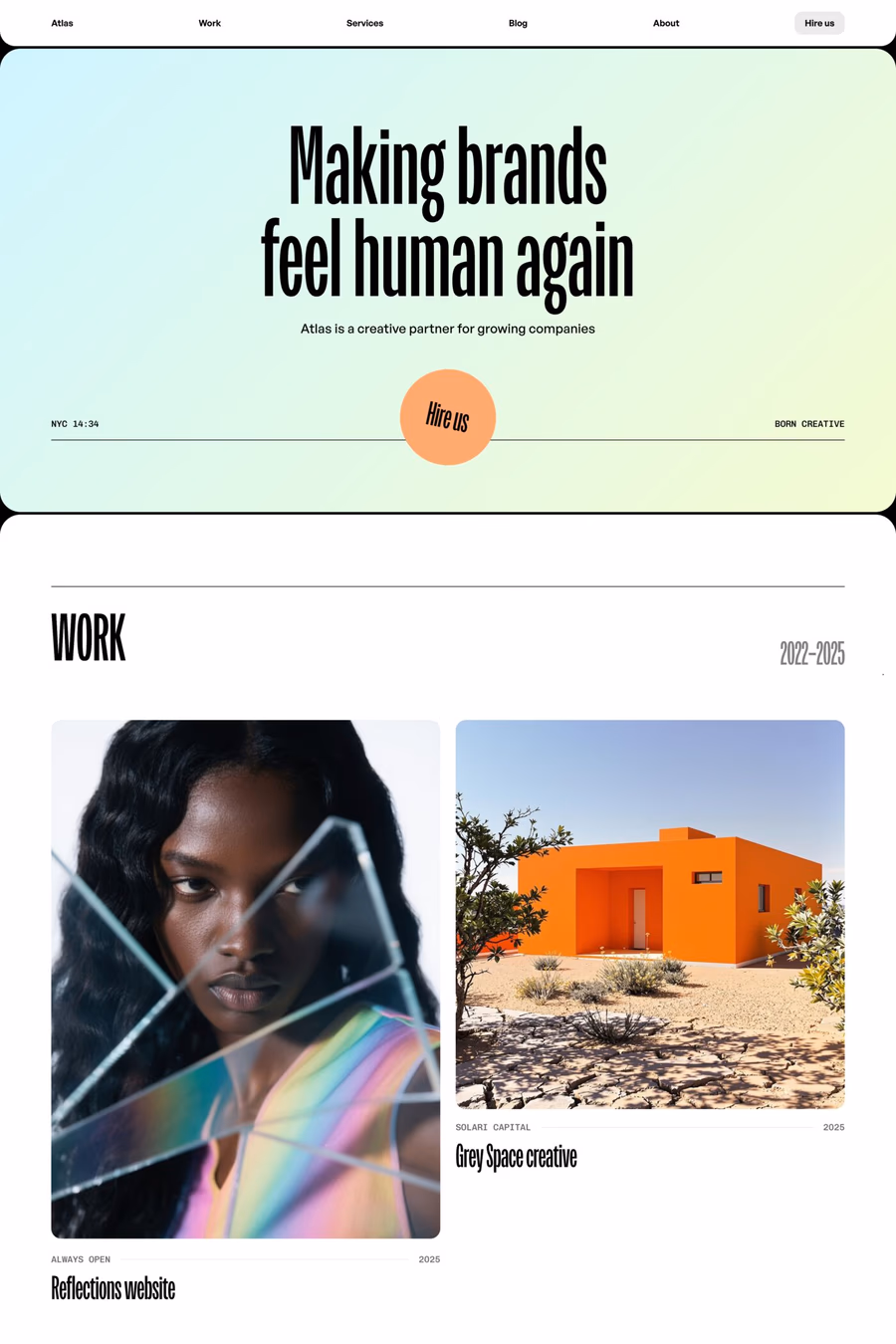
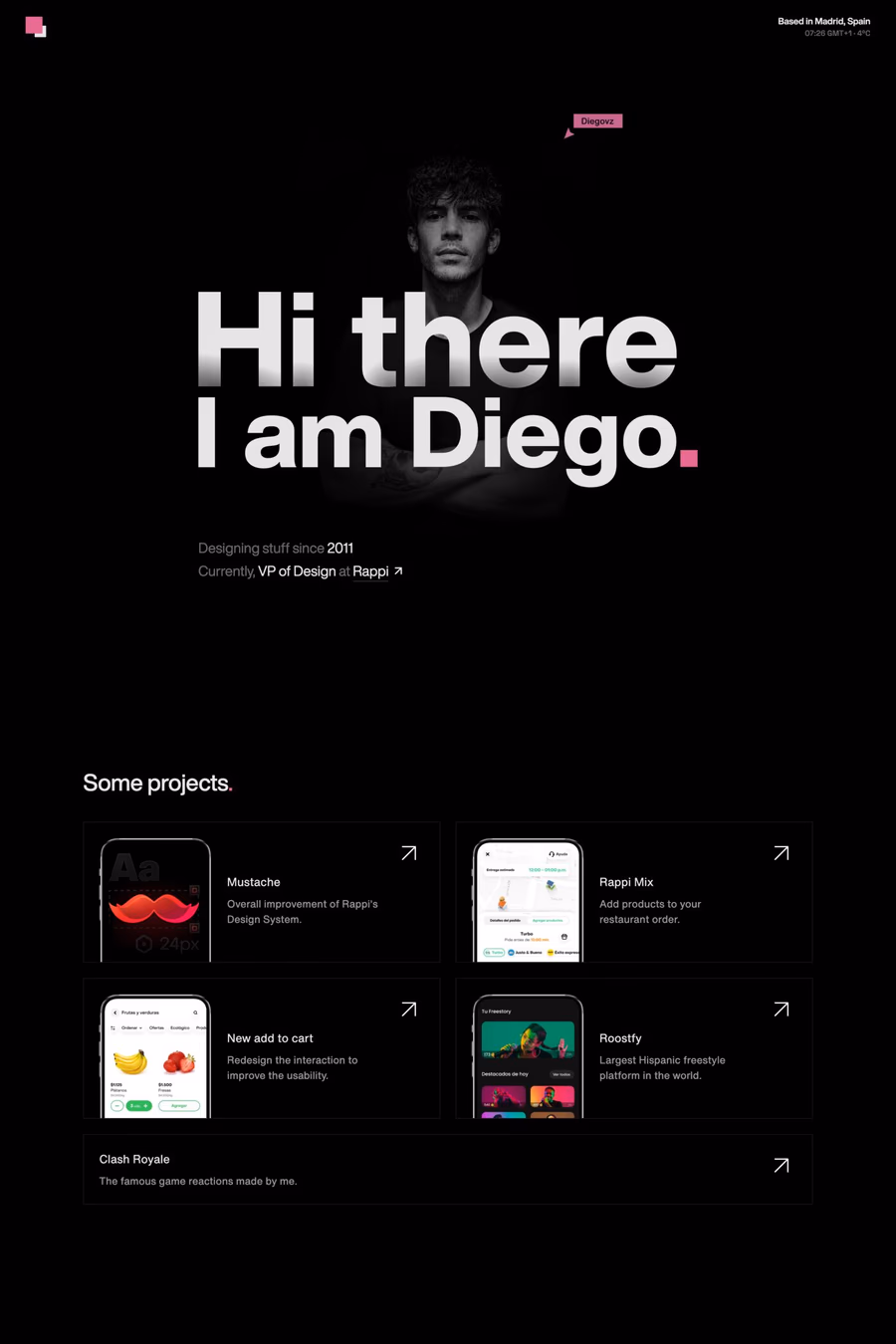
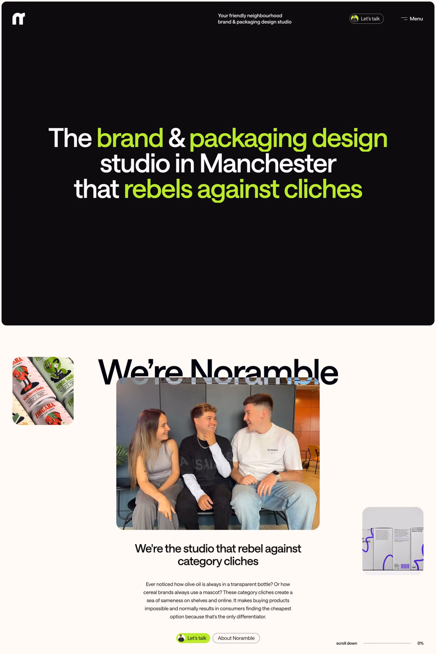
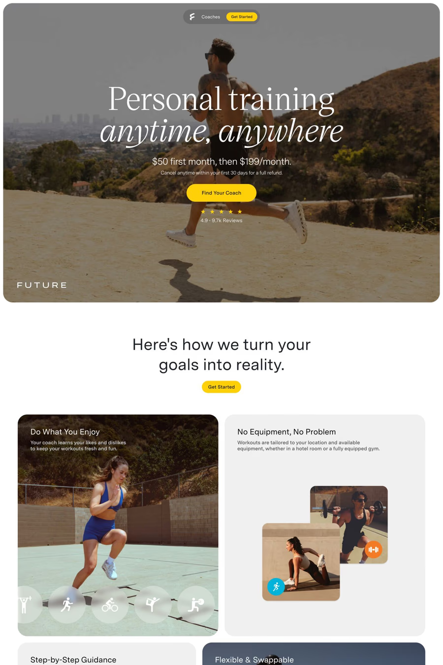
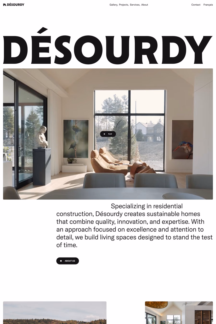
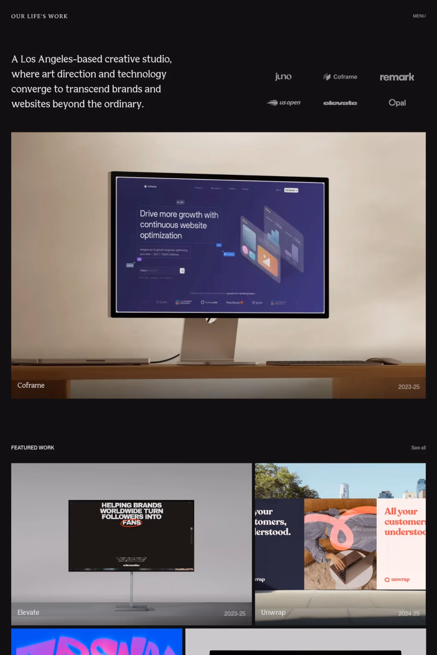
Photography-driven web design places high-quality images at the centre of the visual experience, using full-bleed photos, immersive galleries, and carefully art-directed imagery as the primary means of communication. The design serves as a frame for the photography rather than competing with it.
Curated inspiration sent every Tuesday
Unsubscribe at any time
Generous image sizing, minimal interface chrome, restrained typography that does not compete with the imagery, and careful attention to loading performance are all essential. The layout should elevate the photography, using whitespace and simple grids to let images command attention.
Modern techniques include responsive images with srcset, lazy loading, next-gen formats like WebP and AVIF, blur-up placeholder techniques, and CDN-based image optimisation. Progressive loading ensures images appear quickly even at high quality, maintaining the visual-first experience.