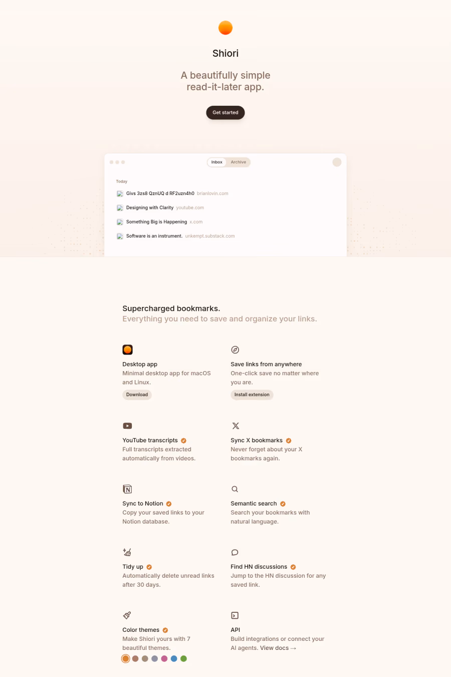
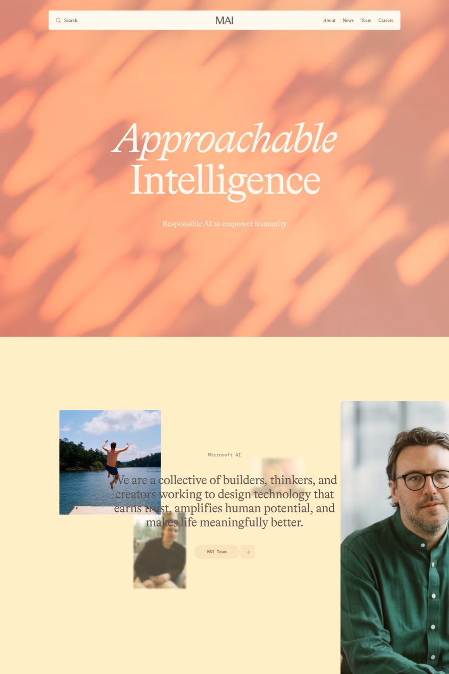
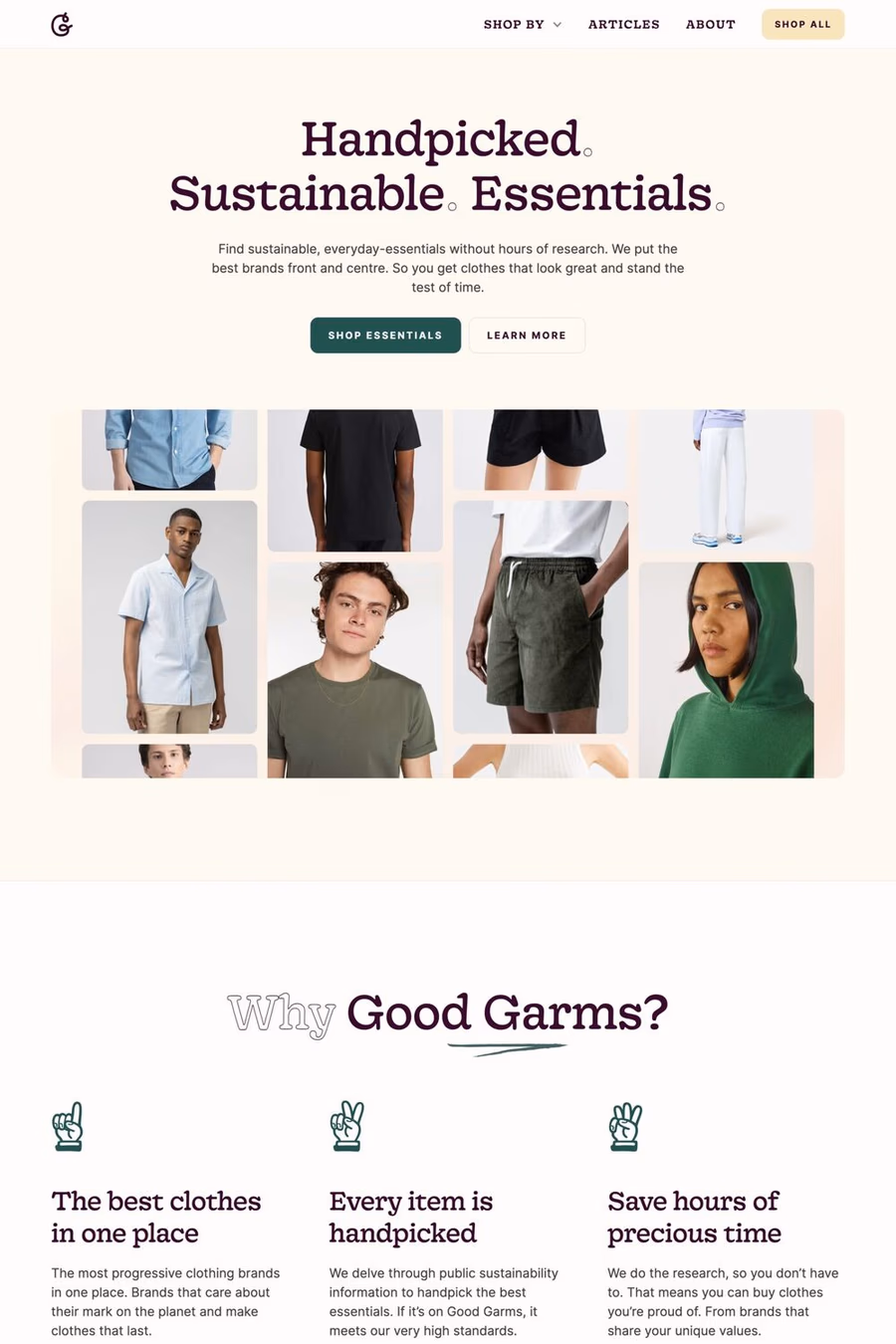
Cream provides a softer, warmer alternative to pure white backgrounds, reducing screen harshness while maintaining a clean, spacious feel. It adds a subtle sense of warmth and refinement that makes digital content feel less clinical and more considered.


Curated inspiration sent every Tuesday
Unsubscribe at any time
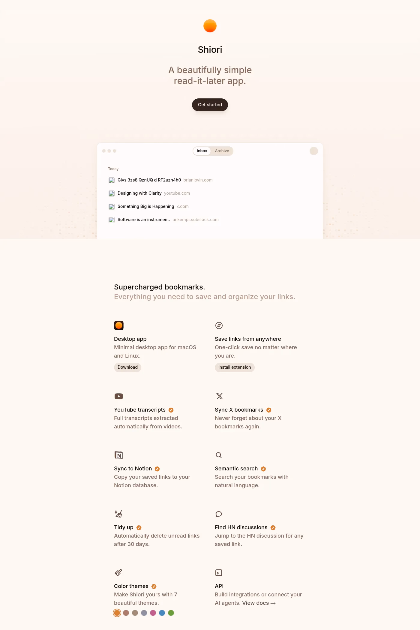

White backgrounds feel clinical and modern, while cream introduces warmth that makes content feel more inviting and less sterile. Cream also reduces the contrast between background and text slightly, which can be easier on the eyes during long reading sessions while still meeting accessibility standards.
Cream complements editorial and serif typography beautifully, evoking the feel of printed paper. It suits minimalist designs, organic and sustainable brands, and fashion or lifestyle sites. Pairing cream with dark brown or charcoal text creates a sophisticated, bookish quality.