Px Grotesk was designed from the rendering of typographic curves on screens. At smaller sizes, pixels sometimes brutally simplify shapes. Taking this paradox as his starting point, Nicolas Eigenheer designed a typeface that embeds a pixel-grid structure into a classic, optically adjusted drawing. The result of this method is a series of hybrid shapes that combine formal solutions from both domains. The signature pixelated look is preserved in the typeface and creates a contradictory relationship between a grid and a flexible line.
1,600+ designers get inspired every Tuesday
Unsubscribe at any time


Px Grotesk was designed from the rendering of typographic curves on screens. At smaller sizes, pixels sometimes brutally simplify shapes. Taking this paradox as his starting point, Nicolas Eigenheer designed a typeface that embeds a pixel-grid structure into a classic, optically adjusted drawing. The result of this method is a series of hybrid shapes that combine formal solutions from both domains. The signature pixelated look is preserved in the typeface and creates a contradictory relationship between a grid and a flexible line.
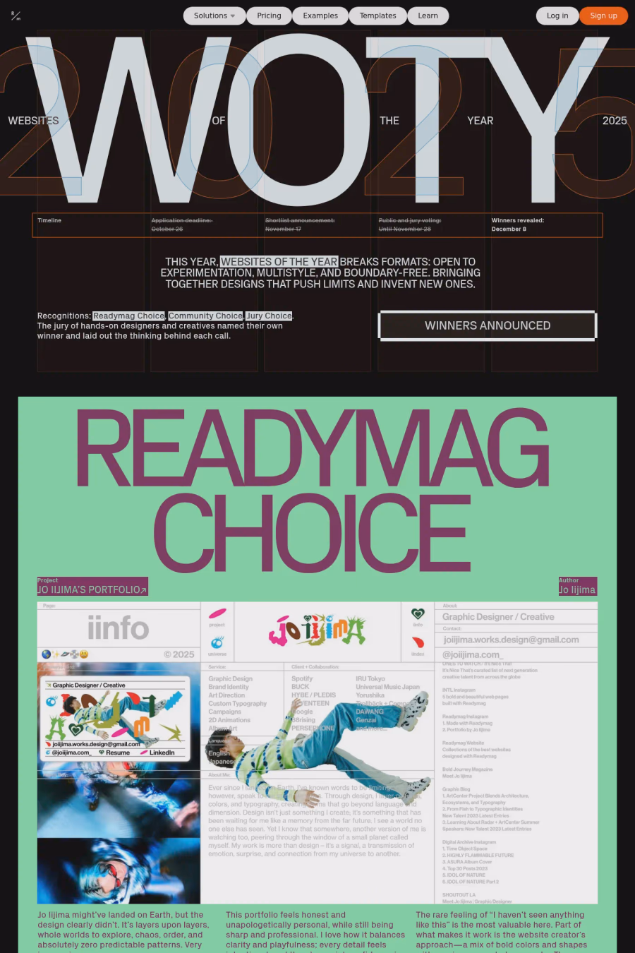
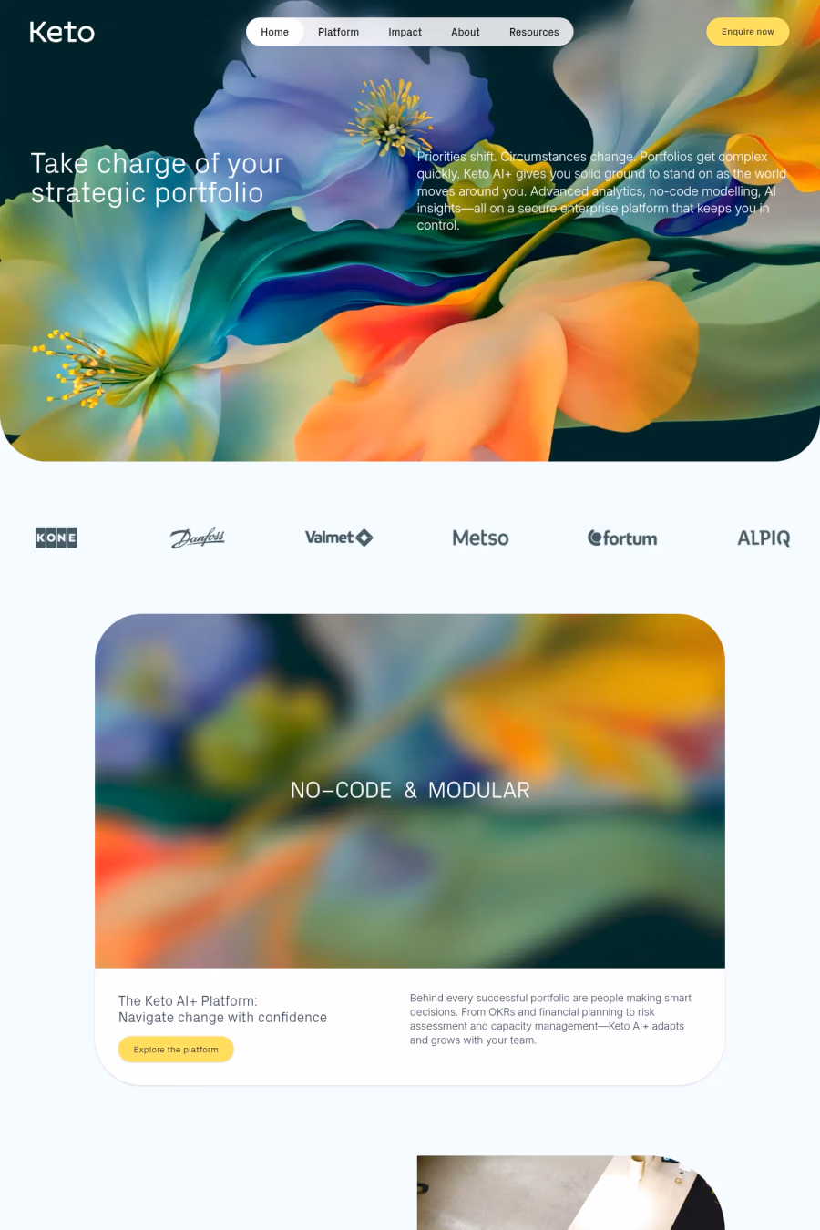
A1 features 4 websites using Px Grotesk, including Swim Club, Websites of the Year, and Keto. Browse these examples to see how designers pair it with different styles and layouts.
Websites using Px Grotesk on A1 tend towards Dark, Lines, and Sans-serif design styles. They’re most commonly built with Shopify, Readymag, and Wordpress.
You can get Px Grotesk from the link above. Many fonts are available through Google Fonts, Adobe Fonts, or as web font files.