ABC Monument Grotesk owes its point de départ to a few intriguing contours that the Swiss design studio Kasper-Florio stumbled across in an online scan of the foundry Palmer & Rey’s 1884 New Specimen Book. Compelled by the letterforms’ compact skeleton, high vertical contrast, and surprisingly sharp end strokes, Kasper-Florio digitized and reinterpreted the typeface for contemporary use.
1,400+ designers get inspired every Tuesday
Unsubscribe at any time


ABC Monument Grotesk owes its point de départ to a few intriguing contours that the Swiss design studio Kasper-Florio stumbled across in an online scan of the foundry Palmer & Rey’s 1884 New Specimen Book. Compelled by the letterforms’ compact skeleton, high vertical contrast, and surprisingly sharp end strokes, Kasper-Florio digitized and reinterpreted the typeface for contemporary use.
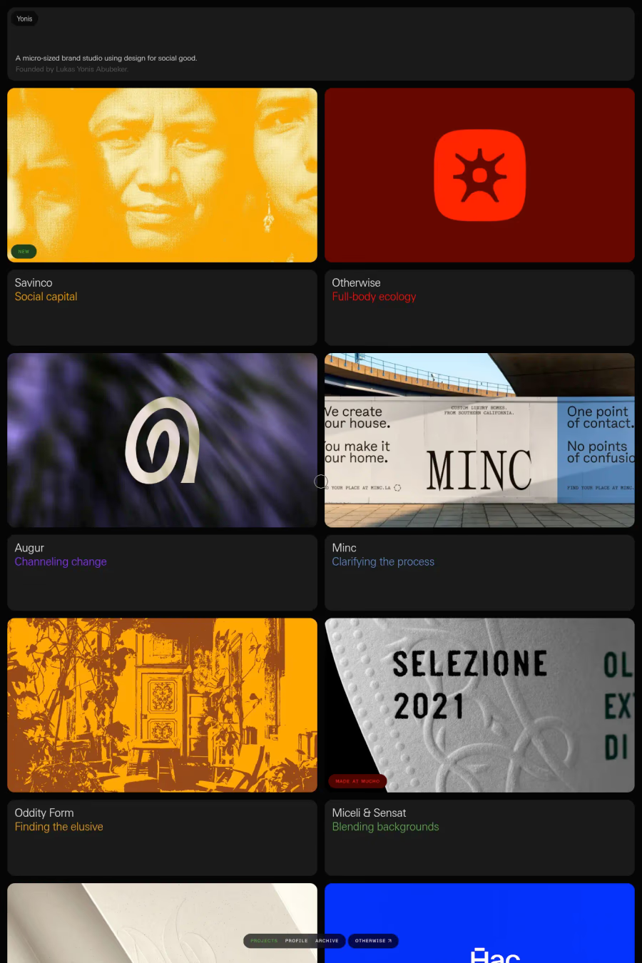
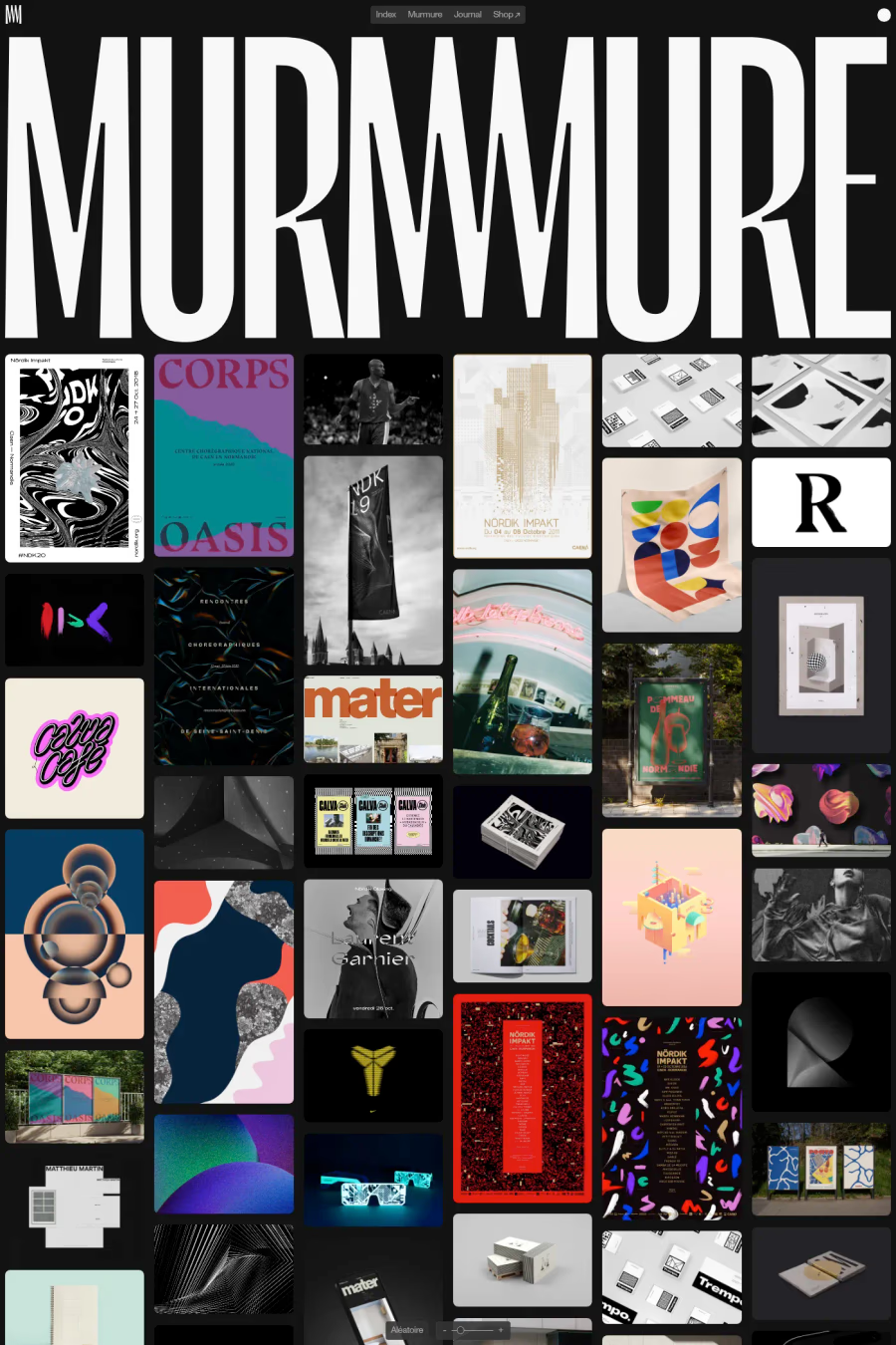
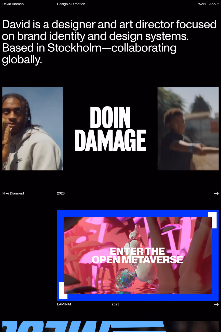
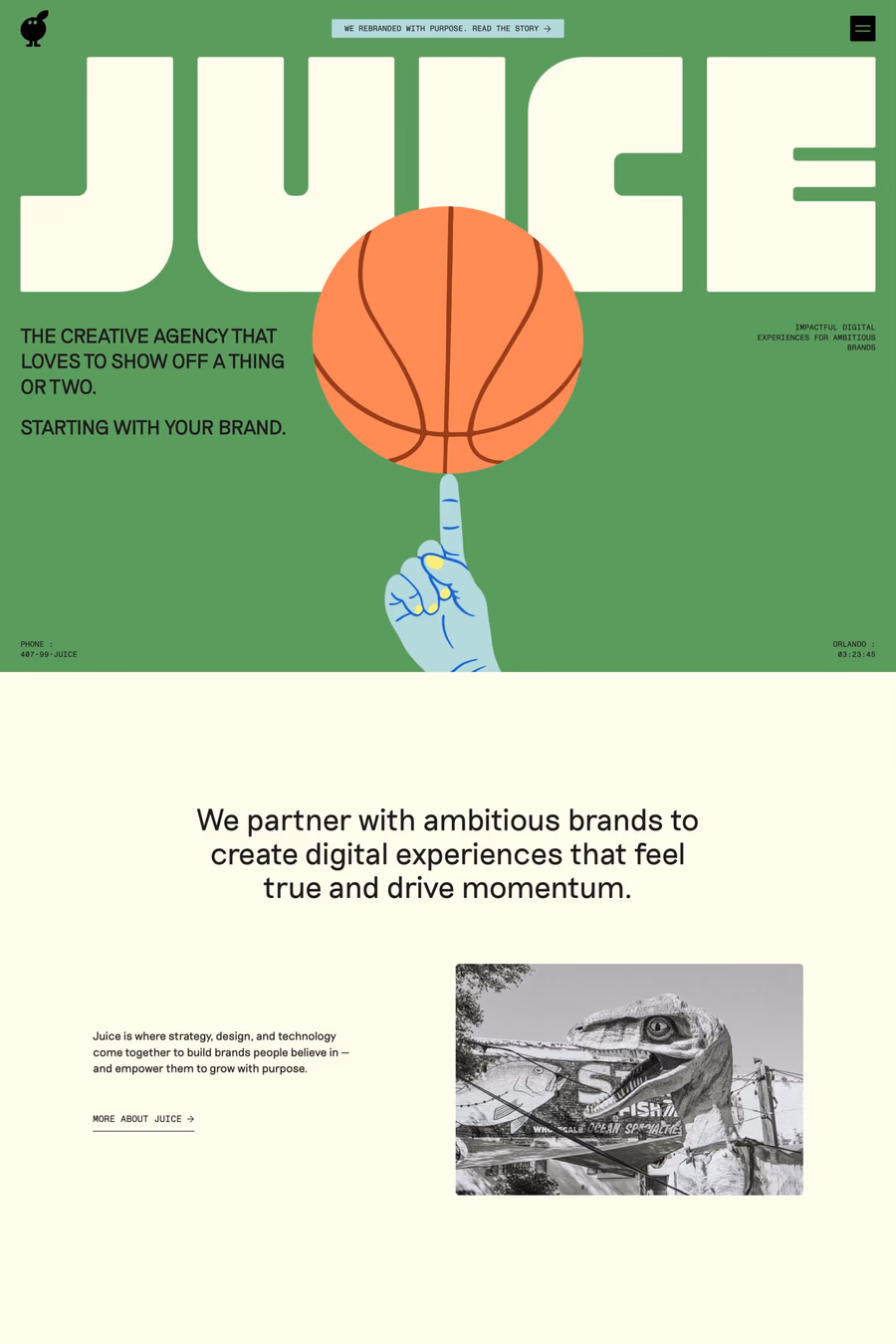
A1 features 13 websites using Monument Grotesk, including VALIENTE®, Glass abstract shapes, and Yonis. Browse these examples to see how designers pair it with different styles and layouts.
Websites using Monument Grotesk on A1 tend towards Big type, Sans-serif, and Varied layout design styles. They’re most commonly built with Webflow, Nuxt, and Next.js.
You can get Monument Grotesk from the link above. Many fonts are available through Google Fonts, Adobe Fonts, or as web font files.