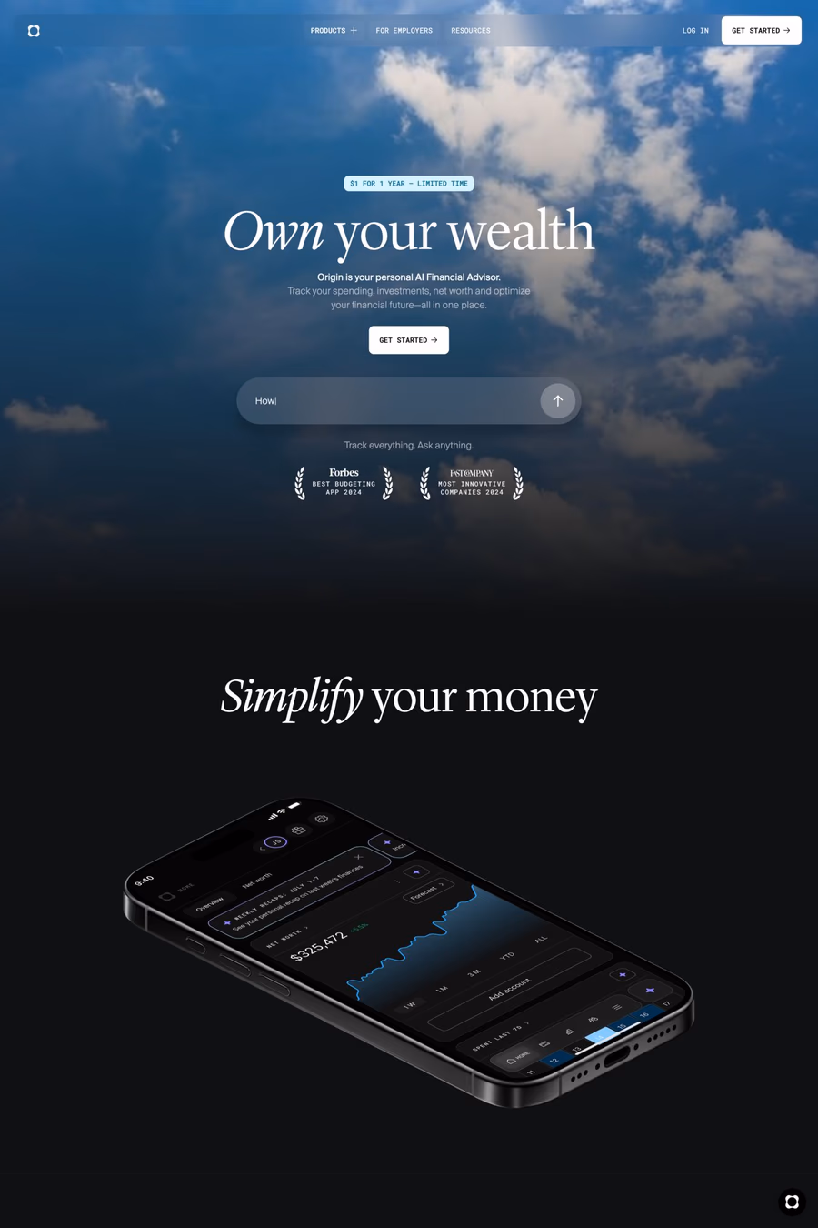
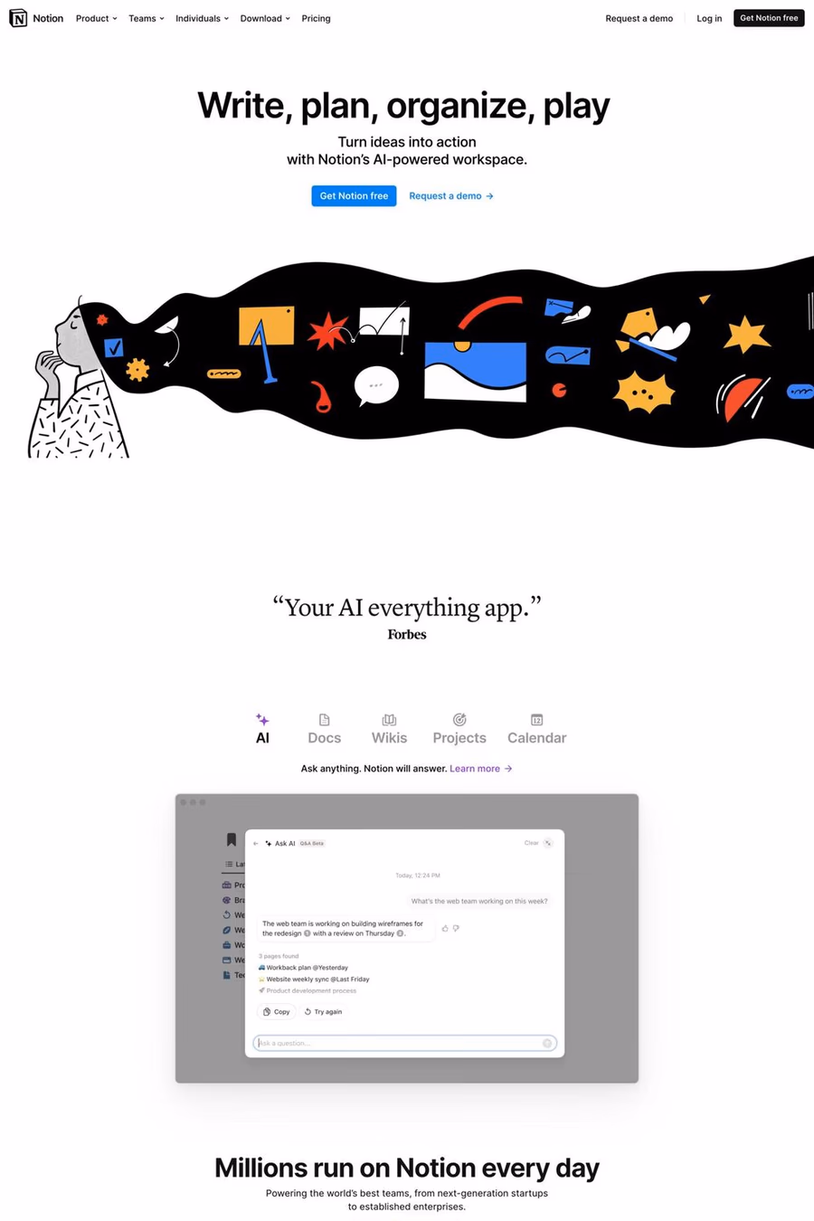
Lyon Text Roman was the centerpiece of Kai Bernau's degree project at the Type + Media course at the Royal Academy of Art (KABK) in The Hague, but was extensively revised and expanded before its debut in the New York Times Magazine in 2009. Like many of the great seriffed typefaces it draws intelligently from the work of Robert Granjon, the master of the Renaissance, while having a contemporary feel. Its elegant looks are matched with an intelligent, anonymous nature, making it excellent for magazines, book and newspapers.
1,450+ designers get inspired every Tuesday
Unsubscribe at any time


Lyon Text Roman was the centerpiece of Kai Bernau's degree project at the Type + Media course at the Royal Academy of Art (KABK) in The Hague, but was extensively revised and expanded before its debut in the New York Times Magazine in 2009. Like many of the great seriffed typefaces it draws intelligently from the work of Robert Granjon, the master of the Renaissance, while having a contemporary feel. Its elegant looks are matched with an intelligent, anonymous nature, making it excellent for magazines, book and newspapers.
A1 features 3 websites using Lyon, including Wist, Origin, and Notion. Browse these examples to see how designers pair it with different styles and layouts.
Websites using Lyon on A1 tend towards Sans-serif, Light, and Outline design styles. They’re most commonly built with Next.js.
You can get Lyon from the link above. Many fonts are available through Google Fonts, Adobe Fonts, or as web font files.