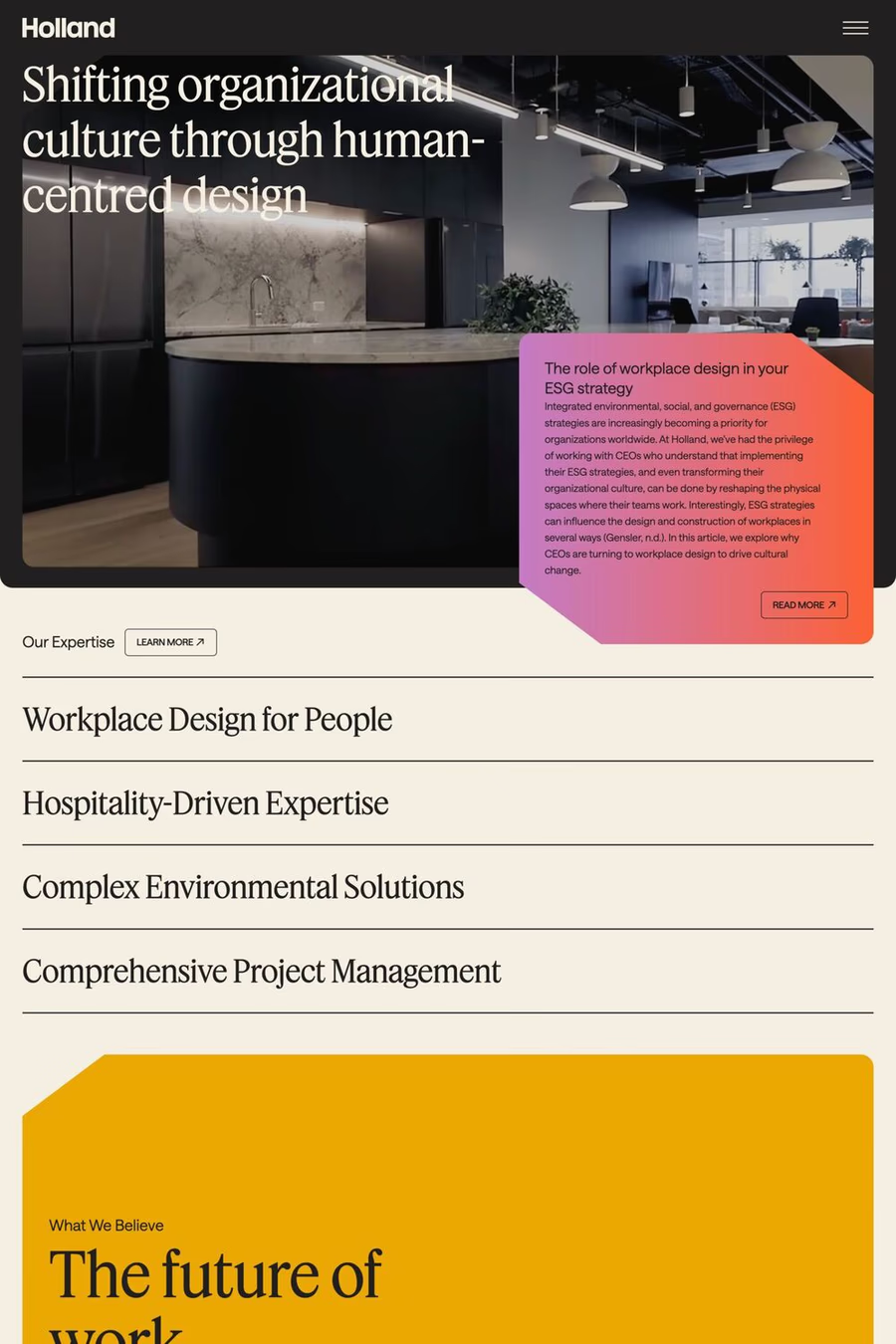
Christian Schwartz and Berton Hasebe designed Feature for T: The New York Times Style Magazine in 2018. Diagonal stress, mismatched contrast between main strokes and serifs, and sharply angled head serifs conspire to give the face tension, dynamism, and immediacy. The collection has been expanded for this release by Hrvoje Živčić, who expanded the weight range and drew italics for the entire collection.
1,600+ designers get inspired every Tuesday
Unsubscribe at any time


Christian Schwartz and Berton Hasebe designed Feature for T: The New York Times Style Magazine in 2018. Diagonal stress, mismatched contrast between main strokes and serifs, and sharply angled head serifs conspire to give the face tension, dynamism, and immediacy. The collection has been expanded for this release by Hrvoje Živčić, who expanded the weight range and drew italics for the entire collection.
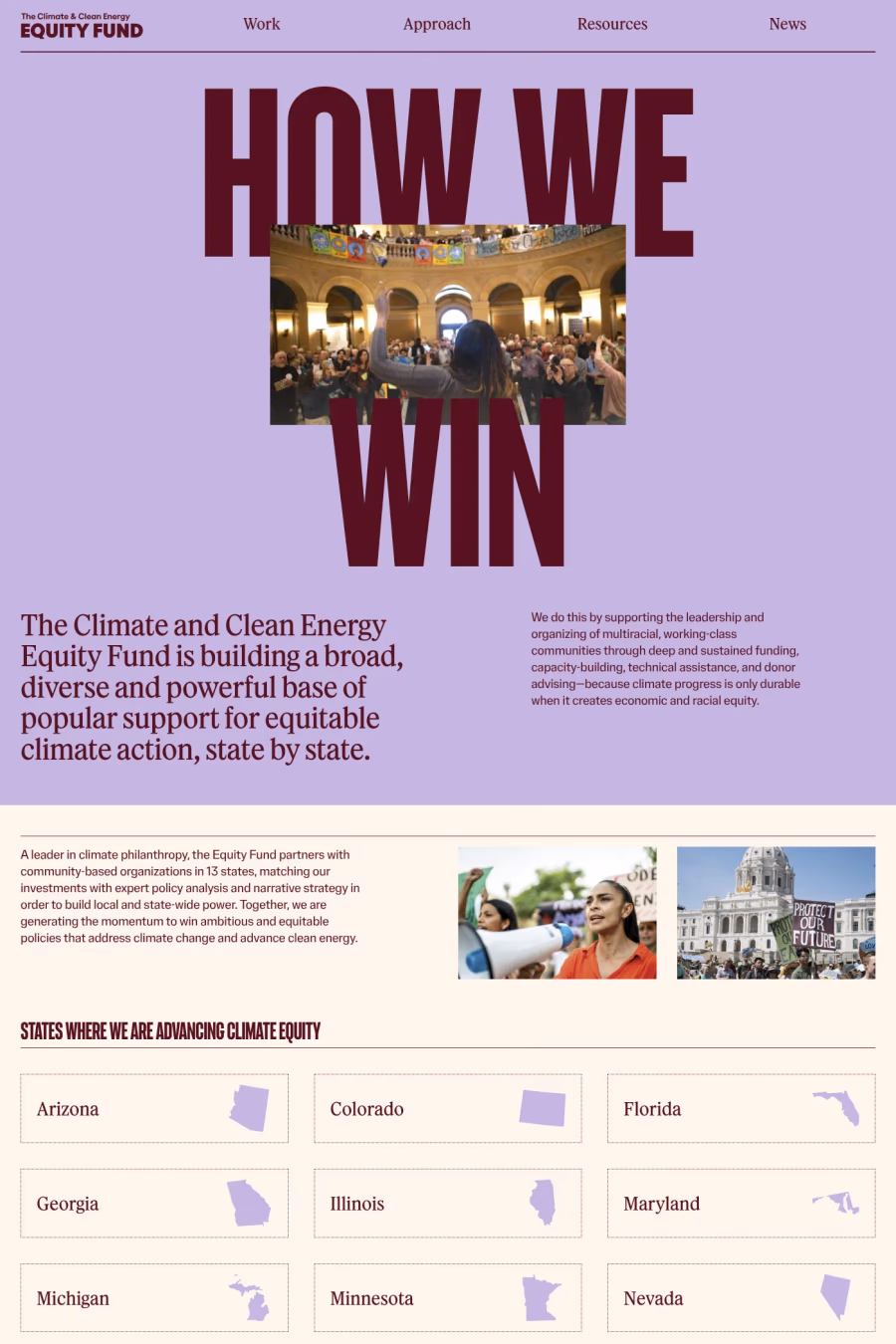
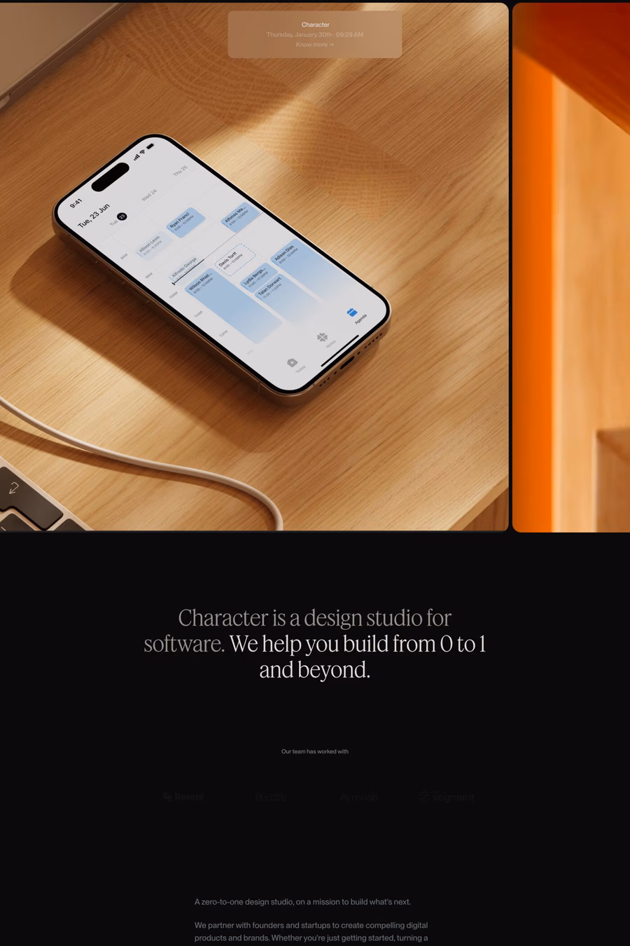
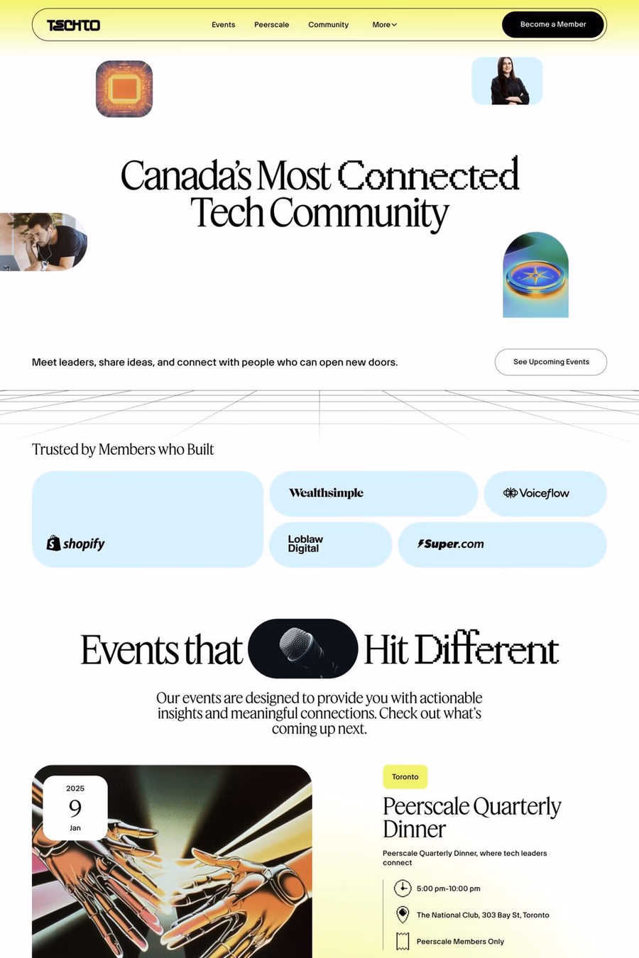
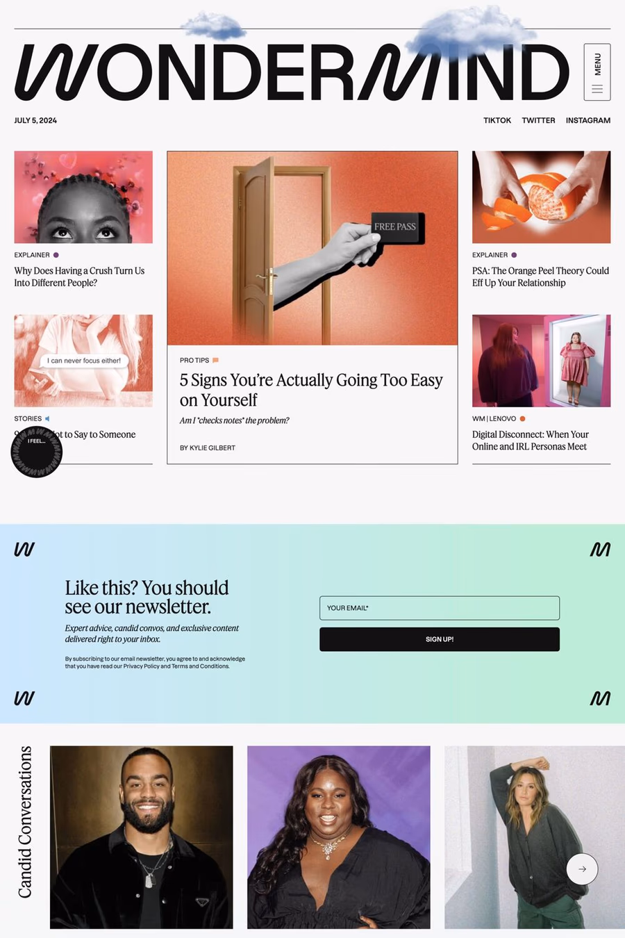
A1 features 10 websites using Feature, including Lovart, Peerscale, and Early Works. Browse these examples to see how designers pair it with different styles and layouts.
Websites using Feature on A1 tend towards Serif, Lines, and Photography design styles. They’re most commonly built with Webflow, Next.js, and Wordpress.
You can get Feature from the link above. Many fonts are available through Google Fonts, Adobe Fonts, or as web font files.