Roboto has a dual nature. It has a mechanical skeleton and the forms are largely geometric. At the same time, the font features friendly and open curves. While some grotesks distort their letterforms to force a rigid rhythm, Roboto doesn’t compromise, allowing letters to be settled into their natural width. This makes for a more natural reading rhythm more commonly found in humanist and serif types.
1,450+ designers get inspired every Tuesday
Unsubscribe at any time


Roboto has a dual nature. It has a mechanical skeleton and the forms are largely geometric. At the same time, the font features friendly and open curves. While some grotesks distort their letterforms to force a rigid rhythm, Roboto doesn’t compromise, allowing letters to be settled into their natural width. This makes for a more natural reading rhythm more commonly found in humanist and serif types.
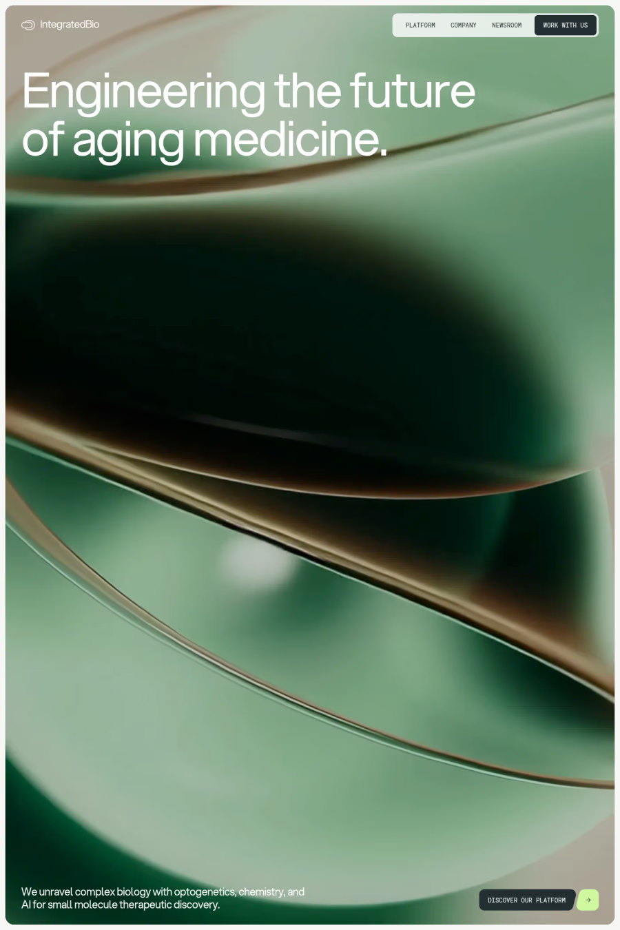
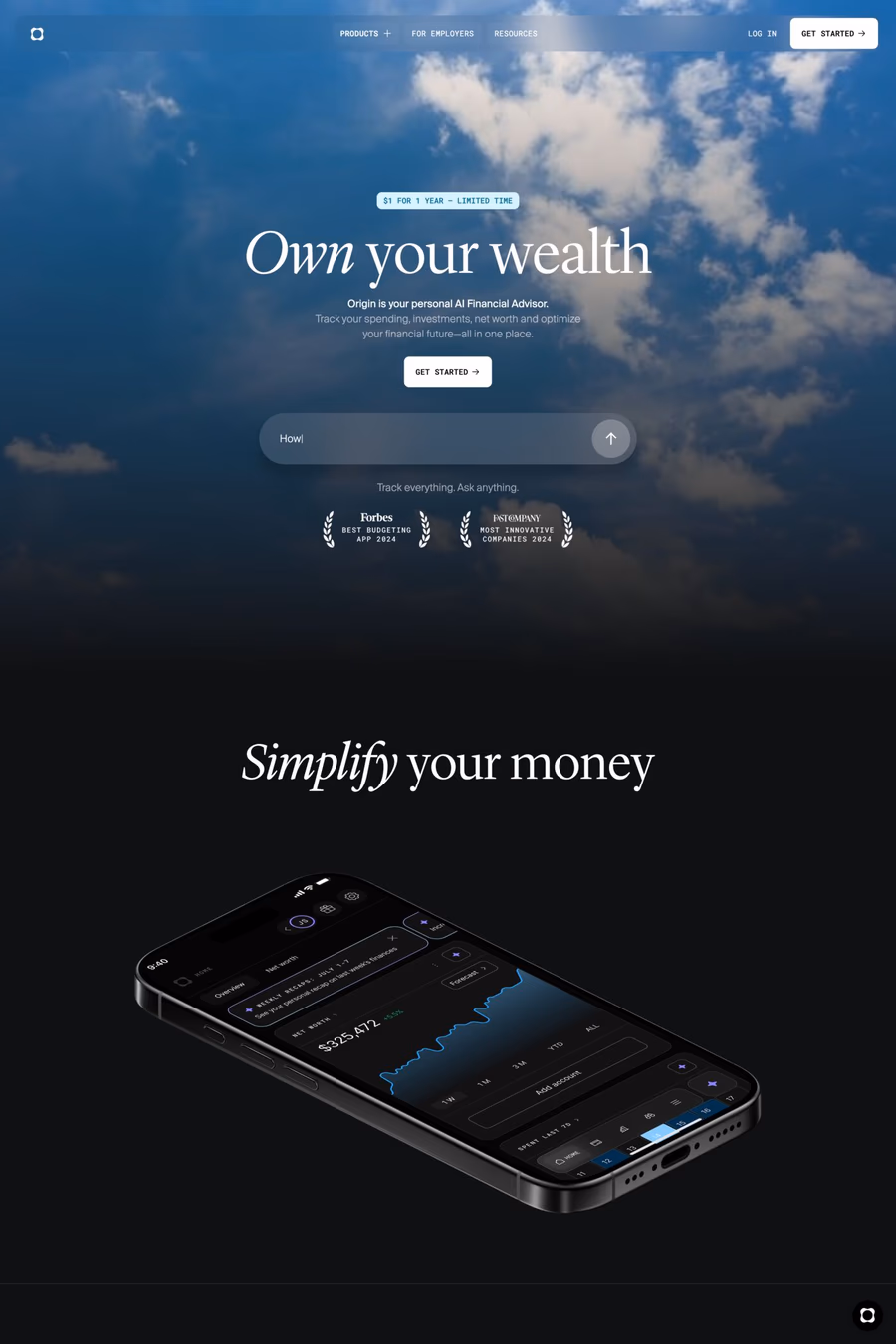
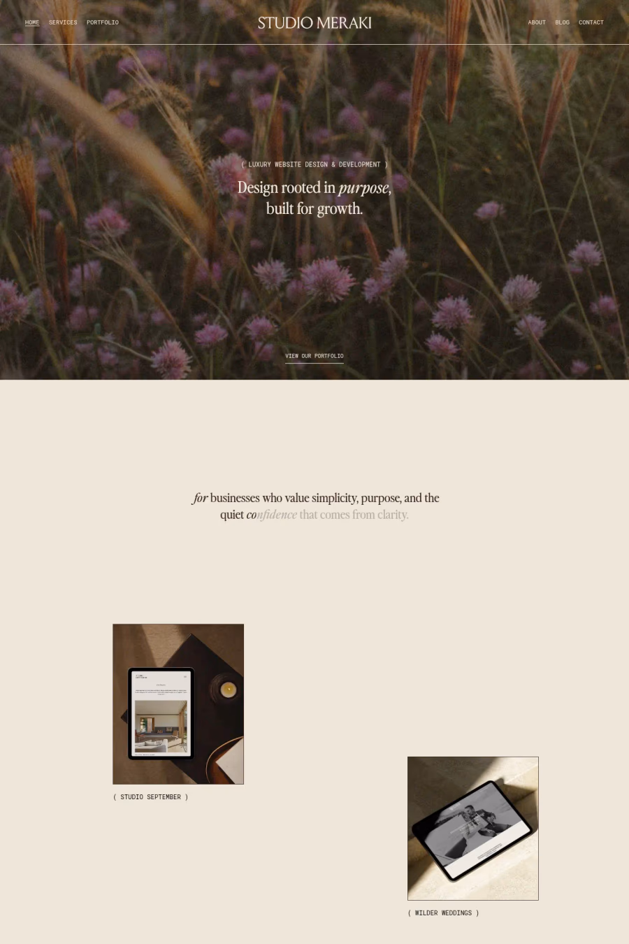
A1 features 11 websites using Roboto, including Studio Meraki, Integrated Biosciences, and Origin. Browse these examples to see how designers pair it with different styles and layouts.
Websites using Roboto on A1 tend towards Photography, Sans-serif, and Scroll animation design styles. They’re most commonly built with Wordpress, Framer, and Next.js.
You can get Roboto from the link above. Many fonts are available through Google Fonts, Adobe Fonts, or as web font files.