Blanco is a serif typeface with 4 weights designed primarily for comfortable, extended reading at smaller text sizes on screen and in print. Its strong, consistent rhythm creates an even value and texture that gives text blocks a calm tone of voice. The unfussy, sturdy details provide a contemporary, understated and thoughtful character. This character allows it to be easily paired with other typefaces, making it a versatile addition (or beginning) to a type library as a utilitarian face. While there are optical corrections in the forms to make Blanco work effectively at smaller sizes, these corrections remain unobtrusive at larger sizes, revealing a warmth and consideration to the details of the design.
1,450+ designers get inspired every Tuesday
Unsubscribe at any time


Blanco is a serif typeface with 4 weights designed primarily for comfortable, extended reading at smaller text sizes on screen and in print. Its strong, consistent rhythm creates an even value and texture that gives text blocks a calm tone of voice. The unfussy, sturdy details provide a contemporary, understated and thoughtful character. This character allows it to be easily paired with other typefaces, making it a versatile addition (or beginning) to a type library as a utilitarian face. While there are optical corrections in the forms to make Blanco work effectively at smaller sizes, these corrections remain unobtrusive at larger sizes, revealing a warmth and consideration to the details of the design.
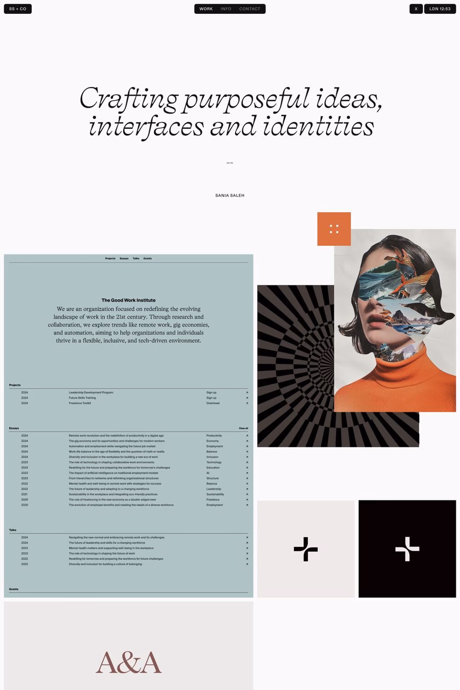
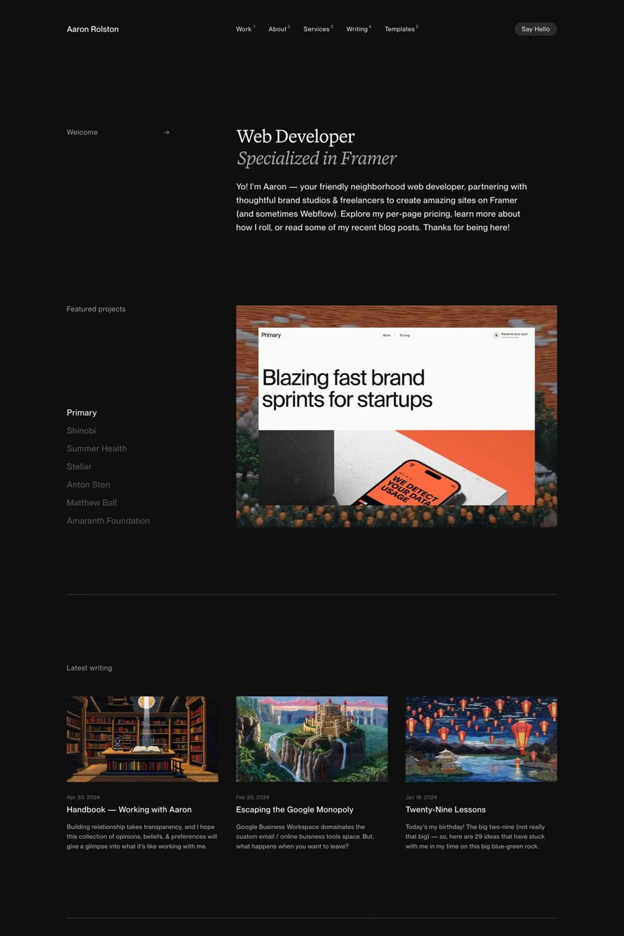
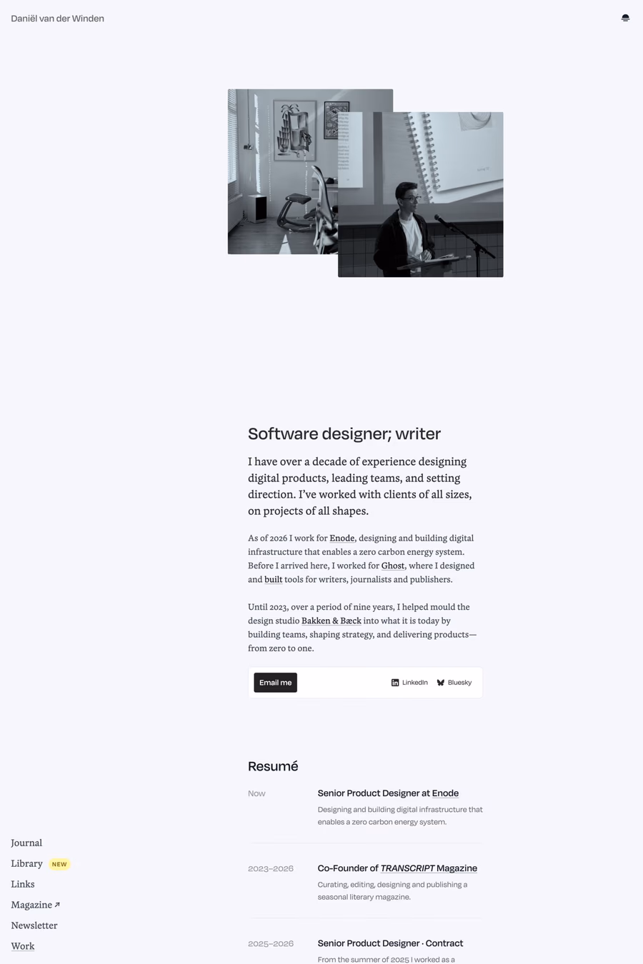
A1 features 3 websites using Blanco, including Daniël van der Winden, Sania Saleh, and Aaron Rolston. Browse these examples to see how designers pair it with different styles and layouts.
Websites using Blanco on A1 tend towards Minimal, Sans-serif, and Light design styles. They’re most commonly built with Webflow and Framer.
You can get Blanco from the link above. Many fonts are available through Google Fonts, Adobe Fonts, or as web font files.