5 fun and playful designer portfolios

Four playful designer portfolios that use bold colour, animation and humour to stand out in 2026.

Bryn TaylorBryn Taylor·17 May 2025
Screenshot from 5 fun and playful designer portfolios

Most designer portfolios are conservative by design — the work is supposed to speak, so the container tries not to. These five take the opposite position: the portfolio itself is the argument. Each one uses personality as a differentiator rather than a risk, in ways that range from typographic conviction to cursor interactions to illustration systems. Browse all designer profiles on A1 for more, or explore colourful landing pages for broader inspiration.
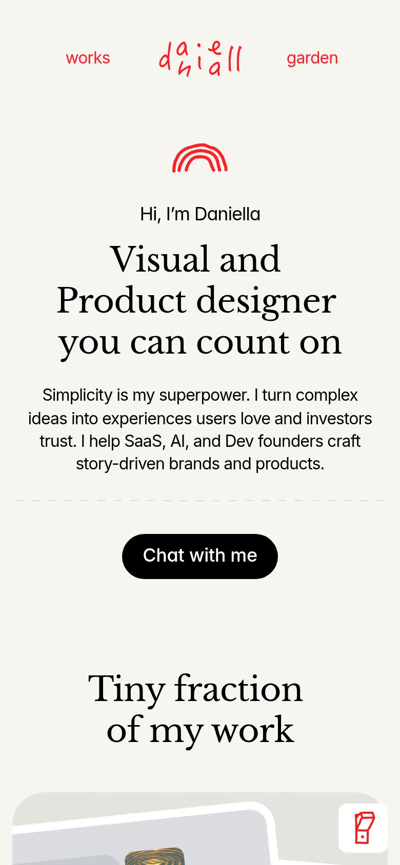
Daniella MarynovaDaniella Marynova mobile

Daniella Marynova

The floral illustrations are embedded into the page architecture rather than sitting as decorative borders — they're part of the structure rather than an overlay. The animations are slow enough to feel intentional, which is harder to calibrate than it sounds: most portfolio animation either rushes or overshoots. The palette runs warm cream and dusty pink, which keeps the botanical elements from tipping into novelty.
Zenwood StudioZenwood Studio mobile

Zenwood Studio

Sky blue backgrounds and drifting clouds sounds like a mood board for a children's brand. In practice it works because the interactions are genuinely surprising rather than just decorative — the clouds respond to cursor movement, and the hover states on project cards are more considered than you'd expect from a site leading with weather. The playfulness is earned rather than applied.
Mat VoyceMat Voyce mobile

Mat Voyce

Type is both the work and the presentation system — the letterforms in motion are from Mat's own type projects, so the portfolio demonstrates the thing being sold. The animation is restrained: nothing that could be described as flashy. For a type designer's portfolio, that restraint is deliberate; the craft is in the forms, not the transitions.
Spencer GaborSpencer Gabor mobile

Spencer Gabor

Green backgrounds and yellow type shouldn't cohere as well as they do here. The broken grid layouts are genuinely broken rather than artfully misaligned — elements overlap and clip in ways that look intentional because the underlying typographic decisions are confident enough to support them. Most designers attempt this kind of compositional risk once and retreat; Spencer's carried it across the whole portfolio.
ValentinValentin mobile

Valentin

Dark base with neon elements and hand-drawn illustrations — a combination that usually reads as inconsistent. Here the hand-drawn elements are restrained enough to feel like texture rather than ornament, and the neons are used sparingly: green on hover states, not spread across the whole page. The portfolio moves between dark and very dark rather than light and dark, which gives the whole thing a nocturnal quality that suits the work.

These portfolios prove that injecting personality into your work doesn't mean sacrificing professionalism. Whether through animation, colour, or unexpected layouts, each designer has found a way to stand out while still showcasing their skills effectively.

Frequently asked questions

What makes a designer portfolio stand out?

The portfolios that stand out have a visual point of view that runs through every decision — not just the work shown, but how the site itself behaves. Zenwood Studio’s cursor-reactive clouds, Mat Voyce’s type-in-motion as both content and container, Spencer Gabor’s broken grid held together by typographic confidence: each one makes the portfolio the argument rather than the frame. The risk is that personality can overwhelm the work. The ones here earn it because the design conviction is consistent, not scattered.

Should a designer portfolio be playful or professional?

The distinction is a false one. Daniella Marynova’s floral illustration system is playful and the animations are precisely calibrated — that precision is professionalism. Valentin’s dark/neon palette is expressive and the restraint with which it’s applied is disciplined. Personality becomes a liability when it’s inconsistent or when it competes with the work rather than contextualising it. When the visual language is held together with conviction, playful and professional aren’t opposites.

Which designer portfolios are worth studying for animation?

Zenwood Studio for cursor-reactive elements — the clouds respond to movement in a way that feels surprising rather than gimmicky. Daniella Marynova for pacing: the animations are slow enough to feel intentional, which is harder to calibrate than it sounds. Mat Voyce for restraint — the letterforms move, and nothing else does, which means the motion means something. All three use animation to reinforce what the site is about rather than to decorate it.

Share post

Get the 10 best sites in your inbox weekly

1,550+ designers get inspired every Tuesday

Midlands
Viacheslav Novoseltsev
Wynn