Framer has become the default for designers building their own sites — fast to ship, capable of custom animation, flexible enough that the result doesn’t look like a platform. That flexibility shows most clearly in designer portfolios, where the builder is also the client. These fourteen span the full range: motion designers with Webby Awards, branding studios with their availability in the headline, solo designers who’ve made restraint into a visual language. None of them look like Framer defaults.


Gabriel Valdivia
Project cards have three tiers of corner rounding — 20px on mobile, 30px tablet, 40px desktop — a detail you feel before you notice it. Images scale to 1.03× on hover via CSS transform, restrained enough to read as responsive rather than animated. The grid steps from single column to two to three as space allows, with generous gaps that stop it feeling dense even at three columns.
A marquee of client logos scrolls at 80 seconds — slow enough to be ambient. Page transitions fade with a 12px upward shift. The contact section has a live chat component embedded directly in it, which means the first test of what he builds is the site itself behaving like a product.


Yianni Mathioudakis
The logo is Y–M — just initials and a dash, typographic not graphic. Projects aren’t image cards; they’re titled links with medium tags (3D, Motion, Web, Brand) and tool names (Spline, Cavalry). That structural choice keeps the focus on category and craft rather than thumbnail aesthetics, and trusts people to click through to the actual work.
Separating 3D, Motion, and Web as distinct sections — rather than mixing them in a single grid — is a real curatorial decision. Each medium has its own visual language. A 2025 Webby Award for Adeo is listed in the press section, not styled as a badge in the hero.


Piet Aukeman
The domain — piet.website — is the entire brand identity compressed into a URL. The hero has an audio player embedded in the introduction, 1 minute 34 seconds long. That changes the pace of the experience from scan to listen. It’s a real design decision.
The Miscellaneous section scrolls horizontally and includes animated GIFs — a distressed Twitter flag, an AFK screen — alongside 36 Days of Type entries and poster work. These aren’t throwaways. They’re the clearest signal of how he thinks when no one’s asking.


Arnaldo Petrazzini
Ten projects listed in a plain vertical column — no thumbnails, no hover previews, no case study cards. The only interaction is a copy-email button that shows “Copied” when triggered. The domain is arnaldo.zip. The footer says “Made in Southern Brazil.” All of it operates on the logic that decoration would be noise.


Daniel Sun
Projects run from 2020 to present in a chronological list, each tagged with service types — Branding, Web Design, Development, Illustrations — which makes the range of the practice readable without a grid. The domain is danielsun.space, a deliberate step away from .com conventions. The About section opens in Kyiv and ends in Porto, doing the personality work the visual restraint leaves room for.
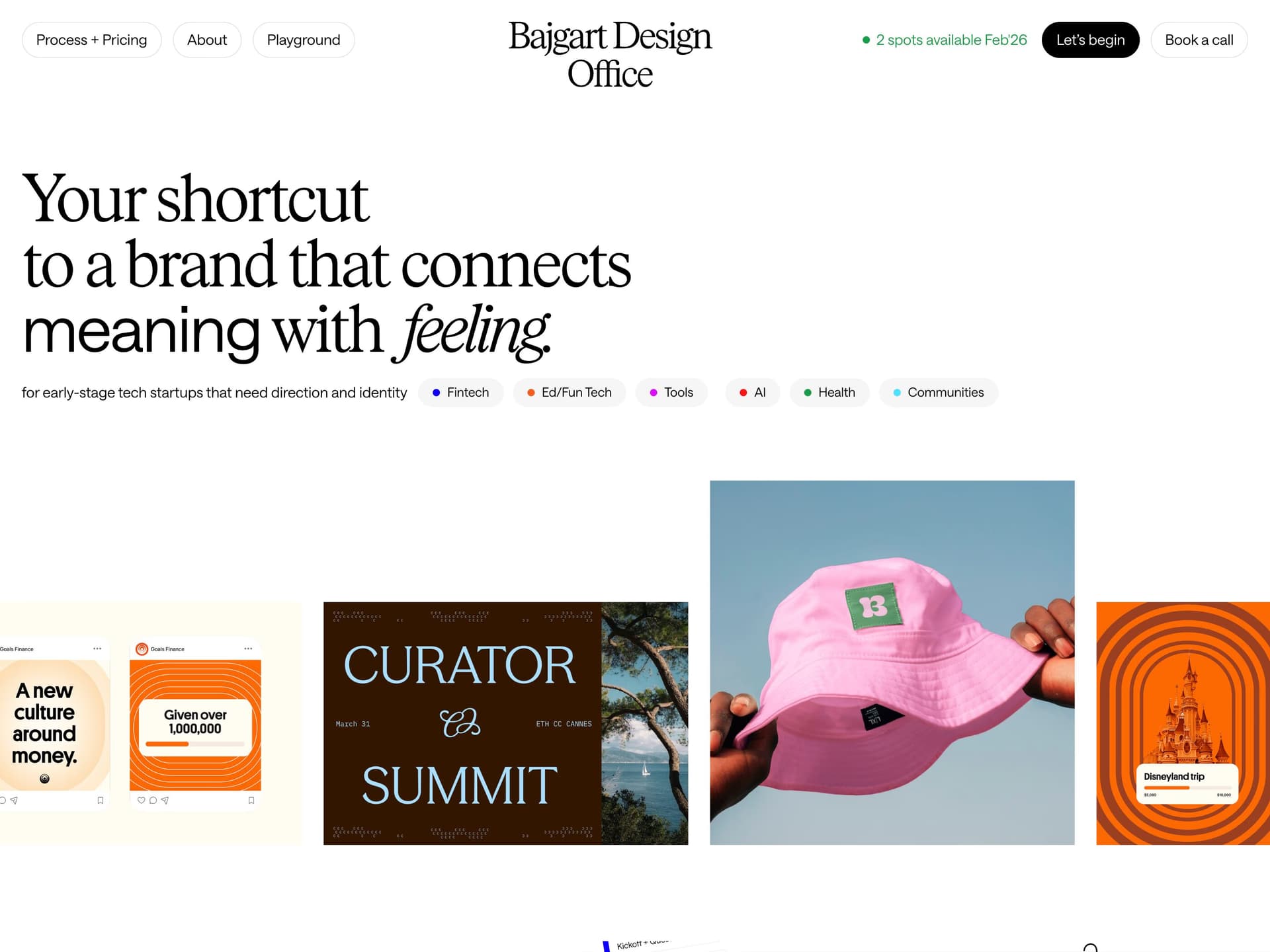
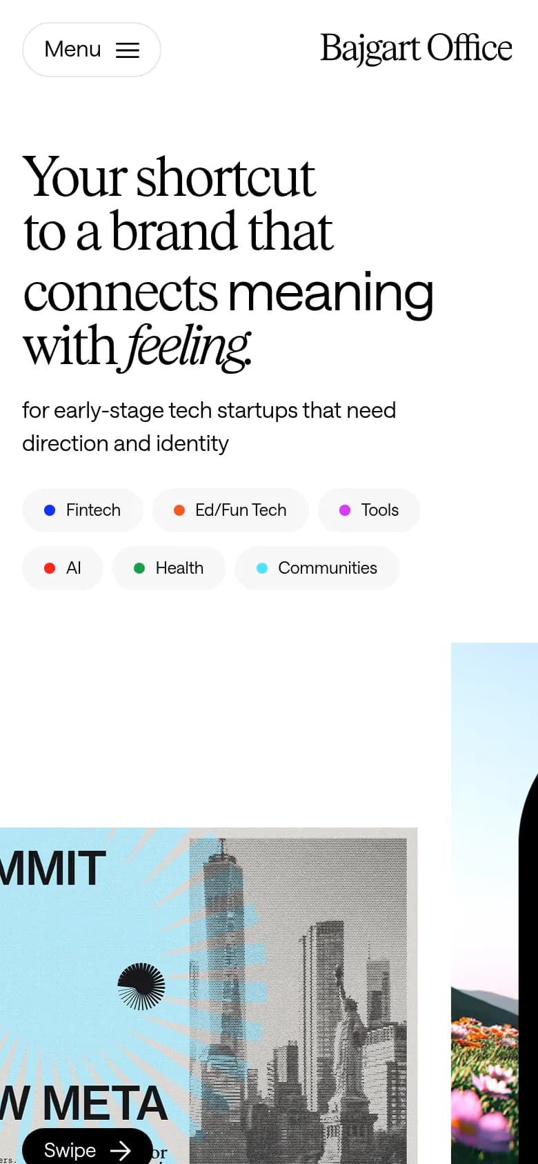
Bajgart Design Office
The hero opens with “Brand ready in two weeks” and “2 spots available Apr ’26” — booking information in the most prominent position on the page. Most agency sites put philosophy there. This one puts the calendar. Projects are organised by sector (Fintech, AI, Health, VC) in a clean vertical layout: category tags, short description, link. No large screenshots, no full-bleed imagery. The restraint is the pitch.


Elvin Hu
White background, black text, single column, left-aligned. Each project follows the same template: title, collaborators, description, external coverage links, year, skill tags in a flat horizontal list. No variation, no flourishes.
There are no portfolio images on the main page — work links out to the Google blog, The Verge, TechCrunch, BrandNew. The site is an index, not a showcase. For the credentialing on offer, that’s exactly the right call.


Blunarova
Navigation links appear in brackets — [VIEW], (coming soon), (pw protected) — a code-editor syntax that becomes a visual identity. The hero sets “Branding & web design for founders who believe brand is leverage” in clean, unhurried type with nothing decorating it. Projects follow a uniform card template: client name, industry tags, deliverables, view link — the same structure repeated, which makes the breadth of verticals easy to scan without visual noise.


Eric Sin
The hero has a stats row: Years of Experience, Clients, Kitties Adopted. The third entry is self-aware about the convention it’s lightly mocking. Italics on “designer” in the opening line give the word a weight it doesn’t always get. Arrow markers — → — used throughout as visual punctuation. Work, Explorations, and Writing sit at the same navigation level, which is an editorial statement about what counts as the work.


Belle Duffner
Projects are listed as titled links with client names and dates in a clean vertical run. A separate Craft section gives personal work its own space rather than mixing it into the client grid. Availability — “Booked for Freelance Until Q2, 2026” — appears in both the header and the footer, so it’s visible on arrival and again when you reach the contact section.

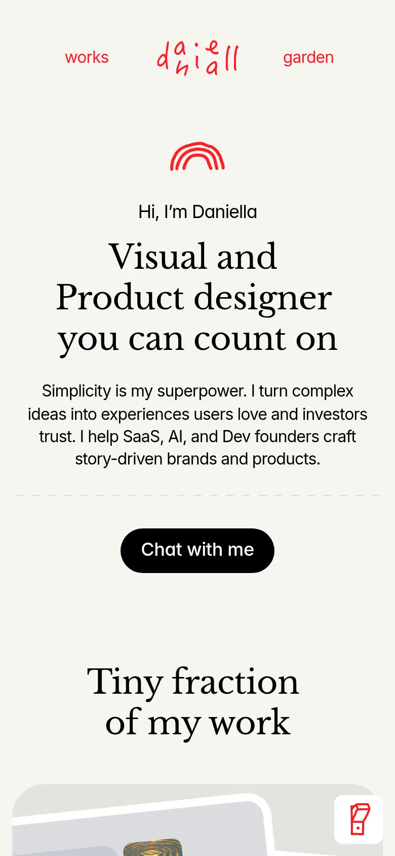
Daniella Marynova
The opening is “Hi, I’m Daniella” — conversational rather than branded, and it earns the warmth. Projects are listed with minimal styling: company name, category tags, a brief description, then an invitation to get in touch for the full work. The contact CTA is an email link with the subject pre-filled as “Hello” — removing the friction of composing a subject and setting the tone before the conversation starts.


Dan Tase
Almost entirely typographic — no hero imagery, no decorative elements, hierarchy created by type scale and spacing alone. Each project follows the same structure: company, context, outcomes, role tags. Projects are framed by company lifecycle stage rather than by deliverable or tool, which is an unusual and clarifying choice.
Akash Tyagi
Section headers are all-caps with arrow markers — EXPERTISE →, SELECTED WORK — used as visual punctuation throughout. Single column, left-aligned, generous whitespace, nothing that isn’t functional.
The footer shows the exact UTC timestamp of the last page update — “Mar 26, 2026, 7:18 AM UTC.” It treats the portfolio as a living document rather than a finished artefact. The primary CTA is “Book an intro call,” not “View my work.”


Bradley Ziffer
“Making things, but with more intention.” Lowercase, the entire opening line. The design matches: clean single-column layout, projects listed without elaborate visual treatments. The restraint of the site is the first evidence the statement can be met.
These fourteen portfolios are drawn from over 50 Framer portfolio websites in the A1 gallery. Browse the full collection — or explore all Framer website examples across every category and style.
Frequently asked questions
What are the best designer portfolio websites built in Framer?
Gabriel Valdivia’s site is the most technically complete — dark/light mode built into the system, scroll animations, and an embedded chat in the contact section that demonstrates what he sells. Yianni Mathioudakis shows the widest range: 3D, motion, and web as distinct disciplines, anchored by a 2025 Webby Award. Arnaldo Petrazzini’s arnaldo.zip is the most restrained — ten projects in a column, no thumbnails, one micro-interaction. The contrast between those three tells you most of what you need to know about how differently Framer can be used.
What makes a great designer portfolio website?
The best ones have a point of view that runs through every decision — the domain name, the CTA, what gets shown and what gets left out. Piet Aukeman’s audio player in the intro, Daniella Marynova’s gated work that requires a direct email, Bajgart’s availability declared in the headline: these aren’t design flourishes, they’re positioning. The portfolio is the first piece of work a potential client sees. It should behave the way the designer thinks.
Why do so many designers use Framer for their portfolios?
Framer gives designers control over animation and interaction without writing code, which means the portfolio can demonstrate design sensibility at the component level — not just through screenshots. Most platforms impose too many constraints; Framer’s constraint is more like a good brief than a box. It’s also fast to ship updates, which matters when availability and project status change frequently.