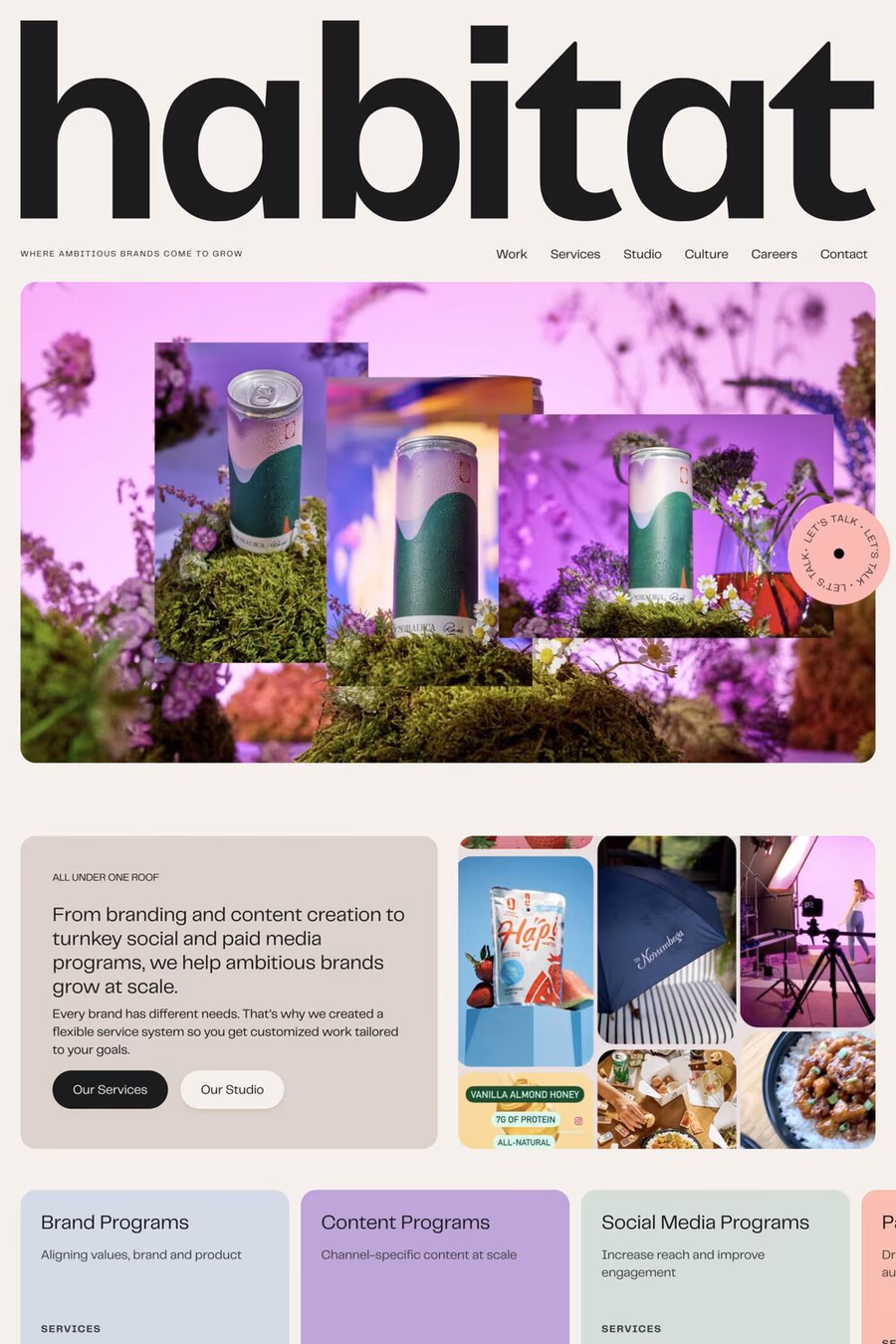
Telegraf combines the forms of mid-century grotesks with rigid angles. ● As its weight increases, Telegraf’s counters become more rectangular, to help with on-screen viewing at small sizes, and to increase impact at large sizes. It would define itself as a well-planted modern grotesk with a powerful presence and a touch of brutalism ▲ Suitable for both large-scale and indie projects.
1,550+ designers get inspired every Tuesday
Unsubscribe at any time

Telegraf combines the forms of mid-century grotesks with rigid angles. ● As its weight increases, Telegraf’s counters become more rectangular, to help with on-screen viewing at small sizes, and to increase impact at large sizes. It would define itself as a well-planted modern grotesk with a powerful presence and a touch of brutalism ▲ Suitable for both large-scale and indie projects.
A1 features 1 websites using Telegraf. Browse these examples to see how designers pair it with different styles and layouts.
Websites using Telegraf on A1 tend towards Pastel, Colourful, and Big type design styles. They’re most commonly built with Wordpress.
You can get Telegraf from the link above. Many fonts are available through Google Fonts, Adobe Fonts, or as web font files.