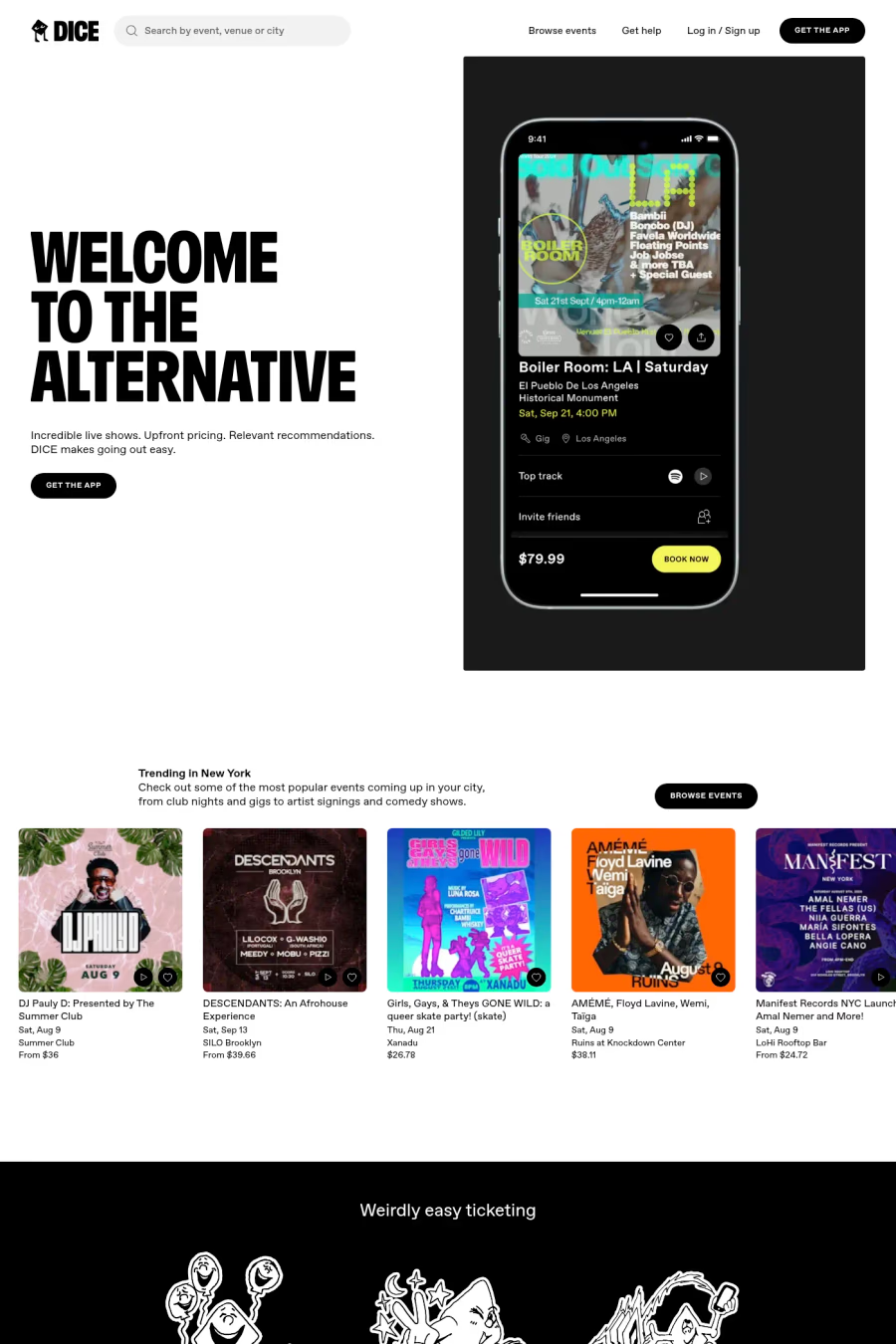
Foggy features a slight softness from subtly rounded corners, clean straights lines, and fewer compromises than its variable forefather. The diacritics are designed to accommodate extremely tight leading, while the lettter-spacing is kept similarly close—a reference to packed live shows—resulting in headlines with a dense, even texture.
1,600+ designers get inspired every Tuesday
Unsubscribe at any time


Foggy features a slight softness from subtly rounded corners, clean straights lines, and fewer compromises than its variable forefather. The diacritics are designed to accommodate extremely tight leading, while the lettter-spacing is kept similarly close—a reference to packed live shows—resulting in headlines with a dense, even texture.
A1 features 1 websites using Foggy. Browse these examples to see how designers pair it with different styles and layouts.
Websites using Foggy on A1 tend towards Display font, Illustration, and Minimal design styles. They’re most commonly built with Next.js.
You can get Foggy from the link above. Many fonts are available through Google Fonts, Adobe Fonts, or as web font files.